Subscribe to Blog via Email
Good Stats Bad Stats
Search Text
April 2025 S M T W T F S 1 2 3 4 5 6 7 8 9 10 11 12 13 14 15 16 17 18 19 20 21 22 23 24 25 26 27 28 29 30 -
Recent Posts
Good Stats Bad Stats
goodstatsbadstats.com
Recession has further polarized families
Such was the title of a piece in the Washington Post on a report by Zhenchao Qian in the Department of Sociology of The Ohio State University titled: “Divergent Paths of American Families”
The title was actually used in the print edition of the article. The online edition title was “Children suffer from growing economic inequality among families since recession,” Seems like the editors want to just confuse their readers.
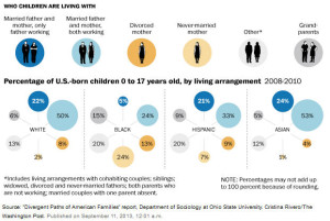 I was initially attracted to the piece by the graphic showing percent of children by family type by race and ethnic groupings. That graphic is shown on the right and the full a graphic is available here. Initially I did not care for the graphic but came to like is a bit better over time. The main reason is that the nature of the differences between the four groups becomes a bit easier to see in the graphic than they do in the table provided in the original report. It does take some study though for the comparisons to become clear. Notice first that there is very little differences in the percent of children in the various family groups between Whites and Asians. That is not so easy to notice at first glance as the two groups are on the two ends of the image. Once having seen the similarity the stark differences in the distribution for the Blacks become readily apparent. The Hispanic group falls between those two set. But their distribution is much closer to that of the Whites and Asians than to the Blacks. That simple difference does not stand out as well in the table as in the graphic.
The interesting thing about the graphic is that it provides absolutely no information about the content of the article in the Post as claimed by either the print or online headline. Also interesting is the imbalance in the graphic. It shows married father and mother with just the father working, but fails to show data for married father and mother with just the mother working. It shows divorce and single mothers, but does not show data for divorce and single fathers. These groups are likely relatively small but the imbalance in the graphic is obvious. In defense of the Washington Post the imbalance caries over from the report.
The big problem with the report is the attempt to link what has happened in society between 2000 and the 2008-2010 period to the “Great Recession.” The term shows up 21 times in the 43 page report so it is no surprise that the Washington Post picked up on the claim of a link to the recent recession. To understand the problem one need first to realize that the official recession started in December 2007, but that the unemployment rate remained below six percent through the summer of 2008. The 2008 data used likely does not reflect very much of the impact of the recession. The actual data for the 2008-2010 time period is from the American Community Survey and is composed of interviews conducted in each of the years 2008, 2009, and 2010. The data at the other end is from the 2000 Census and thus is from eight years prior to the recession. No attempt is made by the author to account for changes between 2000 and 2008. As a result all of the comparison in the table of 2000 data to the 2008-2010 data reflects mostly on what occurred in the years prior to the recession.
There is some attempt to use the 1980 Census data to track overall trends, but these instances mostly support the contention that what happened between 2000 and 2008-2010 are part of ongoing socioeconomic trends rather than from the recent recession.
The report seems to take claimed correlations based on only two data points, 2000 and 2008-2001, with the recession occurring in 2008 and onward as evidence of a causal relationship. Somehow what happened between 2000 and 2007 can be ignored. When things don’t change the author seems to think it fortunate that the recession did not affect that statistic. It is true that in some cases the link is tempered by the use of the term “may.” But the sheer number of times the recession is linked to the data clearly implies a causal relationship.
None of this is justified. The main reason is that there are two effects being reflected in that data. First what happened between 2000 and the start of the recession must me taken into consideration. Only than can what happened during the recession be measured. Some measure may have gotten better between 2000 and 2007 and then taken a turn in the opposite direction as a consequence of the recession. With the data used in this report we only see the sum of these two effects. We have not measured the effect of the recession alone.
Just as importantly correctional does not implies a belief in causation. Two data points only show changes between two points in time that can be linked to any number of causes. When these changes are also in line with ongoing socioeconomic change blaming or crediting the recession for them is not justified.
Unintended pregnancies
The Guttmacher Institute released a report this past Monday titled: “Unintended Pregnancy Rates at the State Level: Estimates for 2002, 2004, 2006 and 2008.” After reading the report I was reminded of a former supervisor’s term for statistical research that went too far. He called it “polishing to soles of your shoes.” I wonder if that is what I am seeing in this paper.
The original source of the data used in the report starts with the Pregnancy Risk Assessment Monitoring System or PRAMS which is a surveillance project of the Centers for Disease Control and Prevention (CDC) and state health departments. The authors used the PRAMS data for the states where it was available. The did some modeling work to add in the other states who are not part of the PRAMS system. Then they added additional data or abortions and “fetal loss” to arrive at their measures of unintended pregnancies.
The CDC produces regular measure of counts and percentages of unintended pregnancies. Their measure is based on a single question in the PRAMS survey. That question is: “Thinking back to just before you got pregnant with your new baby, how did you feel about becoming pregnant?” The set of possible answers is somewhat restrictive. The only possible answers are you wanted to get pregnant when you did, sooner than you did, later than you did, or never. Answering never or later is classified as an unintended pregnancy.The research community, including the authors of this paper are well aware of the limitation noting that later may well mean as little as one month or it many mean “when I get married.” or “when I graduate from College and an well established in at job.”
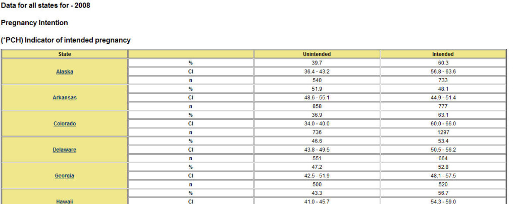 Under this definition the CDC tells us that in GA for example the unintended pregnancy rate was 47.3 percent in 2008. An abbreviated table is from the CDC is shown at the right. The full table is available here. Other similar tables and tables for additional years can be created form the CDC website.
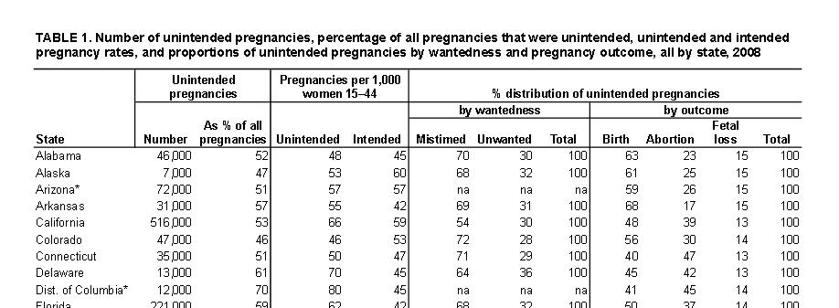 The Guttmacher Institute paper added value with the models for the states not available in the CDC system. The second table on the right shows some of the data from the paper for a few states. I do not consider here the quality of those models but note only that modeling to obtain a full set of states is a worthwhile effort. But they go beyond the models to factor in abortions and what they refer to as “fetal loss.” The value of both of these is open to serious questioning. The estimates obtained by the Guttmacher Institute for unintended pregnancies are generally higher than those obtained by the CDC. For example their estimate for GA is 60 percent, much higher than the CDC number of 47.3 percent.
The main reason for the higher numbers is the count of abortions as they are all counted as unintended pregnancies by the Guttmacher Institute. That they are all unwanted is not an accurate assumptions as abortions are preformed for a number of reasons. Getting data on abortions for unwanted pregnancies alone is not an easy task. Also getting an accurate measure of the number of abortions is also not an easy task. While the Guttmacher Institute conducts survey of abortion providers they have not way of mearsureing abortions due to the use of things like the morning after pill. Some of these methods would be required as true abortions and other are preventative in case a pregnancy occurred where no one knows if it did or did not occur.
Then there is the issue of measures of “fetal loss.” This measure includes miscarriages and the like. Some of these occur in the first weeks of pregnancy and as the authors admit the mothers may not even know that the miscarriage occurred.
So we are left with a new measure, all be it higher, that started out with data where the actual definition of unintended pregnancy is somewhat suspect. To that was added incomplete data on abortions that can only increase the percentages with assumptions that are clearly not correct in all circumstances. Next cases of “fetal loss” were added in based on clearly incomplete data. Somehow I am left with the feeling that I do not know a lot more, but that the soles of my shoes sure do look nice with the new polish.
Posted in Data Quality, Methodolgy Issues
Education and income
My last two posts focused on the question of “Do we need more college grads?” and with education and unemployment. To further round out the picture today I want to look at data on education and income.
Most studies that I have read seem to focus on the lifetime earnings “advantage” of a college degree. I believe that aggregates the data to too high a level. A comment from Jack on my last post also raises a very good point that should not be ignored in these discussions. He asked if ability plays a role in the differences. My answer was that it clearly does. Quantifying that difference and getting data to analysis it is not easy. It likely has an even bigger impact on the question of education and income than it does on education and unemployment.
The graphics below do not answer his question, but only serve as a starting point for furthering the discussion. When dealing with income ability plays a significant role. And when dealing with college degree the field of study – where is someone’s ability? – plays a significant role in their income after graduation. The questions on the value of a college degree really needs to be focused just not on do we have too many college graduates, but on do we have too many college graduates in certain fields. The solution often implied is to not push as much for people to get a college degree. But equally valid is a solution the points to finding ways of reducing the cost the college education.
 To look at income and education by year of age I ended up creating three graphics.
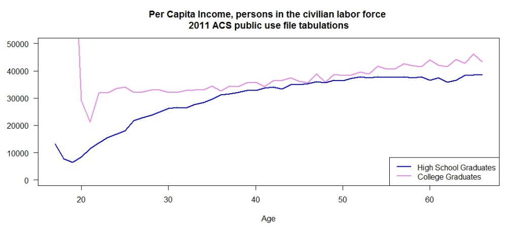
The first graph shows per capita income by year of age for high school graduates and college graduates. I kept the same definition of the two groups as I used in the previous post. High school graduates had a regular degree, no GED, were not enrolled in school and had stopped with the high school diploma. The college graduates were also not enrolled in school and did not have any advance education. These choices focus the discussion on two very different groups. It is best to ignore the first point or two on the plot for the college graduates and they are people who graduated very early and are from a very small sample. So I would not consider those points trustworthy indications of their true earnings as a group. For this group I restricted the universe to the civilian labor force. This matches closely the Current Population Survey Estimates used by the Bureau of Labor Statistics in their monthly employment data series in that it does not include those in the Armed Forces.
There is an initial large difference in per capita income in the younger age group. But most of this advantage disappears with increasing age. This would indicate an initial advantage for those with a college degree that is lost over time. A legitimate question here is are those with a college degree earning enough in the first ten years to more than recoup the cost of that education.
Keep in mind that with increasing age a smaller proportion of the population has a college degree. That may be distorting what is going on in the graphic.
I had intentionally excluded those not in the labor force in the above graphic as I did not want those with low incomes due to personal choices and circumstances to unduly influence the comparison. Those who are in the Armed Forces should also be included in this discussion – particularity if as I suspect they are likely to have a different split between high school and college graduates. They would clearly all be “employed.” The problem with dealing what that group is that incomes are not readily comparable to those in the civilian population as the compensation package with such things as housing benefits is very different.
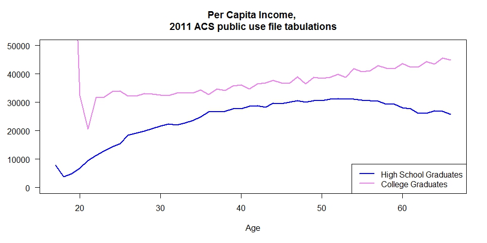 My second graphic included only one change. I expanded the universe to include the civilian population not in the labor force. This graphic presents a far different picture where those with only the high school diploma earn less on a per capita basis than those with a college degree throughout their lives.
Why the difference?
As it turns the answer a large part of the difference can be explained by the labor force participation rate. The third graphic show that rate for the two groups by age. 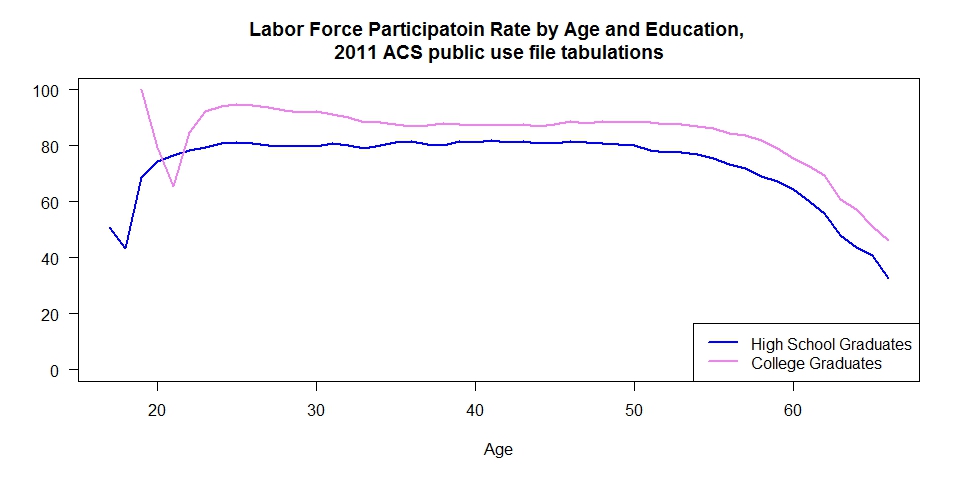 At all ages those with a high school diploma have a lower labor force participation rate. The reasons for that difference must be examined in the discussions.
A legitimate question might be why I used per capita income for the graphics rather than the more common median income. My logic is that by using per capita I get a direct measure of the income difference that can be easily compared to the commonly cited number that the debt for college graduates is in the neighborhood of $30,000 dollars. Medians would not allow that comparison. Having done these plots what I really would like to see is a series of plots showing the full income distribution for the two groups by age. That may well be my next project – but it won’t get done in the next week or two. Equally important is to look at this data by field of degree. That variable is available in the ACS public use micro-data files. So that analysis can be done.
Posted in Telling the Full Story