Subscribe to Blog via Email
Good Stats Bad Stats
Search Text
June 2026 S M T W T F S 1 2 3 4 5 6 7 8 9 10 11 12 13 14 15 16 17 18 19 20 21 22 23 24 25 26 27 28 29 30 -
Recent Posts
goodstatsbadstats.com
Education and income
My last two posts focused on the question of “Do we need more college grads?” and with education and unemployment. To further round out the picture today I want to look at data on education and income.
Most studies that I have read seem to focus on the lifetime earnings “advantage” of a college degree. I believe that aggregates the data to too high a level. A comment from Jack on my last post also raises a very good point that should not be ignored in these discussions. He asked if ability plays a role in the differences. My answer was that it clearly does. Quantifying that difference and getting data to analysis it is not easy. It likely has an even bigger impact on the question of education and income than it does on education and unemployment.
The graphics below do not answer his question, but only serve as a starting point for furthering the discussion. When dealing with income ability plays a significant role. And when dealing with college degree the field of study – where is someone’s ability? – plays a significant role in their income after graduation. The questions on the value of a college degree really needs to be focused just not on do we have too many college graduates, but on do we have too many college graduates in certain fields. The solution often implied is to not push as much for people to get a college degree. But equally valid is a solution the points to finding ways of reducing the cost the college education.
 To look at income and education by year of age I ended up creating three graphics.
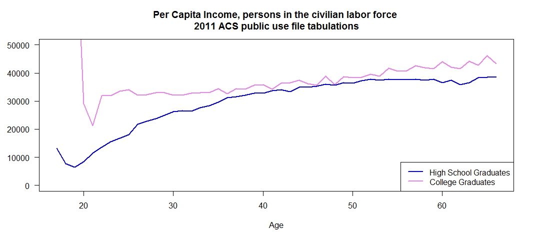
The first graph shows per capita income by year of age for high school graduates and college graduates. I kept the same definition of the two groups as I used in the previous post. High school graduates had a regular degree, no GED, were not enrolled in school and had stopped with the high school diploma. The college graduates were also not enrolled in school and did not have any advance education. These choices focus the discussion on two very different groups. It is best to ignore the first point or two on the plot for the college graduates and they are people who graduated very early and are from a very small sample. So I would not consider those points trustworthy indications of their true earnings as a group. For this group I restricted the universe to the civilian labor force. This matches closely the Current Population Survey Estimates used by the Bureau of Labor Statistics in their monthly employment data series in that it does not include those in the Armed Forces.
There is an initial large difference in per capita income in the younger age group. But most of this advantage disappears with increasing age. This would indicate an initial advantage for those with a college degree that is lost over time. A legitimate question here is are those with a college degree earning enough in the first ten years to more than recoup the cost of that education.
Keep in mind that with increasing age a smaller proportion of the population has a college degree. That may be distorting what is going on in the graphic.
I had intentionally excluded those not in the labor force in the above graphic as I did not want those with low incomes due to personal choices and circumstances to unduly influence the comparison. Those who are in the Armed Forces should also be included in this discussion – particularity if as I suspect they are likely to have a different split between high school and college graduates. They would clearly all be “employed.” The problem with dealing what that group is that incomes are not readily comparable to those in the civilian population as the compensation package with such things as housing benefits is very different.
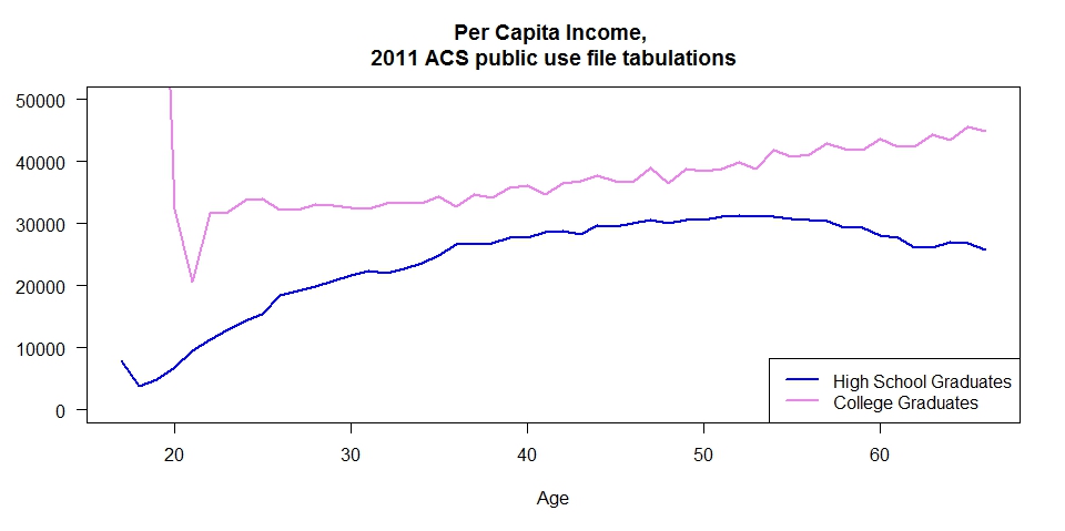 My second graphic included only one change. I expanded the universe to include the civilian population not in the labor force. This graphic presents a far different picture where those with only the high school diploma earn less on a per capita basis than those with a college degree throughout their lives.
Why the difference?
As it turns the answer a large part of the difference can be explained by the labor force participation rate. The third graphic show that rate for the two groups by age. 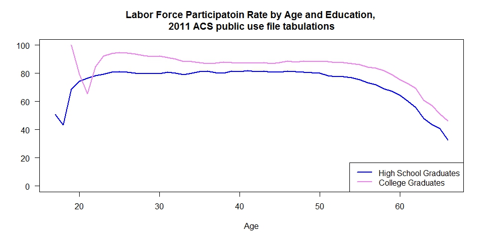 At all ages those with a high school diploma have a lower labor force participation rate. The reasons for that difference must be examined in the discussions.
A legitimate question might be why I used per capita income for the graphics rather than the more common median income. My logic is that by using per capita I get a direct measure of the income difference that can be easily compared to the commonly cited number that the debt for college graduates is in the neighborhood of $30,000 dollars. Medians would not allow that comparison. Having done these plots what I really would like to see is a series of plots showing the full income distribution for the two groups by age. That may well be my next project – but it won’t get done in the next week or two. Equally important is to look at this data by field of degree. That variable is available in the ACS public use micro-data files. So that analysis can be done.
Posted in Telling the Full Story