Subscribe to Blog via Email
Good Stats Bad Stats
Search Text
April 2025 S M T W T F S 1 2 3 4 5 6 7 8 9 10 11 12 13 14 15 16 17 18 19 20 21 22 23 24 25 26 27 28 29 30 -
Recent Posts
Good Stats Bad Stats
goodstatsbadstats.com
Do you really know the number that accurately?
I was looking at the list of potentially hazardous asteroids at spaceweather.com yesterday. The site provides a variety of information on the state of the sun, aurora forecasts, on current and future comets, and at the bottom of the page they provide a table listing recent and upcoming earth-asteroid encounters. It is a neat and very useful/interesting site for those interested in such things.
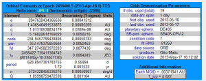 I went on and looked at the details for one of the asteroids. These can be found by clicking on the asteroid name in the table. On of the neat things is that it provides a graphic of the orbit of the asteroids that one can play around with. They do the same thing when they provide information of current comments. It is a very neat feature of the site. But I was dismayed when I noted how accurately they show the orbit elements of the asteroid. Well, they don’t really claim to know the orbit with great accuracy, they just show the numbers as if they did know. The table at the right is the data for asteroid 2013 KA. The site is good in that is provides both the individual orbital elements and a measure of the accuracy each of those elements. But there is a serious disconect between the claimed accuracy and the accuracy that is shown for the individual orbital elements.
As an example they tell me that the semi-major axis of the orbit is 1.436546491533875. I get sixteen digits of accuracy. But then they tell me that the standard error on that number is 0.00085269. In short they only have the semi-major axis measured to an accuracy of about three decimal places. So why tell me the number to fifteen decimal places? Now the units of measurement here are astronomical units. An astronomical unit is approximately 93 million miles. So they know the number to about 9,300 miles. But they give me the number to an implied accuracy of about five thousandths of an inch. Something is very wrong here.
Posted in Small Differences
Drinking and Driving – Let the Battle Begin
The National Transportation Safety Board (NTSB) released a report yesterday titled: Reaching Zero: Actions to Eliminate Alcohol – Impaired Driving. There were numerous recommendations and a good bit of data on a number of actions that could be taken to reduce traffic fatalities related to alcohol consumption. One recommendation garnered a good deal of media and industry attention. That was the recommendation to reduce the level of blood alcohol concentration (BAC) from 0.08 to 0.05.
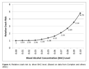 There were two charts in the NTSB report that are most useful in understanding the current situation as it relates to drinking and driving. The first showed the risk of a fatality as a function of the BAC. That graphic is shown on the right. This graphic shows that the relative risk is quite high at the current 0.08 limit. In fact it is also quite high at a 0.07 level. The NTSB clearly feels that the a risk factor of 1.38 at the 0.05 level is high enough to justify classifying those driving at that level as impaired.
Most of the rest of the developed world seems to agree with the NTSB as many countries currently set the limit at 0.05. The World Health Organization is also in agreement with the 0.05 level. Clearly reasonable people have considered the facts and arrived at 0.05 as a reasonable level.
But has the NTSB made a good case for the proposed lowering of the limit? Certainly with close to a third of all traffic fatalities related the alcohol use the level is much too high and current methods to reduce that level are not effective. The current level of 10,000 deaths a year due to alcohol and driving is clearly unacceptable. We as a country would be outraged if 10,000 people a year were dying from any other preventable cause. Just consider the reaction any time there is an e-coli outbreak due to tainted items in the food chain.
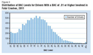 The figure at the right, also taken from the NTSB report, shows the distribution of traffic fatalities by BAC level. This chart shows that about 1,000 fatalities can be attributed to situations where the BAC was 0.05 to 0.05.
A major weakness in the report is the failure to provide detailed numbers for that group of people. The breakdowns are almost universally 0.01 to 0.07, and levels above 0.07. The 0.05 to 0.07 level is the targeted group in the recommendation so more detailed data on that group needs to have have been included. The additional weakness in the analysis is any clear linkage to the number of fatalities that would be eliminated by lowering the level. No method is going to eliminate all fatalities in that group. Three will always be first offenders who cause fatalities. At the same time a reduction in the threshold BAC level would likely reduce fatalities in some of the other parts of the distribution.
Meanwhile the American Beverage Institute has reacted vigorously to the propose lowering of the BAC criterion. They have describe the proposal as ludicrous. That is a strong word and in my mind should not be used in the middle of a serious discussion of issues such as this. Never the less it does show their level of concern. Of course they do have a vested interest in protecting the profits of the alcohol and restaurant industries. Their first responsibility is not in protecting the lives of those on the road of this country.
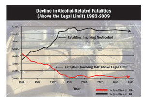 Unfortunately the American Beverage Institute did not bring any data to bear on the discussion in support of their position. Surfing their web sites it becomes immediate clear that their main goal to protect the industry from anything that would impact the sale of alcoholic beverages. One of their web sites even focused on “Bad Stats.” When they attack the statistics of their opponents they need to ensure that their own statistics are clean. They failed to do that with the graphic to the right taken from their negligent driving web site. What stands out here is that a site devoted to the issue of negligent driving makes as its only home page issue the case that driving and driving is no longer the issue.
There are numerous problems with the chart. Start with the title: “Decline in Alcohol-Related Fatalities 1982-2011.” The chart shows only percentages. There are no counts. So the chart cannot show the actual decline in alcohol-related fatalities that has occured. By using their title they create in the chart the implication of an increase in the number of non alcohol-related fatalities in the same time period. The truth is that the two percentages should add to 100%. A decrease on one percentage will be offset by an increase in the other. Then they cut off the lower limit of that chart at 30% giving the mistaken impression that the alcohol-related fatalities is at a very low level when just about anyone should consider 30% to be unacceptable high.
A change to the legal BAC level, if it happens, will likely take years to implement. The arguments will bring forth a wealth of associated information and misinformation. I wait to see how the issue will evolve.
Posted in Data Quality, Telling the Full Story
The Wealthy get Wealthier – Looking Deeper
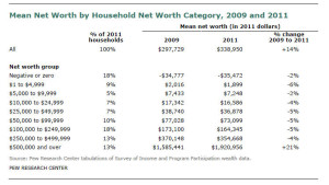 After my last post I got to asking myself what should I see in the table in the Pew Research Center report on mean net worth. Specifically I was looking at the table on the right and asking what to expect for the percent change in mean net worth for those with a net worth above the $500,000 level given various scenarios on how income increased during the recovery from the recession.
This led me to the conclusion that the table itself is almost meaningless because the adjustment to bring the 2009 data up to current dollars in 2011 was been done incorrectly. In fact with the methodology used and the nature of the table the percent change in mean net worth column for all but the last cell can be expected to be in the range of -5% regardless of what is happening in the recovery. This problem could well have been my number one issue in the previous post had I asked the right questions.
The Pew report using the table above claims:
The net worth of the nation’s households increased from 2009 to 2011, but the increase in wealth was far from widely distributed among households. The vast majority of the nation’s households experienced a decline in net worth.
and then goes on to say:
Households in all eight net worth categories from negative or zero to $250,000 to $499,999 of net worth experienced a decline in mean net worth from 2009 to 2011.
Such assertions simply cannot be made from the table provided and neither can they be substantiated by other date in the Census Bureau SIPP tables.
In order to create the table the authors of the Pew report needed to adjust the 2009 data for inflation to reflect current dollars. What they did was to adjust upwards the means for each net worth cell in the 2009 data by about 5%. This was the amount inflation for the two year period. For example the Census Bureau reported a mean net worth of $73,458 for those with a net worth between $50,000 and $99,999. The Pew authors used the inflation adjustment to arrive at the $77,028 number in the table. Unfortunately the adjustment should have been made first on the cell limits. To do so they would have needed to compute the mean net worth in 2009 for those with a net worth between approximately $47,619 and $95,237. They would then adjust that value upwards by 5%. The $47,619 figure in 2009 is equivalent to $50,000 in 2011. To do this they would have to have used the mico-data file for the SIPP that the Census Bureau makes available. By failing to perform the first step the authors in effect make the adjustment twice. Failing to adjust the cell limit in approximate terms is very close to being equivalent to making the inflation adjustment.
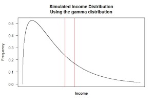
All this becomes a bit easier to visualize if we look at an actual distribution. The same factors apply for income distributions as they do for the distribution of net worth. I’ll look at the income distribution here as that is easier for many to understand. The results apply just as well to a distribution of net worth. The figure to the right represents the 2011 income distribution in the United States. I generated it as a simulation of the US household income distribution for 2011. It is based on a gamma distribution. The actual distribution can be seen here. The simulation is close enough to illustrate my points.
Consider incomes for 2011 those between $90,000 and $110,000. I have marked that group as between the two vertical red lines on the chart. I can compute a mean income for the individuals in that range. The value is just under $100,000. Now I want to look at the 2009 income distribution and ask how it changed. Like the authors of the Pew Research Center report I need to adjust or inflation so that I am working in current dollars. Doing this correctly is the problem. If I made the adjustment as in the Pew report I would look at the 2009 income distribution between $90,000 and $110,000, compute the mean income and then inflate the computed mean by the inflation adjustment between 2009 and 2011. That would be about 5%.
That is the wrong adjustment. Real dollars in 2009 would be 5% less than the 2011 numbers. So the correct procedure, as I outlined above, is to look at individuals in 2009 with incomes between about $85,714 and $104,761. I would compute the mean income for those individuals and then make the inflation adjustment.
 With the correct adjustment they would have seen almost no changes in mean net worth for any but the top cell. Does this mean that they are only holding steady while those at the top are getting wealthier. No it does not. In any of the middle cells as income, or net worth, increases households move out of the cell into the next higher cell, some remain in the cell but their incomes increase. And new households enter the cell from a lower cell replacing those who have left. The mean and the median for those in the cell at any point in time remain about the same.
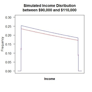
The figure on the right illustrates this point and is based of the previously mentioned figure. The figure shows under the red line the distribution of households with incomes between $90,000 and $110,000 at some point in time. If everyone’s income increased by 5% the blue line represent the distribution of incomes at the new point in time for those who now have incomes between $90,000 and $110,000, but who in 2009 had incomes between $85,714 and $104,761. The income distribution in figure two has been shifted to the right and is shown in blue in the new figure.
Visualize computing the mean income for the two distributions. Be careful as we are copying the mean on the x-axis, not the y-axis. There are more households in the distribution as the second point in time as illustrated by the higher curve, but the shape of the distribution is almost identical and thus the computed mean income will remain vertically unchanged. So unless there were major changes in the shape of the income distribution over the two year time span the actual measured change in mean income (an mean net worth if that was what I was looking at here) would remain almost constant. This is true for all of the bounded cells. What happens in the top cell is more complex and dependent on the a number of factors.
Because the expected change is close to zero when the authors of the Pew report made the inflation adjustment they way they did the virtually ensured that the estimated change in net worth for all of the bounded cells would be negative an approximately the size of the inflation adjustment. It is no surprise that their table shows (erroneous) that mean net worth declined by about 5% for all of the bounded cells.
Posted in Methodolgy Issues