Subscribe to Blog via Email
Good Stats Bad Stats
Search Text
April 2025 S M T W T F S 1 2 3 4 5 6 7 8 9 10 11 12 13 14 15 16 17 18 19 20 21 22 23 24 25 26 27 28 29 30 -
Recent Posts
Good Stats Bad Stats
goodstatsbadstats.com
The Wealthy get Wealthier
The headlines this week read “Richest are getting richer.” This was based on the report from the Pew Research Center which in turn used on data on wealth released by the Census Bureau from the Survey of Income and Program Participation(SIPP). The report from the Pew Research Center was titled:
An Uneven Recovery, 2009-2011 – A Rise in Wealth for the Wealthy; Declines for the Lower 93%.
Usually I like the work coming out of the Pew Research Center. They are generally very good with their analysis and good about describing how they do their work. But in this case they have needlessly complicated their analysis and in the process fell short on a couple of basic statistical principles.
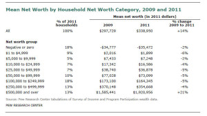 The main headline for the report is that the top 7 percent of households saw their net worth increase by 28 percent between 2009 and 2011 while all other households was a decrease in net worth. However, the SIPP data provided no information on wealth for the top 7 percent of households. The data only gave information for the top 13 percent of households. The Pew Research Center authors had to make a number assumptions and calculation to get to the 7 percent number. The PEW version of the SIPP data table is shown to the right.
Issue 1: Use of the mean instead of the median.
In most discussion of income it is preferable to use the median rather than the mean as unusually large but rare income level changes can translate into large shift in the value of the mean while the median is immune to such effects. Outlier observations are prone to distort the value of the mean. This is especially true when working the upper tail of the income distribution. In this case the mean and the median told two very different stories. The authors saw this and said in their report:
Even though households with net worth of $500,000 or above saw their mean net worth increase from 2009 to 2011, this group’s median net worth decreased during the same period—to $836,033 in 2011 from $889,275 in 2009.
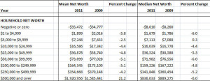 But they then chose to ignore the issue. I have inserted an Excel table on the right showing the data by wealth level for both the means and the medians from the SIPP data. It is imperative that the difference between the two measures be dealt with in the discussions of the issues raised in the report. Otherwise the authors leave themselves open to criticism that they chose the measure beneficial to the point they wished to make. In this analysis the criticism is given greater creditability by the length the authors went to so they could focus on the top 7 percent of households rather than on the top 13 percent of households as described in the SIPP. This enabled them to talk about a smaller proportion of the household and to show a greater differential gain in net worth (28 vs 21 percent).
Issue 2: Ignoring sampling error.
The report barely mentions the issue of sampling error saying only:
“The estimates are based on responses from a sample of the population and may differ from the actual values because of sampling variability and other factors.”
The Census Bureau provided measure of sampling error for both mean and median net wealth estimates. Of most concern here is the large standard error on the 2011 estimate of mean net worth. The 90 percent confidence interval extends from $1,543,460 to $2,298,452. The fact that this confidence interval overlaps the 2009 estimate of net wealth is of significant concern. This does not necessarily mean that a classical test of the difference between the 2009 and the 2011 estimates would fail to demonstrate an increase in mean net worth as the sample for the same year are based on the SIPP longitudinal panel using mostly the same respondents. However it does raise questions about the use of mean.
Issue 3: Computing the new worth for the top 93 percent of households.
It is in the computation of the new worth for the top 7 percent of households that questions on the methodology come to the forefront. The Census Bureau provides no data that can be use to make direct estimate so the authors of the Pew study made a number of claims and assumptions. They start by claiming:
“A simultaneous rise in the mean and decline in the median implies that aggregate net worth increased only among households above the median—that is, the 8 million households with net worth of $836,033 or more in 2011.”
This is just plain wrong. There is any number of scenarios under which the aggregate net worth of those under the median can increase while the median remains unchanged or declines. Complicating this analysis is that there are two median in play for those with net worth over $500,000 – the 2009 median of $889,275 and the 2011 median of $836,033. The authors choose to focus on the 2011 median of $836,033. But this means that since the number of households with a net worth over $500,000 was essentially the same at both points in time there are almost certainly more households in the range of $500,000 to $836,033 in 2011 that there were in 2009. And thus the 2011 aggregate net worth for this group could easily be larger in 2011 than it was in 2009.
The report goes on to say:
“Those upper 7% of households had an estimated aggregate wealth gain of 28% from 2009 to 2011, while the estimated aggregate wealth of households in the $500,000 to $836,033 range fell by 4%.”
The methodology used to get the 28% figure is described in a footnote on page 8 of the report. Since the actual data is not available they authors made the assumption the the distribution of wealth was uniform across the interval from $500,000 to 889,275 in 2009 and similarly assumed that the distribution was uniform across the interval form $500,000 to $836,033 in 2011. But this is the tail of the income distribution. An assumption of a uniform distribution is clearly wrong if one downloads the SIPP micro-data file for either year and looks at a simple histogram.
Such obvious problems should not be found in a report from of research organization of the caliber of the Pew Research Center.
Some parting thoughts.
I have tried not to say I disagree with the overall conclusions the authors make. I do not think the data presented here supports that conclusion. Their logic on what is happening the nations economy makes sense and it such the it seems very likely that with the recovery of the stock market the wealthy have gained disproportionately. I must ask did they also loss disproportionately when the stock market fell? An analysis/report such as this in my mind does more to damage the credibility of the case the authors are making than to support their claims.
Cost of Child Care Going Up – Is That the Right Story?
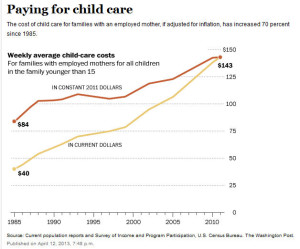 A few days back I spotted the graphic on the right in the Washington Post. It was a stand alone graphic with no article to explain the image. But the graphic does send a powerful message that the cost of child care has gone up substantially in the past 25 years.
But as it turns out this is not the full story, or even the right story. In this case the single graph fails to capture what is happening to child care costs.
The graphic was contained in the recently released Census Bureau report “Who’s Minding the Kids? Child Care Arrangements: Spring 2011.” The Washington Post made only minor changes, but most notably added the header highlighting the 70 percent increase in the cost of child care since 1985.
The data in the graph is correct and the headline is correct. The Census Bureau survey data shows that the cost has risen 70 percent. However to understand what has happened in that time period the Census Bureau also provided a much better graphic in the press release for the report that shows a much more complex situation exists. In this graphic we find that while the cost of child care has gone up the percentage of family income required to pay for that child care has remained stable.
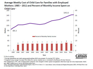 What is going on? Many things have changed over the last 25 years. Incomes have changed, family structure has change, the number of dual income families has changes. All of these as other factors undoubtedly influence what we see in the graph.
The Census Bureau press release highlights a number of important changes.
Median salaries for child care workers have not changed. The percent of families paying for child care has declined from 42 percent to 32 percent. The use of organized day care has increased while the use of non-relative for day care has declined.
This was a much more complex story and deserves more than a simple graph without any analysis of what has transpired over the last 25 years.
Posted in Telling the Full Story, The Media
Home Price Confusion and a Bar Chart Inside Bar Chart
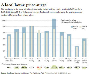 In as piece on the price of homes in the Washington DC area the Washington Post published the graph at the right. Call this a bar chart within a bar chart with a series of “half bubble charts” at the bottom. For the embedded bar charts we are to ignore the area and focus only on the height of the bars. However, to the eye the March 2012 numbers look much smaller than they really are. But just so we don’t get confused they provide us with the numerical percentage change at the bottom of the chart. They add clutter with small half moon bubbles showing the percentage change as well. But then there is a problem. One of the percentages is negative. Their solution is to use a yellow bubble that is barely visible and reverse the orientation of the “half moon.” There are many better ways to present the data with a great deal more clarity.
In a related piece the same day the published a article titled “Americans spending larger share of annual income on homes.” But whoever wrote the headline did not read the first paragraph of the article:
As mortgage rates hover near historic lows, Americans are saving big on monthly mortgage payments. In the fourth quarter of 2012 alone, homeowners spent almost 37 percent less on the payments than they did in the years before the housing bubble, according to real estate tracking firm Zillow.
Let’s see now I’m spending more by spending 37 percent less? That must be some of that new math.
The article itself seems to get the story straight. People are spending their money now on higher priced homes instead of spending on higher interest rates. What I don’t like is the metric they use to compare cites over time. They use the ratio of the median price of a house to the median income for the metric. In the context of the story about where people are putting their money the key number should be the proportion of income that the current buyer is putting towards their house payments. Then questions can be asked as to how that varies by geography and over time.
The full table comparing the various cites can be seen here. Another of my questions is the currency of the income data in the table. It the ratios provided for 2012 Q4 are not based on current data for income, but do use current data for housing prices then likely those ratios are biased upward. The older the income data the larger the bias will be. Quality income data for a single quarter of the year by city is generally not available only four months after the end of the quarter. Unfortunately the piece does not provide adequate information on what data was used to compute the ratios.
Posted in Graphics Visualization, The Media, Where's the Data?