Subscribe to Blog via Email
Good Stats Bad Stats
Search Text
April 2025 S M T W T F S 1 2 3 4 5 6 7 8 9 10 11 12 13 14 15 16 17 18 19 20 21 22 23 24 25 26 27 28 29 30 -
Recent Posts
Good Stats Bad Stats
goodstatsbadstats.com
When a forcast is not a forcast
The National Weather Service, using data provided by the US Geological Survey, posts on the web data and forecasts for many rivers in the United State. Earlier this year I was looking at the forecasts for the river levels at St. Louis on the Mississippi River. The current forecast can be found here.
The problem is that the charts and associated data files are not really forecasts. The key is a note at the bottom of each graph that says.
NOTE: River forecasts for this location take into account past precipitation and the precipitation amounts expected approximately 24 hours into the future from the forecast issuance time.
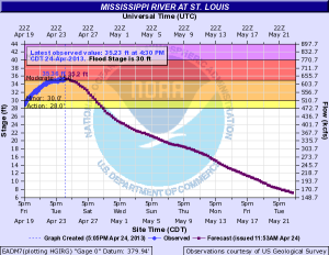 What the graph shows apparently is the forecasts with the assumption that takes into consideration rains that are predicted to occur within the next 48 hours. But then they assume no rain after that time. This would not be so bad except that the graphs frequently predict the water levels out a full three weeks into the future. This means that the forecast frequently predict lower water levels than occur. That can be bad in the winter months – such as last winter when record low water levels were forecast and the Federal Government was spending tax dollars trying to make sure that the river remained navigable for the barges the travel the river. Such forecasts can encourage spending that may not be necessary. On the other hand in time when the river is a flood stage the forecasts will tend to predict that the river will fall below flood stage much sooner that what will actually happen.
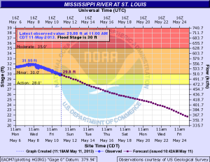
The three graphs on the right that were posted at the website illustrate the problem using the data for the Mississippi River at St. Louis. I have not looked at the situation at other river gauge locations.
 In the first graph was downloaded from the site on April 24 of this year. At that time the river level was at 35.36 feet. That was about five feet above the flood stage of 30 feet. The forecast at that time was for the river to fall below flood stage six days later on April 30.
The second graphic is from May 11th and show that the river had just then fallen to 30 feet. That was an error of eleven day. It took the river three times as long as the forecast claimed to reach that level.
But the story continues. According to the original forecast the river level would fall to about eight feet on May 22. The May 11 forecast revised that to 18 feet. That is a big difference.
I forgot to download the graphic for May 22, but did get the one for May 21. That graphic for that date is shown on the right. At that time the river level was at 25.9 feet an rising.
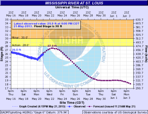 NOAA need to rethink what they are posting. If they insist on using only the forecast of precipitation within the next 24 hours then the forecast graph need to be restricted to a much shorter time frame. Alternately they could do some modeling based on past history as well as utilize some longer range weather forecasts to incorporate more realistic estimates of precipitation amounts and the resulting impact on the river levels.
Posted in Graphics Visualization, Methodolgy Issues
Tornado graphics that don’t work
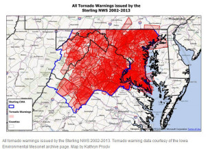 It was inevitable that after the devastating tornado in Moore, OK others would ask what is the tornado risk in my area. The Washington DC area was no exception. The Washington area Capital Weather Gang posted a piece about tornadoes in the Washington forecast area. But the graphics just do not work. The lead visualization is posted to the right. There was attempt to overlay the tornado warnings for the area with deepening color representing more warnings. The problem is that there were so many warnings for the time period that was used that very little is left that shows differences in the number of warnings across the forecast area. The mountains to the west get fewer warnings as do both Washington DC and Baltimore MD. Beyond that there is little that stands out. A few words would have conveyed that informaton. Then the story could have turned to more interesting information.
Two graphics in the piece used three dimensional plots where the third dimension is meaningless. That is a big blunder in graphic visualization as the use of meaningless dimensions distort the true relationships. The author of the piece would do well to read Tufte’s book The Visual Display of Quantitative Information.
The final graphic that the author admits was included in the piece not because it added information but because it look nice. I won’t copy or link the the image here. It’s not worth it.
I look at much of was was done in the piece as interesting for exploratory work. The graphics used would be useful to the analyst in trying to understand the level of tornado risk in the Washington forecast area. But a different set of graphs is needed to convey that information to the readers.
Posted in Uncategorized
Health care cost variability and mortality
The federal government recentlyreleased some detailed data on the variability of health care costs across the hospitals in the Untied States. Much was made of just how much variability there was even for hospitals in the same geographic area.
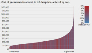 Kitware, Inc. posted an interactive graphic visualization of the data for the treatment of pneumonia and heart failure. An example graphic is posted to the right. The graphic always shows costs for the y-axis. But the x-axis can be sorted by cost, mortality, or reimbursement. In all cases mortality rate are shown by the color code for the vertical bars.
I find the graphics themselves to be less than informative. Part of that is in how the visualization is constructed. But part of it is also the limitations of the data that was released.
Take the graph above. Kitware elected to show the sorted distribution of cost. This in itself is fine. But then they added in the second dimension of mortality. The attempt is to link mortality to costs. But that would be better shown as a simple scatter diagram of costs vs mortality. The problem with that is that it would likely show a big mess with no clear link between the two variables. In this case a nice looking graphic has been substituted for some more serious statistical analysis.
But is this the right data set to show a link between mortality and costs? The problem is that the data that was released only provides average costs for each hospital. What is needed is the additional data on differences between hospitals and between the patients within a hospital that can explain some of the variability in the costs and outcomes. Average costs just do not provide adequate information. A person arriving the hospital in heart failure and dies within a few hours has much different cost outcome than someone who lives for several days before sub-coming to heart failure. Seriously ill patients are transferred between hospitals. Patients without health insurance arrive at the hospital in a very different state of health than those with health insurance. We need to be able to remove the variability due to these and other patient related conditions before we can hope to understand the true differences in costs by hospital.
It is also not clear how costs and mortality should be connected. Higher mortality rates may well imply sicker and therefore more expensive patient care. On the other hand lower mortality rates may imply longer hospital stays and therefore more expensive patient care. Data on those relationships may already be available. They need to be linked into the discussions of costs and cost variability by hospital.
The release of the data set by the government is a good starting point. I see it as the very first baby step. I hope in the future to see much more detailed data.
Posted in Graphics Visualization, Telling the Full Story