Subscribe to Blog via Email
Good Stats Bad Stats
Search Text
July 2026 S M T W T F S 1 2 3 4 5 6 7 8 9 10 11 12 13 14 15 16 17 18 19 20 21 22 23 24 25 26 27 28 29 30 31 -
Recent Posts
goodstatsbadstats.com
The Wealthy get Wealthier – Looking Deeper
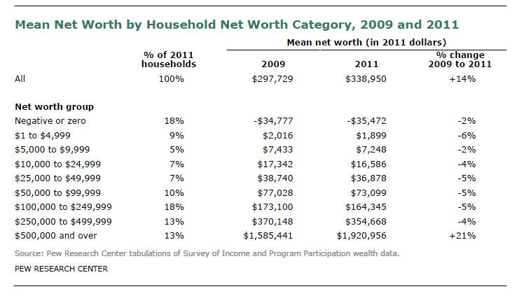 After my last post I got to asking myself what should I see in the table in the Pew Research Center report on mean net worth. Specifically I was looking at the table on the right and asking what to expect for the percent change in mean net worth for those with a net worth above the $500,000 level given various scenarios on how income increased during the recovery from the recession.
This led me to the conclusion that the table itself is almost meaningless because the adjustment to bring the 2009 data up to current dollars in 2011 was been done incorrectly. In fact with the methodology used and the nature of the table the percent change in mean net worth column for all but the last cell can be expected to be in the range of -5% regardless of what is happening in the recovery. This problem could well have been my number one issue in the previous post had I asked the right questions.
The Pew report using the table above claims:
The net worth of the nation’s households increased from 2009 to 2011, but the increase in wealth was far from widely distributed among households. The vast majority of the nation’s households experienced a decline in net worth.
and then goes on to say:
Households in all eight net worth categories from negative or zero to $250,000 to $499,999 of net worth experienced a decline in mean net worth from 2009 to 2011.
Such assertions simply cannot be made from the table provided and neither can they be substantiated by other date in the Census Bureau SIPP tables.
In order to create the table the authors of the Pew report needed to adjust the 2009 data for inflation to reflect current dollars. What they did was to adjust upwards the means for each net worth cell in the 2009 data by about 5%. This was the amount inflation for the two year period. For example the Census Bureau reported a mean net worth of $73,458 for those with a net worth between $50,000 and $99,999. The Pew authors used the inflation adjustment to arrive at the $77,028 number in the table. Unfortunately the adjustment should have been made first on the cell limits. To do so they would have needed to compute the mean net worth in 2009 for those with a net worth between approximately $47,619 and $95,237. They would then adjust that value upwards by 5%. The $47,619 figure in 2009 is equivalent to $50,000 in 2011. To do this they would have to have used the mico-data file for the SIPP that the Census Bureau makes available. By failing to perform the first step the authors in effect make the adjustment twice. Failing to adjust the cell limit in approximate terms is very close to being equivalent to making the inflation adjustment.
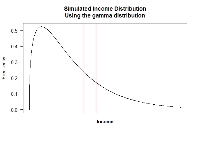
All this becomes a bit easier to visualize if we look at an actual distribution. The same factors apply for income distributions as they do for the distribution of net worth. I’ll look at the income distribution here as that is easier for many to understand. The results apply just as well to a distribution of net worth. The figure to the right represents the 2011 income distribution in the United States. I generated it as a simulation of the US household income distribution for 2011. It is based on a gamma distribution. The actual distribution can be seen here. The simulation is close enough to illustrate my points.
Consider incomes for 2011 those between $90,000 and $110,000. I have marked that group as between the two vertical red lines on the chart. I can compute a mean income for the individuals in that range. The value is just under $100,000. Now I want to look at the 2009 income distribution and ask how it changed. Like the authors of the Pew Research Center report I need to adjust or inflation so that I am working in current dollars. Doing this correctly is the problem. If I made the adjustment as in the Pew report I would look at the 2009 income distribution between $90,000 and $110,000, compute the mean income and then inflate the computed mean by the inflation adjustment between 2009 and 2011. That would be about 5%.
That is the wrong adjustment. Real dollars in 2009 would be 5% less than the 2011 numbers. So the correct procedure, as I outlined above, is to look at individuals in 2009 with incomes between about $85,714 and $104,761. I would compute the mean income for those individuals and then make the inflation adjustment.
 With the correct adjustment they would have seen almost no changes in mean net worth for any but the top cell. Does this mean that they are only holding steady while those at the top are getting wealthier. No it does not. In any of the middle cells as income, or net worth, increases households move out of the cell into the next higher cell, some remain in the cell but their incomes increase. And new households enter the cell from a lower cell replacing those who have left. The mean and the median for those in the cell at any point in time remain about the same.
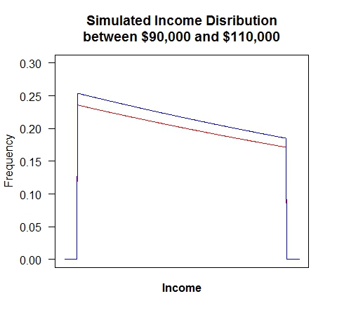
The figure on the right illustrates this point and is based of the previously mentioned figure. The figure shows under the red line the distribution of households with incomes between $90,000 and $110,000 at some point in time. If everyone’s income increased by 5% the blue line represent the distribution of incomes at the new point in time for those who now have incomes between $90,000 and $110,000, but who in 2009 had incomes between $85,714 and $104,761. The income distribution in figure two has been shifted to the right and is shown in blue in the new figure.
Visualize computing the mean income for the two distributions. Be careful as we are copying the mean on the x-axis, not the y-axis. There are more households in the distribution as the second point in time as illustrated by the higher curve, but the shape of the distribution is almost identical and thus the computed mean income will remain vertically unchanged. So unless there were major changes in the shape of the income distribution over the two year time span the actual measured change in mean income (an mean net worth if that was what I was looking at here) would remain almost constant. This is true for all of the bounded cells. What happens in the top cell is more complex and dependent on the a number of factors.
Because the expected change is close to zero when the authors of the Pew report made the inflation adjustment they way they did the virtually ensured that the estimated change in net worth for all of the bounded cells would be negative an approximately the size of the inflation adjustment. It is no surprise that their table shows (erroneous) that mean net worth declined by about 5% for all of the bounded cells.
Posted in Methodolgy Issues