Subscribe to Blog via Email
Good Stats Bad Stats
Search Text
April 2025 S M T W T F S 1 2 3 4 5 6 7 8 9 10 11 12 13 14 15 16 17 18 19 20 21 22 23 24 25 26 27 28 29 30 -
Recent Posts
Good Stats Bad Stats
goodstatsbadstats.com
Visual clutter – affirmative action poll results
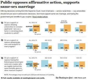
This has to be one of the more cluttered graphic that I have seen in some time. It was published in the Washington Post on June 12 in a piece titled: “Wide majority opposes race-based college admissions programs, Post-ABC poll finds.” The full accompanying graphic can be seen here.
 One of the core principle of graphic visualization is to reduce clutter and maximize white space while making the point of the graphic clear.
Start with the decision to use boxes to show the percentages. Three boxes not even laid out side by side make it very difficult for the reader to envision the relative size of the boxes. The designer must have realized this as they then cluttered the graphic by inserting the percentage into or next to every single box. If you are going to do that you may as well just give me a table of numbers.
Now look at the second poll question in the graphic: “Do you support or oppose letting gay men and lesbians to marry legally?” There are really only four key numbers in the graphic. It would be easy to state in the text of the article that 47 percent support and 40 percent oppose with 3 percent expressing no option. The rest of the graphic then shows only that support decreases with the increasing age of the respondent. A very simple bar chart with the 76, 55, 40 percent numbers would do the job and be very clear on the effects. This puts the percentages by age next to each other where the reader can easily visualize the differences in the percentage by age. That visualization is hindered when both the support and opposition numbers are shown in the graphic.
There is no reason to show both the support and the opposition numbers as with a no opinion rate of 2-3 percent across all age groups the trend line remains the same regardless of which numbers you choose to show – support or opposition. If they want to say younger people are more supportive show the the support numbers. If they want to say older people are in opposition show the percentage opposed.
The same principles apply to the other two lines in the graphic.
Posted in Graphics Visualization
“Top 5 world worst problems”
I noticed today on the CNN homepage a link titled “Top 5 world worst problems.” Curious I went to the link. It turns out that reporter John Sutter as part of his new Change the List project is asking for input on subjects he should cover. The concept is to “push for progress in places that need it most.” He and CNN have put together a list of 20 top issues and is asking readers to vote on the top five issues. The full list of the 20 top list is posted here. You can vote there as well.
My first reaction to the list was that I found it mind boggling that global warming and climate change was not on the list. But the the purpose of the list seems to be focus on short term and local problems. So perhaps there is some logic behind not including it on the list. But on the other hand when I think in terms of the the big issues before us certainly climate change needs to be on that list.
The list itself seems rather strange when I think of “top problems.” One item on the list deals with happiness saying: “Australia is the happiest, according to one survey. Who could use cheering up?” Somehow I cannot see how that made the list of big problems. How did that make the voting list?
There are a couple of issues where simple statistics is not understood. One item asks “Which U.S. state has the highest incarceration rate?” That is not a problems. It is a given. From a simple statistical perspective, and from simple logic one state will have the highest incarceration rate. That is not the problem. If there is an issue it is that the incarceration rate is too high in one or more states. The discussion needs to focus not on one state, but on the issue of what is too high a rate and are we as a country sending too many people to jail for the wrong reasons.
The same logic applies to the question about “America’s most endangered river.”
I am puzzled as well as to how such items as a lack of high-speed internet access in pockets of the US, high school graduation rates in the US, and the rich poor gap in the US made the list of the potential top 5 worst problems in the world. Those items make the list seem very much US centric. Sure they are US problems, but should they even show up on at list of the major world problems?
I wonder if they will publish the vote tallies or just tell us which were picked at the top 5 for the reporter to follow up with.
Posted in Statistical Literacy, The Media
Death and the Emerald Ash Borer
In January of this year the US Forest Service published a paper titled: “The Relationship Between Trees and Human Health” in the American Journal of Preventive Medicine. The paper reported on an association between deaths from from heart disease and lower respiratory track disease and deforestation caused by the Emerald Ash Borer.
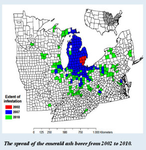
 The authors go to great lengths to cite from the literature the health benefits of a natural environment. The thesis they present is that seeing the death of the Ash trees somehow creates a stress, or a lack of nature in a person’s environment that leads to an increase in the mortality rate. They use data from fifteen states where the Emerald Ash Borer has been seen. I have copied their county level map showing the extent of the infestation on the right. The infestation started in the Detroit area in 2002 and has slowly spread from there.
The model the authors use is a very simple linear regression. They include a number of variables on demographics, length of the infestation, and time series data on the growth and extent of the infestation. They also include data on the amount of tree cover from the Ash trees. Wisely they included a trend variable to account for improvements in hearth outcomes over time. A variable that seems obvious but is not mentioned it overall tree cover. If the argument is that the visual decline in tree cover is a stress then it seems clear that a measure of the magnitude of such a decline is essential to the analysis, but for some reason they choose only to include in the model tree cover from the Ash and not the decline in total tree cover due to the infestation. Their apparent decision not to include total tree cover in the model is puzzling as the authors used the variable to derive the estimates of Ash tree cover in each county.
Another problem that the authors faced was they were trying to identify a small effect relative to the amount of data available. In the regression the coefficient for the Emerald Ash Borer was barely statistically significant while the associated confidence interval was very large. For example in the regression for Heart disease the 90 percent confidence interval extended from -25.38 to -1.64. Keeping in mind that variance estimate are always less reliable than the quantity being estimated an interval of this size is not something I would want to base claims upon. This is the danger of using standard statistical testing and failing to pay proper attention to what the data is capable of showing.
The authors discuss briefly a third regression they ran. For this final regression they used the same models to predict accidental deaths. This model did not result in a statistically significant regression coefficient for the impact of the Emerald Ash Borer. From this the authors drew comfort that their model worked well in that it showed no statistically significant effect for a cause of death that would have no “plausible” link to the Emerald Ash Borer. But in reality this regression provides not information. The fundamental reason is that the Heart Disease it the leading cause of death, respiratory track disease ranks third, while accidental death ranks fourth. With fewer deaths it is less likely that the results of their model would indicate a statistically significant result. This is particularly true given the large confidence intervals they saw in their original models. This is also the wrong approach to the question. The appropriate test is a formal comparison of the models. Test for example the difference between the regression coefficients for the Emerald Ash Borer variable in the three models. Comparing statistical significance to lack of statistical significant is a common but wrong approach. Formal testing is required.
I have to wonder as well why the authors choose to look at accidental deaths for their third model rather than cancer deaths as the number of cancer deaths is much larger than those from accidents being the second leading cause of death in the US.
Also fundamental to this type of analysis is the question as to the appropriateness of a linear model. Why should we assume a linear relationship between the variables in the model. That relationship is assumed. A model is fit. The results are reported. But there is nothing reported on why a linear relationship is appropriate.
The underlying model of what is happening is not well specified. Is the loss of the trees hastening deaths that would have occurred anyway? In that case the effect in the model is temporary as the pool of those that would be impacted is depleted by the earlier than normal deaths. That is not reflected in the model. It is hard to envision other models. I don’t think a claim that the presence of the Emerald Ash Borer causes heart disease is something the authors would want to entertain. And certainly it is doubtful as relevant in the short time frame since the original infestation by the borer.
Posted in Methodolgy Issues