Subscribe to Blog via Email
Good Stats Bad Stats
Search Text
July 2026 S M T W T F S 1 2 3 4 5 6 7 8 9 10 11 12 13 14 15 16 17 18 19 20 21 22 23 24 25 26 27 28 29 30 31 -
Recent Posts
goodstatsbadstats.com
Health care cost variability and mortality
The federal government recentlyreleased some detailed data on the variability of health care costs across the hospitals in the Untied States. Much was made of just how much variability there was even for hospitals in the same geographic area.
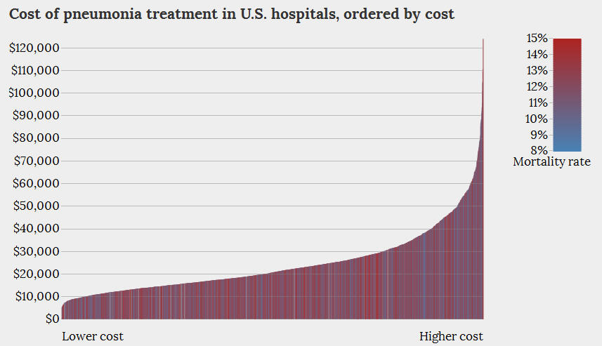 Kitware, Inc. posted an interactive graphic visualization of the data for the treatment of pneumonia and heart failure. An example graphic is posted to the right. The graphic always shows costs for the y-axis. But the x-axis can be sorted by cost, mortality, or reimbursement. In all cases mortality rate are shown by the color code for the vertical bars.
I find the graphics themselves to be less than informative. Part of that is in how the visualization is constructed. But part of it is also the limitations of the data that was released.
Take the graph above. Kitware elected to show the sorted distribution of cost. This in itself is fine. But then they added in the second dimension of mortality. The attempt is to link mortality to costs. But that would be better shown as a simple scatter diagram of costs vs mortality. The problem with that is that it would likely show a big mess with no clear link between the two variables. In this case a nice looking graphic has been substituted for some more serious statistical analysis.
But is this the right data set to show a link between mortality and costs? The problem is that the data that was released only provides average costs for each hospital. What is needed is the additional data on differences between hospitals and between the patients within a hospital that can explain some of the variability in the costs and outcomes. Average costs just do not provide adequate information. A person arriving the hospital in heart failure and dies within a few hours has much different cost outcome than someone who lives for several days before sub-coming to heart failure. Seriously ill patients are transferred between hospitals. Patients without health insurance arrive at the hospital in a very different state of health than those with health insurance. We need to be able to remove the variability due to these and other patient related conditions before we can hope to understand the true differences in costs by hospital.
It is also not clear how costs and mortality should be connected. Higher mortality rates may well imply sicker and therefore more expensive patient care. On the other hand lower mortality rates may imply longer hospital stays and therefore more expensive patient care. Data on those relationships may already be available. They need to be linked into the discussions of costs and cost variability by hospital.
The release of the data set by the government is a good starting point. I see it as the very first baby step. I hope in the future to see much more detailed data.
Posted in Graphics Visualization, Telling the Full Story
I have both your articles in this week.
Are you getting visitors here from down-under at all?
Thanks again for the link. And yes Sydney shows up near the top of the list in Google Analytics when I look at it. Links from your blog show up as well……Larry