Subscribe to Blog via Email
Good Stats Bad Stats
Search Text
July 2026 S M T W T F S 1 2 3 4 5 6 7 8 9 10 11 12 13 14 15 16 17 18 19 20 21 22 23 24 25 26 27 28 29 30 31 -
Recent Posts
goodstatsbadstats.com
Tornado graphics that don’t work
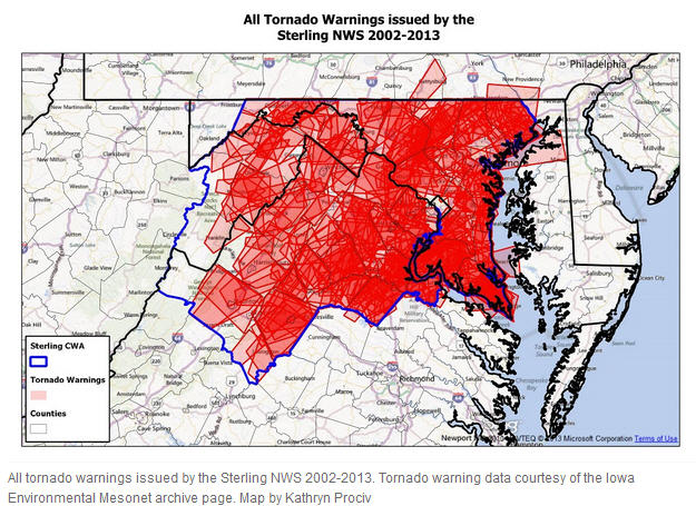 It was inevitable that after the devastating tornado in Moore, OK others would ask what is the tornado risk in my area. The Washington DC area was no exception. The Washington area Capital Weather Gang posted a piece about tornadoes in the Washington forecast area. But the graphics just do not work. The lead visualization is posted to the right. There was attempt to overlay the tornado warnings for the area with deepening color representing more warnings. The problem is that there were so many warnings for the time period that was used that very little is left that shows differences in the number of warnings across the forecast area. The mountains to the west get fewer warnings as do both Washington DC and Baltimore MD. Beyond that there is little that stands out. A few words would have conveyed that informaton. Then the story could have turned to more interesting information.
Two graphics in the piece used three dimensional plots where the third dimension is meaningless. That is a big blunder in graphic visualization as the use of meaningless dimensions distort the true relationships. The author of the piece would do well to read Tufte’s book The Visual Display of Quantitative Information.
The final graphic that the author admits was included in the piece not because it added information but because it look nice. I won’t copy or link the the image here. It’s not worth it.
I look at much of was was done in the piece as interesting for exploratory work. The graphics used would be useful to the analyst in trying to understand the level of tornado risk in the Washington forecast area. But a different set of graphs is needed to convey that information to the readers.
Posted in Uncategorized