Subscribe to Blog via Email
Good Stats Bad Stats
Search Text
April 2025 S M T W T F S 1 2 3 4 5 6 7 8 9 10 11 12 13 14 15 16 17 18 19 20 21 22 23 24 25 26 27 28 29 30 -
Recent Posts
Good Stats Bad Stats
goodstatsbadstats.com
Smoking, Health, and NBC – What did you say?
NBC News on a new study on the health risks of smoking in a report titled “Lifelong smoking reduces life by a decade.” But at many points they failed miserably at providing real data.
At one point they said that smoking triples the chances for a premature death. So if I smoke my risk of premature death goes from some unknown level to a new point at three times that level. Did it go from one chance in a million to three chances in a million or did it go form one chance in ten to three chances in ten? Those are very different outcomes.
They went on to say that having only a few cigarettes a day doubles the chances of dying younger. Again doubles from what level? Give us the data. I’m sure it is in the report.
And finally they went on to say something that likely confused most and provided no real data. The claim was that by stopping smoking by age 40 has the effect of reducing the increased risk of dying by 40 percent. So now I am being told that something that when up by some unspecified amount has now been reduced by 40 percent.
In the end all they really said is that smoking is not good for you. They claimed that they were reprorting on a study that quantified that statement but failed to give any real data.
Posted in Where's the Data?
Romney – manufacturing jobs ad – How not to do bar graphs
The Romney campaign has come out with an add critical of the Obama administration on the status a manufacturing jobs in the United States vs those in China. Whoever put together the graphics for the ad must have spend a great deal of time studying how to lie with graphics for the graphics in the add could hardly be worst and more decisive. The Washington Post has already been critical of the ad and the distortions it includes. Their fact checker has given it two Pinocchios.
The ad morphed from one graphic to a second. I copied the before and after graphics from the commercial. They are shown to the right. 
 The ad first claims a loss of over 500,000 manufacturing jobs in the United States and then claims an increase of 25 percent in the number of such jobs in China. The key fault, from a statistical perspective, is that the scales for the bar charts do not start at zero and are not consistent for the left and right hand bars withing the chart.
The first thing to note is that the first comparisons the verbal part of the add starts with “This is America’s manufacturing when President Obama took office. This is China’s. Deception number one is that the implication of the graph is that at the start of the Obama administration America had twice as many manufacturing jobs as did China. From the table in the Washington Post piece citing United Nations statistics this is blatantly false. At that time the US held 18.5 percent and China held 15.1 percent. Hardly close to a two to one ratio.
As the ad continues saying “we have lost over half a million manufacturing jobs.” In the graphic the size of the bar showing the US jobs drops by about half. That implies that we have lost half of all manufacturing jobs. But that is far from true. The BLS puts us closer to 12 million such jobs at the present time. So the loss is closer to 4 percent. That is barely enough to move the bar in the graphic.
Next the ad claims an over 25 percent increase in manufacturing jobs in China. But the size of the bar showing jobs in China doubles in size. The statement is not even constant with the graphic.
At the end of the graphic bit the number of jobs in China looks to be twice the number in the United States. But again the numbers from the United nations show this is far from the truth.
The American public deserves better respect for their intelligence than this ad comes close to providing.
Posted in Uncategorized
West Nile Virus – How Bad is it?
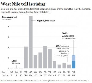
The Washington Post ran a story on September 12th titles “Does the West Nile outbreak signal an epidemic of viral epidemics? Yes and no.” Somewhere in the process of writing there was a disconnect between the written content and the graphic that accompanies the piece.  The graphic is mostly meaningless and uses questionable data. The graphic is displayed at the right.
So what is wrong. The article highlights the”2,636 officially reported cases nationally” by the Centers for Disease Control and Prevention (CDC). While this is an accurate citation of the current numbers the CDC itself in its data release states:
“The high proportion of neuroinvasive disease cases among reported cases of West Nile virus disease reflects surveillance reporting bias. Serious cases are more likely to be reported than mild cases. Also, the surveillance system is not designed to detect asymptomatic infections.”
The Washington Post article cites the CDC, saying:
Lyle Petersen, director of the CDC’s division of vector-borne diseases, said this year’s West Nile season is on pace for a record number of severe infections, such as brain inflammation. These infections are considered the best indicator of the epidemic’s scope because they are most consistently reported to health authorities. Most people who are bitten by infected mosquitoes don’t develop symptoms, and their cases are not reported.
In short the message is don’t use the data on the total number of reported cases to track the disease. But this is exactly what the Washington Post did with the graphic. They might have had second thoughts when they gave a breakdown for the this year in the graphic for the number of total number of case and the more serious case impacting the brain. But this is insufficient as there are no numbers to compare. What is the number of serious cases in previous years? A serious secondary problem with the graph is that prior to 2012 the data is for the entire year, while for 2012 the data shows only the number of cases through September 11th. Thus even the totals for the year cannot be compared as no information is provided on the proportion of cases for the year the occur after September 11th in a typical year.
 The graphic also raises the question what happened in 2003? This is important as the article tries to point to that as the high point of the disease over the last decade. What is the reason for the high number of cases in 2003. The graph as the right shows only the number of serious cases over the same time period. The big increase in the number of case from 2002 to 2003 is gone. This happens because there was a very large number of non-serious case reported in 2003 that is not typical of other years. The graph still raises the question of why there were so many more cases in 2002 and 2003 relative to other years. Also the current year at this point does not really appear to be that much out of line. It actually look like the number of cases has been unusually low for the previous four years and now has returned to more typical levels. What remains to be seen is how many more case will be identified during the remainder of the year.
A few more comments are in order on graphic design issues in the Washington Post article. The title of the graph is very misleading. “The West Nile Toll is Rising.” The graph fails to support the claim. The visual clutter in the graph is extensive. There is no reason to label the high and low points on the graph and provide the exact number of cases in each year. That information does not contribute to the intended message. Since, as I said earlier, the split of the data for 2012 into serious cases and total cases provides no useful information the verbiage surrounding that one data point unnecessarily clutters the graph.
Posted in Graphics Visualization, Methodolgy Issues