Subscribe to Blog via Email
Good Stats Bad Stats
Search Text
March 2026 S M T W T F S 1 2 3 4 5 6 7 8 9 10 11 12 13 14 15 16 17 18 19 20 21 22 23 24 25 26 27 28 29 30 31 -
Recent Posts
goodstatsbadstats.com
Romney – manufacturing jobs ad – How not to do bar graphs
The Romney campaign has come out with an add critical of the Obama administration on the status a manufacturing jobs in the United States vs those in China. Whoever put together the graphics for the ad must have spend a great deal of time studying how to lie with graphics for the graphics in the add could hardly be worst and more decisive. The Washington Post has already been critical of the ad and the distortions it includes. Their fact checker has given it two Pinocchios.
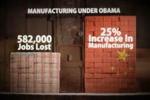
The ad morphed from one graphic to a second. I copied the before and after graphics from the commercial. They are shown to the right. 
 The ad first claims a loss of over 500,000 manufacturing jobs in the United States and then claims an increase of 25 percent in the number of such jobs in China. The key fault, from a statistical perspective, is that the scales for the bar charts do not start at zero and are not consistent for the left and right hand bars withing the chart.
The first thing to note is that the first comparisons the verbal part of the add starts with “This is America’s manufacturing when President Obama took office. This is China’s. Deception number one is that the implication of the graph is that at the start of the Obama administration America had twice as many manufacturing jobs as did China. From the table in the Washington Post piece citing United Nations statistics this is blatantly false. At that time the US held 18.5 percent and China held 15.1 percent. Hardly close to a two to one ratio.
As the ad continues saying “we have lost over half a million manufacturing jobs.” In the graphic the size of the bar showing the US jobs drops by about half. That implies that we have lost half of all manufacturing jobs. But that is far from true. The BLS puts us closer to 12 million such jobs at the present time. So the loss is closer to 4 percent. That is barely enough to move the bar in the graphic.
Next the ad claims an over 25 percent increase in manufacturing jobs in China. But the size of the bar showing jobs in China doubles in size. The statement is not even constant with the graphic.
At the end of the graphic bit the number of jobs in China looks to be twice the number in the United States. But again the numbers from the United nations show this is far from the truth.
The American public deserves better respect for their intelligence than this ad comes close to providing.
Posted in Uncategorized