Subscribe to Blog via Email
Good Stats Bad Stats
Search Text
April 2025 S M T W T F S 1 2 3 4 5 6 7 8 9 10 11 12 13 14 15 16 17 18 19 20 21 22 23 24 25 26 27 28 29 30 -
Recent Posts
Good Stats Bad Stats
goodstatsbadstats.com
Fiscal Cliff – Graphing the Impact of the Compromise
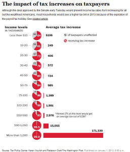
With the compromise the other night on the fiscal cliff negotiations there has been the usual proliferation of graphics in the media trying to convey to the public the impact of the decisions on changes in the structure of the the tax changes. On such article appeared in the Washington Post. The accompanying graphic left much to be desired.  Sometimes people get carried away with cute graphics to tell a story, this graphic looks nice at first glance but fails the reader in several ways.
Come on, Washington Post, you can do better.
Posted in Uncategorized
Immigration Myths and Statistical Literacy
Over at CNN I noticed an opinion piece by Fariborz Ghadar titled “Dispel the immigration myths.” This is an interesting piece in that the approach taken by Ghadar is data driven. Thus one could argue that by addressing the statistical literacy of the reader on the immigration issue he is dispelling some of the myths surrounding the debate in immigration policy. Unfortunately the use of data in the piece badly fails the test of statistical literary. He mixes percentages and level in inappropriate way, used data that is not relevant to the issues at hand, and he makes comparisons that are not valid across countries.
I am not trying here to take a position on immigration or on Ghadar’s options on immigration issues, but rather with the methods he uses to make his points. I will also not exhaustively examine every statement he makes, but rather only deal with some of those he makes early in the piece. The point is if someone is going to make a case for any argument they should use the appropriate data and use is wisely.
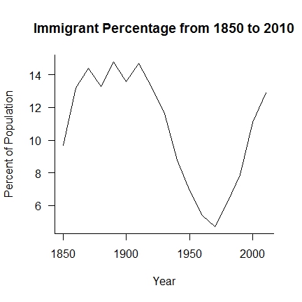
 The first “myth” that Ghadar tries to deal with is that “America continues to be a nation of immigrants.” Referring to this link he points out that we are currently at about 13 percent immigrants in the United States. By that he means that 13% of those currently living in the country as of 2011 were not US citizens at birth. The graphic, as it was posed the day I looked at it had a problem with the labeling of the axis so I have reproduced the relevant part of the graph at the right. the data covers the period 1850 to 2010. The more recent 2011 numbers puts the percent immigrant population at 13.0 percent. All of the data are based on US Census Bureau published figures.
Ghadar’s statement is “While America at one point had a huge influx of immigrants, today the picture is quite different.” But using his numbers is it really all that different? From 1880 to 1920 the percentage was higher, but it peaked at 14.8 percent. If we were a nation of immigrants at the 14.8 percent level is 13.0 percent all that different. At those levels about one in six or seven people you meet would on average be an immigrant. That is not to say that being a nation of immigrants is a bad thing. It is just that the current situation is not that different than that of the the early 20th century. The more relevant questions would be to ask if 13 percent of the population being immigrants a problem?
The second “myth” Ghadar address it “that everyone who is thinking of emigrating wants to come to the U.S” Given the migration of populations around the globe it is hard for me to believe that anyone thinks they all want to come to the United States. So I do not see this as a “myth” that needs to be dealt with.
What does Ghadar say? He points out “As a percentage of population, Canada and Australia both have significantly higher rates of foreign-born residents than the U.S., at approximately 20% and 26% respectively.” He goes on to say that the rate (13.0) “is now on par with those of France and Germany.”
A problem here is that Ghadar is mixing percentages and numbers. It is not a question of who has the larger percentage immigrant population but rather of what proportion of the immigrants are going to each country. So how do the countries compare. The United States with a 2011 population of 311.8 million would have approximately 40.5 million immigrants. Canada with a 2011 population of 33.5 million would have approximately 6.7 million immigrants, and Australia with a 2011 population of 21.8 million would have an immigrant population of 5.7 million. Thus in terms of the number of immigrants the United States far surpasses both Canada and Australia. Ghadar made the error of looking only at the percentages and not at the number of immigrants as he should have.
But there is a second more fundamental problem with Ghadar’s approach. The current level of immigrant population is not a measure of current preferences for countries by the current immigrant population. Those are the people Ghadar is talking about. The percent immigrant population is a measure of immigration over the life time of the current residents of a county. That includes those who move to the county decades ago. He needs to find a very different data set to make his case on this “myth.” The relevant data would be on immigration in the last ten year.
Enough said on the specifics of the opinion piece. If one is to make a case for a specific position then they need to use the right data and use it correctly. This is the essence of statistical literacy. Unfortunately that was not done in this piece.
Posted in Statistical Literacy
Global Warming and a Random Walk Model
Matt Asher at his Probability and Statistics Blog posted a piece titled “The surprisingly weak case for global warming.”
Given all of the research and data available it is hard to conceive of someone making such a claim. Last I heard even some of the opponents argument has gone from the denial of the reality of global warming to arguing about the reality of human caused global warming. Matt uses one set of data covering the period from 1881 to 2001 provided online by NASA. This pales in comparison to the amount of data covering 2000 years from multiple sources that the serious climate researchers are utilizing.
The model proposed for analysis in the posting describes the Earth’s climate as a very simple random walk. This claims that next year’s temperature is this year’s temperature plus a change term which is a random variable. That means that if this year’s temperature was usually high then next year’s temperature should also be expected to be high and the temperature is just as likely to increase next year as it is to decrease next year.
Nowhere in the posting or the analysis is there any consideration at to the appropriateness of the random walk model to the physical factors that influence the climate of the Earth. Models are useful but they must be grounded in the real world with some basis of justification. The basic question “is this an appropriate model” was not asked.
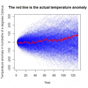
What did the modeling show?  The plot similar to the the one in the original post is shown on the right. The solid red line depicts the temperature trend over the last 131 years. The trend line is apparent and is not something that is seriously questioned in the literature. Fitting a very simple linear regression to the data will yield significant results. The light blue lines depict 1000 simulation under the random walk model which assume the same year to year variability that is in the original data. Noting the wide range of results in the simulations the author claims that it is clear that the actual trend line is well within what could be expected under normal temperature variation under the random walk model.
It is at this point that the author notices the first piece of information that indicates problems with his model. He next examines the data and observes a negative year to year correlation in the changes in temperature. Explaining this he says:
what does a negative correlation mean in this context? It tells us that if the earth’s temperature rises by more than average in one year, it’s likely to fall (or rise less than average) the following year, and vice verse. The bigger the jump one way, the larger the jump the other way next year (note this is not a case of regression to the mean; these are changes in temperature, not absolute temperatures). If anything, this is evidence that the earth has some kind of built in balancing mechanism for global temperature changes,
He had the opportunity at this point to question the appropriateness of his model. The data is telling him that there is a problem but he is not seeing it. Instead he goes on to refine his modelling of the random walk to incorporate the negative correlations. He much too easily dismissive the idea that regression to the mean is a real phenomenon because he is dealing with change estimates rather than with the actual data. In fact his statement “this is evidence that the earth has some kind of built in balancing mechanism for global temperature changes” is recognition that regression to the mean is likely present.
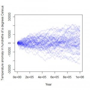
 On of the problems in using a random walk to model temperature trends on the the Earth is they have the unfortunate property of tending to wander off to the extremes. The author had modeled the temperature over a 131 year period. By extending the modeling period to a much longer time line the problems with the model assumptions become readily apparent. The plot at the right does just that. It shows the results using the same model data and the same code that the author used to generate his models with the time frame extended back one million years. At the extreme some of the simulations show changes of 200 degrees Celsius over that time period. With an increase of only about 80 degrees Celsius the oceans would boil off. A drop of similar magnitude would result in a snowball Earth. The models of the temperature history of the Earth over the last million years are more on the order of 10 degrees Celsius. This clearly shows that the random walk model as implemented by the author show more variably in the Earth’s climate over time than can be matched to the historical record. A plot of the estimate temperature deviations over the long term can be seen here, here, and here.
Posted in Methodolgy Issues