With the compromise the other night on the fiscal cliff negotiations there has been the usual proliferation of graphics in the media trying to convey to the public the impact of the decisions on changes in the structure of the the tax changes. On such article appeared in the Washington Post. The accompanying graphic left much to be desired. 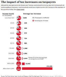 Sometimes people get carried away with cute graphics to tell a story, this graphic looks nice at first glance but fails the reader in several ways.
There is so much visual clutter that it is very hard to know where to start reading the graph.
Notice that counts of the number of “taxpayers unaffected.” What does this mean? It is very difficult for a change to the tax code to not have an impact on someone with income. So does “unaffected” really mean no increase in taxes? This is further confused by the note on the $200,000 to $500,000 income level giving an amount of an average reduction of taxes for two percent of the group. Why is this number given only for this group?
The terms “taxpayers” and “households” are intermixed. Do the terms refer to just “households” or do they refer to “taxpayers.” Not all taxpayers are in households.
Pie charts are usually best avoided. But putting together a stack of pie charts to show the changes does not work. It is very difficult to compare one pie chart to another. Having the numbers printed on the graph helps but also introduces visual clutter. This feature would work much better as a very simple bar chart or as a table. Either of those would show the clear downward trend in the percent of “taxpayers” with increased taxes as income levels increase. That trend is hidden when the pie charts are used.
Next to the stacked pie charts is the horizontal bar chart showing the average tax increase by income level. Clearly the number is largest for those making over a million dollars. But the comparisons to this group are largely meaningless. No one looking at the graphic knows what the average or median income levels are for this group. Is it five million, is it ten million, is the average increase being driven by those at the extreme high end of the distribution. A better graphic would show the average percent increase in taxes for each group.
I have one last minor point. The data source is given at the “Tax Policy Center.” In this internet age it would be very helpful to provide a direct link in the online version of this article to the actual table or data set that was used for the graphic.
Come on, Washington Post, you can do better.