Subscribe to Blog via Email
Good Stats Bad Stats
Search Text
April 2025 S M T W T F S 1 2 3 4 5 6 7 8 9 10 11 12 13 14 15 16 17 18 19 20 21 22 23 24 25 26 27 28 29 30 -
Recent Posts
Good Stats Bad Stats
goodstatsbadstats.com
Do AP Exams Measure School Performance?
The Prince George’s County Maryland county executive, in his frustration over the performance of the school system has proposed to shift many of the responsibility for the school system from the elected school board to the county government. In the mist of the discussions the education reporter for the Washington post has put forth a piece arguing that the success in the Prince George’s school system on advance placement test not be lost in the discussions. He characterizes the AP testing as the “overlooked successes.”
The piece is very short on data demonstrating the successes that the reporter claims exist. He provides numbers for only two high schools in the county. For one he says:
Oxon Hill High School, 45 percent low income, jumped from 490 to 754 AP tests in that same period, and raised its passing rate from 15 to 17 percent.
The time period refers to is never adequately given in the writeup. I was surprised that anyone would be bragging about improving a passing rate form 15 to 17 percent!
Jay Mathews, the author of the piece likes to make the case that exposure to AP level coursework is significant even if the students to not pass the AP tests. He claim there has been a significant increase in the number of students taking the tests and in the number passing the tests in the county.
What do the numbers show? In the end it is clear that this is a case of using the wrong data to make conclusions while ignoring the better data that is readily available.
Let’s start with the number of test takers. Data available from the College Board web site show that nationwide the number of test takers has increased by 102 percent. In Maryland the number has increased by 122 percent. Numbers available from the Prince George’s school system show an increase of 167 percent. Thus it looks like the Prince George’s school system is improving relative to the state and the country. I have not found the key number which is what proportion of the graduating class in Prince George’s county are taking the AP tests.
Performance can not be measured just in terms of the numbers of test takers. If taking more test is an indicator of improvement then the pass rate for the tests needs to reflect that improvement. SAT scores should be increasing. If the improvements are not measurable then they likely did not happen. The county executives frustration is that performance is not where it should be by his measures. Looking at the AP pass rates I have to agree with him. In 2012 results passing grades of three or better was achieved in 2,437 tests out of the 8,951 test taken in the county for a pass rate of 27.2 percent. The comparable figures for the state was 61.3 percent and for public schools nationwide the number was 57.2 percent. The county lags far behind both. Is the situation improving as claimed by Jay Mathews? The comparable numbers for 2007 were 34.7 percent for the county, 62.2 percent for the state and 57.2 percent for the nation. The answer is a resounding no! Even more disconcerting are the scores on the individual AP tests. In the Calculus AB test 85 percent of the scores were a one. This compares to 24.9% at the national level. In fact at the national level 30.6% receive a score of five. In a field near and dear to my heart 70 percent of the scores on the statistics test were a one. The comparable number for the nation was 12.2%. (As a note the nation numbers and some of the state numbers are posted by the College Board at their website. The Prince George’s school system emailed me copes of their 2007 and 2012 reports. These reports show more detail on the scores among the test takers. They are apparently not available online.)
Perhaps AP test scores are not the best measure of improvement. The county also tabulates SAT scores as well in their annual report. The mean critical reading score declined from 446 in 2002 to 433 in 2012. The mean mathematics score has declined from 441 to 422 in the same time period. Certainly if Jay Mathews is correct and students are benefiting from exposure to the AP classes then the results should be showing up in the SAT scores. That is apparently not happening.
The current system has clearly not brought improvements. The proposed changes may not work either. But clearly changes to the system are justified.
Posted in Telling the Full Story, The Media, Where's the Data?
Did I get the data I asked for?
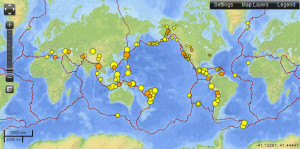
 The U.S. Geological Survey (USGS) provides a web site where it is possible to view a map and download the data for recent earthquakes worldwide. The map at the right is a copy of the map as it appeared on Sunday March 31, 2013. While this is good and useful data it aptly illustrated the need to be careful with all data and cross examine it to be sure you are getting what you think is being provided.
The page clearly indicates that it shows “Earthquakes – 7 days, M2.5+” In fact this labeling appears on the page three times. They provide options to filter the data and exclude some of the earthquakes from the map. The data feed provides for downloading all of the earthquakes for the last 30 days. So what could be the problem?
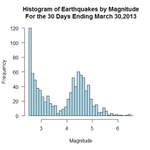
 The problem is that what earthquakes provided in graphic and in the data files are clearly stated. You are exactly the data claimed on the page. But that is not likely to be what you think you are getting. The histogram on the right shows the distribution of earthquakes by the magnitude of the quake. Is it really possible that there are a plethora of very small quakes, then with increasing magnitude the number of quakes decrease only to rise for a second peak around magnitude 4.5? What is going on?
The answer is provided in a link tucked away near the bottom of the page an not likely to be notice: Which earthquakes are included on the map and list? Going to the link one finds the within the United States just about all earthquakes down to magnitude 2.5 make the list. However outside of the United State quakes up to about magnitude 5.0 frequently do not make the list. The file does not give all the earthquakes over magnitude 2.5 as one might expect. It just provides data for the earthquakes that make it to the USGS system.
The consequence is that the map in its default configuration gives a distorted view to the user of the distribution of earthquake worldwide by showing a disproportionate number of quakes in the Untied States relative to the rest of the world. The USGS in an effort to provide as much data as possible has tried to serve the needs of both the US users and the worldwide users. They have tried to serve two masters and as a result have failed to adequately serve either. The professional geologists likely understand the limitations of the files and the map, however the casual user will not know the limitations of the data and the descriptions of those limitations are too well hidden for many to ever find.
I like the site. I like the data availability. I like that that the data can be downloaded in a variety of formats. I like that the that the data is available with a very small lag between when an earthquake happens and when it shows up on the web site. Minor changes would solve the problems. The default graphic likely should show only earthquakes over magnitude 5.0 and the metadata on the page itself should describe the limitations on what earthquakes are reported with a specific note that those on the lower end of the scale are not generally available outside of the Untied States. This information should not be buried on another page that most users are unlikely to ever see.
Posted in Data Quality, Graphics Visualization
A less than informative graphic
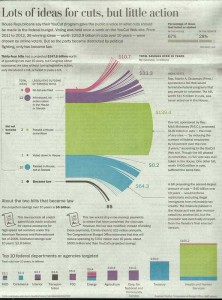
Another example of graphics gone wild. This one appeared in the print edition of the Washington Post. I linked to the online edition of the story, but someone must have realized the full graphic just did not work as it does not appear (or at least I have not found it) in the online version of the story: The (86,000) budget-cutting ideas that got away. The Washington Post only provided parts of the image in the online story. So I scanned the full grahic and posted it to right.
The piece is about budget cut suggestions coming from two sources. First the Obama administration asked for suggestions from federal employees. Then the Republicans put fourth each week suggestions and asked the people of the county to vote on their suggested cuts. It is rather obvious that the Republican suggestions are likely to have a partisan flavor to them and thus many are not likely to be become law. While that most of the proposals from both camps never become law was the point of the story here I have to question the graphic that the Washington Post choose to illustrate the various cuts.
They mixed into the graphic dot charts, bar charts, and whatever one would call the chart in the center of the graphic. It is itself a mixture of a bar chart, a pie chart, and some kind of line chart. The lines at the end server no purpose. I suppose they were supposed to represent individual proposals. But they sure do not represent 86,000 plus proposals. Mostly they are just fluff. A few line got special mention and a brief description of the proposed cut. To see the problems in just this part of the graphic convince me that the area in green that dominates the center of the chart at $139.4 billion is just over twice the size of the blue area below it that represents $64.3 billion. The chart violates two important rules of graphic design: don’t waste ink on what is not important to the story you are trying to communicate and secondly keep areas in proportion to the numbers they represent.
The line of bar charts at the bottom of the page present an additional set of problems. the color coding does fortunately carry over from the central chart to this row of charts. However the fit does not match. The $139.5 Billion cut that in central chart applies across the board to federal employees now only applies to Health and Human Services. Something unexplained has happened. Then try to compare the size of the blue boxes for Treasury and Health and Human Services. The online edition of this portion of the chart allow a mouse hover to see the numbers. That that technique should not be necessary to visualize the proportions.
Posted in Graphics Visualization, The Media
