Subscribe to Blog via Email
Good Stats Bad Stats
Search Text
April 2025 S M T W T F S 1 2 3 4 5 6 7 8 9 10 11 12 13 14 15 16 17 18 19 20 21 22 23 24 25 26 27 28 29 30 -
Recent Posts
Good Stats Bad Stats
goodstatsbadstats.com
The link between life expectancy and wealth
Last week the Washington Post published a piece “Long life, wealth go together, study says” The Post has an annoying habit by the way of changing the title of an article between the print and online editions of the paper. The online title is “Research ties economic inequality to gap in life expectancy”
But what is the data? They referenced a study at the University of Washington and provide a link to the Institute for Health Metrics and Evaluation (IHME). However the only recent paper at that site is “New data show countries around the world grappling with changing health challenges” which refers to issues of global health. It links wealth and life expectancy at the global level.
The entire Washington Post article relies on the comparison between Putnam and St Johns counties in Florida. There is not doubt that life expectancy and income are higher in St Johns county than they are in Putnam county. But correlation does to prove causation and this is where the post article comes up short. This is especially true when only two cherry picked counties are used to make the point. Much more analysis is need beyond that described in the article.
The agenda behind the discussion appears to be the issue of raising the retirement age for Social Security and Medicare eligibility. This comes out in the citation from Dr. Rockeymoore of Global Policy Solutions who is quoted as saying:
“People who are shorter-lived tend to make less, which means that if you raise the retirement age, low-income populations would be subsidizing the lives of higher-income people,”
The article goes on to cite Monique Morrissey at the Economic Policy Institute who says:
“For many people, raising the retirement age would amount to a significant benefit cut.”
The argument being made is that the poor do not live as long as the wealthy therefore their contributions into the Social Security system subsidize the benefits of the wealthy. The follow-up logic is that this problem will be exacerbated if the retirement age is raised above the current levels. So first they are implying that wealth leads to a longer life. Then they follow up with this then shortchanges the poor in that they collect less from the system and subsidize the wealthy. These are strong claims.
The weakness in the logic of this argument is in the question: Is it wealth that determines life expectancy or is it lifestyle choices? The data cited in the Washington Post article lends credence to the lifestyle choices as a culprit when it points out that in Putnam county 27 percent are smokers and 35 percent are obese, while in St Johns the comparable percentages are 15 percent and 22 percent. What we have is a claimed correlation between life expectancy, wealth, and lifestyle. The article and the references it cite do not address the much more complex problem of the relationship between these variable.
All to easy is it to see a correlation between income and life expectancy and conclude that there is a causal effect. It is much more difficult to prove such a relationship. I won’t say the conclusions are wrong, only that the case remains to be made.
As a reality check I offer two web sites with maps of life expectancy by county. The actual data can be downloaded here. A very interesting exercise would be to download income data from American Factfinder (US Census Bureau) and look at the relationship. Just from the maps alone if income determines life expectancy the Midwest must be the richest part of the country. There are an awful lot of counties there on the higher end of the life expectancy scale. This in turn casts doubt on the claimed correlation between life expectancy and wealth – at least within the United States.
Posted in Telling the Full Story, The Media
Pie Chart + Stacked Bar Chart = Confusion
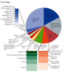
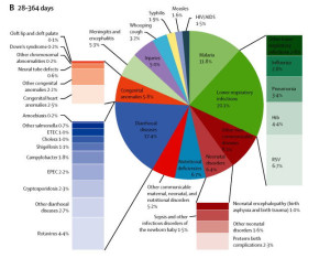
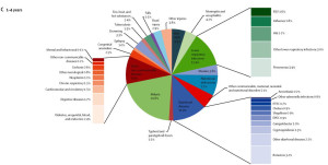
 The three charts to the right showed up in the paper “Global and regional mortality from 235 causes of death for 20 age groups in 1990 and 2010: a systematic analysis for the Global Burden of Disease Study 2010.” They were part of one figure in the paper( figure 2). It is well worth viewing the original figure. You will need to register (free) to view the entire paper.
I generally do not care for pie charts so lets start with the problem with those. We are given three pie charts showing causes of mortality in infants and young children. It is quite natural to try to compare across the three age groups. Comparing the size of the slice of pie within one chart is hard enough, but here we must compare across three separate pies. But then the authors made that effort even more difficult by the haphazard placement of the slices of the pie. Take the second and third parts of the figure, for ages 24 days to one year vs the 1 to 4 year old group. In the first “malaria” and “lower respiratory infections are placed next to each other. In the second part the slices are situation across from each other in the pie. In fact there is no consistent placement of the various causes of death across the three charts. Please make it easy for me to make comparisons.
 Then because some of the slices of the pie are rather small the authors decided on at series of stacked bar charts to show causes of death within the slices of the pie. A basis rule of graphics is that area should be used constantly throughout the chart. This principle has been completely abandoned. The area within a stacked bar bears no resemblance to the area within the pie chart. Worst the various stacked bar charts cannot be reliably compared to each other. Try comparing retrovirus(0.7%) to Neural tube defects(1.5%) in the chart for the youngest infants? Does the second really look to be twice the size of the first?
Then try to compare the stacked bar charts across the three parts of the figure. Looking at the charts for “lower respiratory infections for the young infants vs the 1 to 4 year old group is instructive. Is the size of the bar for “RSV” for proportionate larger for the infants than for the 1 to 4 year old group given the percentages (2.3% vs 1.6%). And again just like with the pie charts the authors did not maintain any consistency in the ordering of the causes of death between the various bar charts across the three parts of the figure. Consistency in design is important if the reader is expected to easily grasp the visualization.
 The authors did do the reader the favor of displaying the percentages for each of the causes of death. But this adds considerably to the visual clutter. I am forced to ask would not a simple table have been much more effective in displacing the data in a way that can be easily understood? Had they done that it would be much easier to see things like the difference in percentage of deaths due to “lower respiratory infections” across the three groups (6.8%, 20.1% and 12.4%).
Posted in Graphics Visualization
Even with penalties many workers may forgo [health] insurance
Such is the title of an article in the Washington Post on a study by the ADP Research Institute. The study and the claims raise several questions.
The Data.
The ADP report is based on data from the large corporations that they work with. This means that a significant segment of the population that works for the smaller businesses are excluded from the study. They say “this information includes exact employee base salary, eligibility, benefits elections and total premiums paid.” The income data in the report come from employee W-2 forms. Much of the analysis focuses on single individuals and households. Nothing is said in the report on how ADP determined marital status and household size. This is important as the W-2 information may not be a good source for that information. For most of my working career my W-2 did not accurately reflect my household situation. As ADP also had access to health benefit information they may have gotten some of the marital status data there. That would not give them information for those how have forgone health insurance coverage. Thus there are several sever limitations to what can be said from the data.Any discussion of these limitations is noticeably missing from the report.
Focusing on the Singles Population
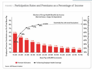
 The presentation uses mostly data for and makes conclusions for the single people in the database. Single is as measured by ADP. They do not make a sufficient effort to make it clear throughout most of the study that they have restricted the analysis to this group. The Washington Post article for instance never states that the numbers they cite from the report are for singles rather than for the entire population. The first hint in the report they are talking only about singles is buried in a footnote on page 9 of the 24 page report. On page 11 they provide the graphic on the right and finally mention that the data is dealing with single people with no dependents.
ADP choose to focus on singles because they does not have family income data. Their data is the income is for individual employees. They say “For purposes of this study, unmarried, nonunion, full-time employees were chosen specifically because their reported base pay may be a reasonably accurate proxy for total household income.”
Unfortunately this assumes that the unmarried employee for whom ADP has records is the only person in the household with significant income. Census Bureau numbers can be informative here. In 2007 there were about 19 million nonmarried family households headed by a man or woman. But there were also 37 million nonfamily households. The Census Bureau defines these households as consisting of a householder living alone (a one-person household) or where the householder shares the home exclusively with people to whom he/she is not related.. They are not all single person households. More importantly there is no justification for the assumptions that one person in the household accounts for all or most of the income. That is true only in the single person household. But the Census Bureau numbers tell us that about 7 million of these households there are about 15 million people. For these 15 million people it would be very problematic to assume as does ADP does that the earnings of just one person in the household is a good proxy for total household income. That may have been true 50 years ago. But apparently ADP has never heard of the term “living together.” Given the group of people that ADP has chosen to focus on headlines like “many workers………” are clearly overstatements of what the data shows.
The Married Population
ADP does at one point turn to the married families. Admitting that they do not have spousal income they make assumptions in their analysis about household and spousal income in order to reach some of their conclusions.
They start off saying “Assuming each dual-income household earns, on average, twice as much as a single household.” Based on that assumption they go on to say “Results show that 16.0% of married individuals paid more than 9.5% of base pay to obtain health coverage…” The correct statement is that 16.0% of married individuals in our database who pay for health insurance….. That have made an unstated assumption. The question must be asked who in a married couple family buys the health insurance? If income level is a confounding variable then their conclusion is wrong. If on average the higher income earner buys the health insurance then they have understated the 16.0% figure. This is an assumption that should not be made without looking at data.
The Graphic.
Finally a few comments are needed on the graphic above. This one does not rank amount quality data visualizations. The authors have mixed a bar chart and a line chart into one graphic. Both sets of data are of the same type. They should be displayed consistently. Visualization got in the way of communication. The red bars look good, but showing the percent electing health insurance coverage became problematic so the authors elected to use a line chart. And why does the line chart trail off with the notation “Essentially flat, with small fluctuations.” Please, plot the data instead of clustering up the chart with words when the data would tell me the same thing. The message is the relationship between the two series. A simple x-y chart of one series against the other would make the point they are talking about obvious.
Posted in Graphics Visualization, Methodolgy Issues