Subscribe to Blog via Email
Good Stats Bad Stats
Search Text
July 2026 S M T W T F S 1 2 3 4 5 6 7 8 9 10 11 12 13 14 15 16 17 18 19 20 21 22 23 24 25 26 27 28 29 30 31 -
Recent Posts
goodstatsbadstats.com
A less than informative graphic
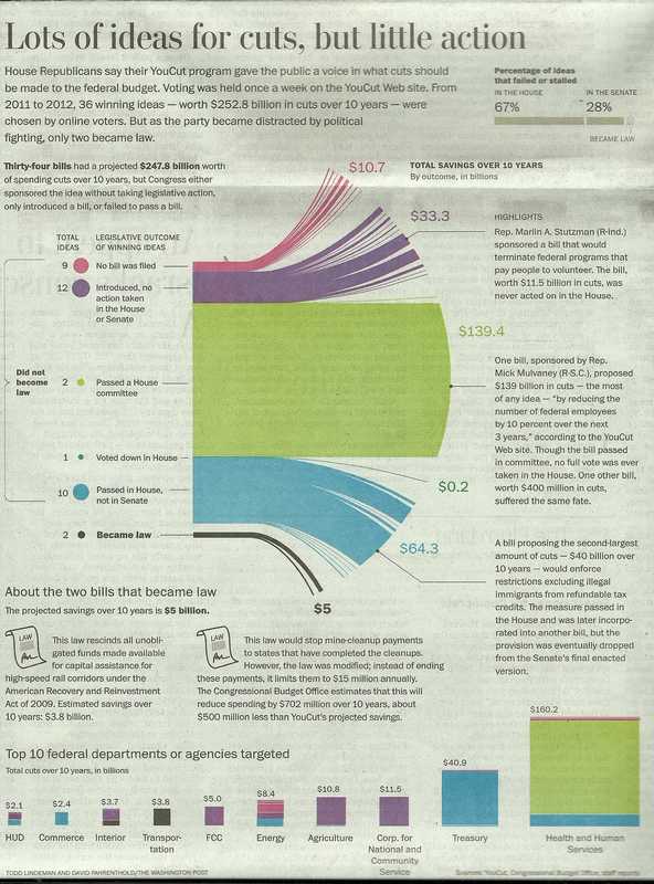
Proposed Budget Cuts
The piece is about budget cut suggestions coming from two sources. First the Obama administration asked for suggestions from federal employees. Then the Republicans put fourth each week suggestions and asked the people of the county to vote on their suggested cuts. It is rather obvious that the Republican suggestions are likely to have a partisan flavor to them and thus many are not likely to be become law. While that most of the proposals from both camps never become law was the point of the story here I have to question the graphic that the Washington Post choose to illustrate the various cuts.
They mixed into the graphic dot charts, bar charts, and whatever one would call the chart in the center of the graphic. It is itself a mixture of a bar chart, a pie chart, and some kind of line chart. The lines at the end server no purpose. I suppose they were supposed to represent individual proposals. But they sure do not represent 86,000 plus proposals. Mostly they are just fluff. A few line got special mention and a brief description of the proposed cut. To see the problems in just this part of the graphic convince me that the area in green that dominates the center of the chart at $139.4 billion is just over twice the size of the blue area below it that represents $64.3 billion. The chart violates two important rules of graphic design: don’t waste ink on what is not important to the story you are trying to communicate and secondly keep areas in proportion to the numbers they represent.
The line of bar charts at the bottom of the page present an additional set of problems. the color coding does fortunately carry over from the central chart to this row of charts. However the fit does not match. The $139.5 Billion cut that in central chart applies across the board to federal employees now only applies to Health and Human Services. Something unexplained has happened. Then try to compare the size of the blue boxes for Treasury and Health and Human Services. The online edition of this portion of the chart allow a mouse hover to see the numbers. That that technique should not be necessary to visualize the proportions.
Posted in Graphics Visualization, The Media