Subscribe to Blog via Email
Good Stats Bad Stats
Search Text
July 2026 S M T W T F S 1 2 3 4 5 6 7 8 9 10 11 12 13 14 15 16 17 18 19 20 21 22 23 24 25 26 27 28 29 30 31 -
Recent Posts
goodstatsbadstats.com
Did I get the data I asked for?
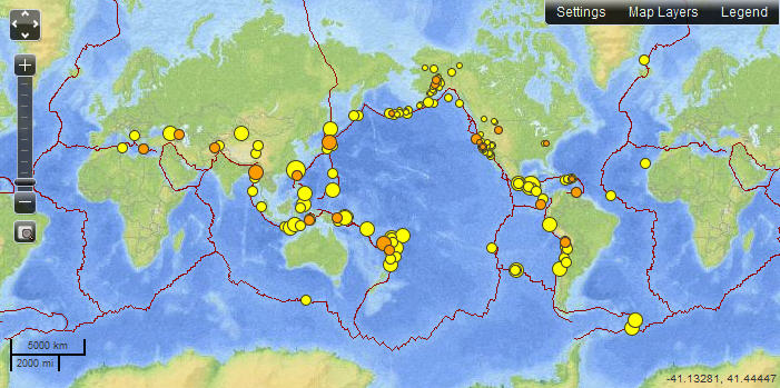 The U.S. Geological Survey (USGS) provides a web site where it is possible to view a map and download the data for recent earthquakes worldwide. The map at the right is a copy of the map as it appeared on Sunday March 31, 2013. While this is good and useful data it aptly illustrated the need to be careful with all data and cross examine it to be sure you are getting what you think is being provided.
The page clearly indicates that it shows “Earthquakes – 7 days, M2.5+” In fact this labeling appears on the page three times. They provide options to filter the data and exclude some of the earthquakes from the map. The data feed provides for downloading all of the earthquakes for the last 30 days. So what could be the problem?
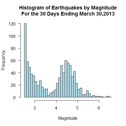 The problem is that what earthquakes provided in graphic and in the data files are clearly stated. You are exactly the data claimed on the page. But that is not likely to be what you think you are getting. The histogram on the right shows the distribution of earthquakes by the magnitude of the quake. Is it really possible that there are a plethora of very small quakes, then with increasing magnitude the number of quakes decrease only to rise for a second peak around magnitude 4.5? What is going on?
The answer is provided in a link tucked away near the bottom of the page an not likely to be notice: Which earthquakes are included on the map and list? Going to the link one finds the within the United States just about all earthquakes down to magnitude 2.5 make the list. However outside of the United State quakes up to about magnitude 5.0 frequently do not make the list. The file does not give all the earthquakes over magnitude 2.5 as one might expect. It just provides data for the earthquakes that make it to the USGS system.
The consequence is that the map in its default configuration gives a distorted view to the user of the distribution of earthquake worldwide by showing a disproportionate number of quakes in the Untied States relative to the rest of the world. The USGS in an effort to provide as much data as possible has tried to serve the needs of both the US users and the worldwide users. They have tried to serve two masters and as a result have failed to adequately serve either. The professional geologists likely understand the limitations of the files and the map, however the casual user will not know the limitations of the data and the descriptions of those limitations are too well hidden for many to ever find.
I like the site. I like the data availability. I like that that the data can be downloaded in a variety of formats. I like that the that the data is available with a very small lag between when an earthquake happens and when it shows up on the web site. Minor changes would solve the problems. The default graphic likely should show only earthquakes over magnitude 5.0 and the metadata on the page itself should describe the limitations on what earthquakes are reported with a specific note that those on the lower end of the scale are not generally available outside of the Untied States. This information should not be buried on another page that most users are unlikely to ever see.
Posted in Data Quality, Graphics Visualization
You have made it.
Great blog..
I hope more people come by from my efforts!
congratulations
Thank you…..