Subscribe to Blog via Email
Good Stats Bad Stats
Search Text
June 2025 S M T W T F S 1 2 3 4 5 6 7 8 9 10 11 12 13 14 15 16 17 18 19 20 21 22 23 24 25 26 27 28 29 30 -
Recent Posts
goodstatsbadstats.com
Home Price Confusion and a Bar Chart Inside Bar Chart
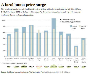
 In as piece on the price of homes in the Washington DC area the Washington Post published the graph at the right. Call this a bar chart within a bar chart with a series of “half bubble charts” at the bottom. For the embedded bar charts we are to ignore the area and focus only on the height of the bars. However, to the eye the March 2012 numbers look much smaller than they really are. But just so we don’t get confused they provide us with the numerical percentage change at the bottom of the chart. They add clutter with small half moon bubbles showing the percentage change as well. But then there is a problem. One of the percentages is negative. Their solution is to use a yellow bubble that is barely visible and reverse the orientation of the “half moon.” There are many better ways to present the data with a great deal more clarity.
In a related piece the same day the published a article titled “Americans spending larger share of annual income on homes.” But whoever wrote the headline did not read the first paragraph of the article:
As mortgage rates hover near historic lows, Americans are saving big on monthly mortgage payments. In the fourth quarter of 2012 alone, homeowners spent almost 37 percent less on the payments than they did in the years before the housing bubble, according to real estate tracking firm Zillow.
Let’s see now I’m spending more by spending 37 percent less? That must be some of that new math.
The article itself seems to get the story straight. People are spending their money now on higher priced homes instead of spending on higher interest rates. What I don’t like is the metric they use to compare cites over time. They use the ratio of the median price of a house to the median income for the metric. In the context of the story about where people are putting their money the key number should be the proportion of income that the current buyer is putting towards their house payments. Then questions can be asked as to how that varies by geography and over time.
The full table comparing the various cites can be seen here. Another of my questions is the currency of the income data in the table. It the ratios provided for 2012 Q4 are not based on current data for income, but do use current data for housing prices then likely those ratios are biased upward. The older the income data the larger the bias will be. Quality income data for a single quarter of the year by city is generally not available only four months after the end of the quarter. Unfortunately the piece does not provide adequate information on what data was used to compute the ratios.
Posted in Graphics Visualization, The Media, Where's the Data?