Subscribe to Blog via Email
Good Stats Bad Stats
Search Text
July 2026 S M T W T F S 1 2 3 4 5 6 7 8 9 10 11 12 13 14 15 16 17 18 19 20 21 22 23 24 25 26 27 28 29 30 31 -
Recent Posts
goodstatsbadstats.com
Visual clutter – affirmative action poll results
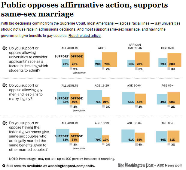
This has to be one of the more cluttered graphic that I have seen in some time. It was published in the Washington Post on June 12 in a piece titled: “Wide majority opposes race-based college admissions programs, Post-ABC poll finds.” The full accompanying graphic can be seen here.
 One of the core principle of graphic visualization is to reduce clutter and maximize white space while making the point of the graphic clear.
Start with the decision to use boxes to show the percentages. Three boxes not even laid out side by side make it very difficult for the reader to envision the relative size of the boxes. The designer must have realized this as they then cluttered the graphic by inserting the percentage into or next to every single box. If you are going to do that you may as well just give me a table of numbers.
Now look at the second poll question in the graphic: “Do you support or oppose letting gay men and lesbians to marry legally?” There are really only four key numbers in the graphic. It would be easy to state in the text of the article that 47 percent support and 40 percent oppose with 3 percent expressing no option. The rest of the graphic then shows only that support decreases with the increasing age of the respondent. A very simple bar chart with the 76, 55, 40 percent numbers would do the job and be very clear on the effects. This puts the percentages by age next to each other where the reader can easily visualize the differences in the percentage by age. That visualization is hindered when both the support and opposition numbers are shown in the graphic.
There is no reason to show both the support and the opposition numbers as with a no opinion rate of 2-3 percent across all age groups the trend line remains the same regardless of which numbers you choose to show – support or opposition. If they want to say younger people are more supportive show the the support numbers. If they want to say older people are in opposition show the percentage opposed.
The same principles apply to the other two lines in the graphic.
Posted in Graphics Visualization
got you in a few times.
please keep it up!