Subscribe to Blog via Email
Good Stats Bad Stats
Search Text
May 2025 S M T W T F S 1 2 3 4 5 6 7 8 9 10 11 12 13 14 15 16 17 18 19 20 21 22 23 24 25 26 27 28 29 30 31 -
Recent Posts
Good Stats Bad Stats
goodstatsbadstats.com
Increase the Probability of a 100 Flood – It Can’t be Done!
Global warming is a real issue. The rise of sea level as a consequence of global warming is a natural consequence. I am not going to debate the reality of climate change or the reasons for climate change. Here I need to talk about how in describing a real consequence those who believe in global warming sometimes get the statistics wrong. No matter which side of the issue someone is on, it is always best to get the facts right or else they diminish credibility.
Such was the case this morning when I spotted an article in the Washington Post titled: “Risk of sea-level rise outlined.” Take this one quote from the piece:
Along the shores of Virginia, sea level rise multiplies the risk of a 100-year flood by 2030 by more than a factor of three, from 9 percent to 29 percent.
Now wait a minute a one year flood risk is a statistical statement of the expected frequency of floods within the 100-year flood plain. So I went to the source document at climatecentral.org. Their report, titled “Surging Seas”, outlines the consequence of rises in sea level resulting from global warming. The fact sheet for the state of Virginia states:
Odds of a 100-year flood or worse by 2030, with sea level rise from global warming: 29%
Table 2 on page 9 of the report is even more confusing. It provides “projected odds by 2030 for Historic ‘Century’ Floods.” for various locations. For example the number given for Atlantic City, NJ is 30%. I have no idea what that statement means. Does that mean there is a three in ten change of a 100 year flood in Atlantic City in 2030?
The authors attempt to finesse the issue with a footnote saying:
A 100-year flood is defined as a flood reaching a fixed elevation so high that it is expected to take place with only a 1% chance in a year, here assuming a water elevation baseline at 2009 sea level. But because sea level is rising, the odds of floods reaching any fixed elevation become higher over time.
Here the first phrase is correct. And the second sentence is true. But the statement “assuming a water elevation baseline at 2009 sea level” attempts to change the rules. What they are doing is reevaluating the risk of a given flood within currently defined geographic 100 year flood plains. They are then trying to say that these areas will be flooded more frequently if sea level were to rise. That is a true statement. However if there is a sea level rise the 100 year flood plain will expand and the statistical definition holds constant. There is still a 1% chance of a flood of that level each year.
The shame is that in what seems to be well done work they have created confusion with the mixture of definitions and logic. The case they have made still holds true – flooding will be worst in the presence of sea-level rises.
Posted in Methodolgy Issues
Explaining Reasons for Income Inequality
Last week the Census Bureau released the report Household Income Inequality Within U.S. Counties: 2006–2010 providing data on income inequality for all counties in the United States. Their Chosen measure for this analysis is the Gini Index. The calculations were based on five years of American Community Survey household data.
On the same day the DC Fiscal Policy Institute released the report Big Gap: Income Inequality in the District Remains One of the Highest in the Nation. They looked at income inequality in 50 of the largest cities and found that the District of Columbia(DC) ranked third using their measure. Instead of utilizing the Gini index they choose to use the ratio of mean income of the 20% highest income earners to the income for the lowest 20% of income earners. They used just the 2010 American Community Survey household data.
The DC Fiscal Policy Institute report focuses mainly on the situation in the District of Columbia and examines why the income gap is as large as it is in the District. It goes on to make suggestions for improving the situation. It is that part of the discussion that I want to focus on in this posting. I also want to discuss one aspect of the coverage of the report by the Washington Post. I will likely return in a subsequent post to focus on issues important to comparisons of the level of income inequality across political jurisdictions.
The report focus on educational levels as being a main driver of income inequality saying:
This wide gap in income points to a city with two economies. Residents with a college degree largely are thriving in DC’s government- and information-driven economy. Meanwhile, those who lack higher education have far fewer opportunities for economic success.”
The Washington Post in their article on the report made some significant changes to this quote saying:
The institute’s report, to be issued Thursday, said the dichotomy was the result of two vastly different economies in the District. One is populated by college graduates thriving in well-paying information and government jobs. The other is for people lacking higher education, scrambling for even low-paying work.
Both quotes focus on education as driver in income inequality. The difference here is that the DC Fiscal Policy Institute focuses on the type of economy in DC while the Washington Post focuses on two specific types of employers – information technology and government. The Washington Post should have gone beyond the data in the report to better understand the situation.
Just looking at Federal pay statistics from OMB of salaries for those in the Senior Executive Service(SES), with bonuses included, range between $152,000 and $183,000. While those salary levels would put them in the top 20% of income earners in DC it is not high enough to drive the main income of those in the top 20% cell to the mean income level of $250,000 cited in the DC Fiscal Policy Institute report. There would have to be a second person in the same household making a good income to bring the household income for those in the SEC up to the $250,000 figure. In addition OPM reports that of the almost 8,000 members of the SES only about 75% of them live in the DC metropolitan area. Likely far fewer actually live in the District of Columbia itself. Further the BLS puts the Civilian Labor Force for DC at about 300,000. So those living in DC and making the higher salaries represent only very small segment of population.
The DC Fiscal Policy Institute report goes on to focus on other reasons for the level of income inequality in DC.They claim that the DC metropolitan area has “one of the highest central city and suburban poverty disparities among large cities in the nation.” They point to stagnate salary levels for those in DC with only a High School diploma. Yet the data paint a bit of a different story. If one wants to understand why DC has a higher level of income inequality they need to look at the reason why the high income households have such large incomes. For in the report they say:
The poorest DC households by contrast — those in the bottom fifth by income — had an
average income of $9,100. This is close to the average among the largest U.S. cities.
The low end of the income scale DC is very much in the mainstream of the top 50 cites in the country. Thus the larger income inequality in DC relative to other cities lies in the level of income earned by those in the top 20% of the income distribution. Yet the report suggests:
Addressing income inequality — lifting the incomes of those at the bottom — requires adequate
funding for programs that support the city’s workforce and affordable housing supply.
These suggestions however only address those at the low end of the distribution and thus would be appropriate in any of the 50 cites. Implemented they may well reduce the spread in the level of income inequality. However they do nothing to address why the incomes in DC in the upper 20% of households as higher than those in other cities. I do fail to see how providing “affordable housing” does anything to reduce income inequality. In fact providing “affordable housing” could well have the reverse effect as with more available it would make it easier for those with low incomes to move into the city or remain in the city and thus exacerbate the measures of income inequality.
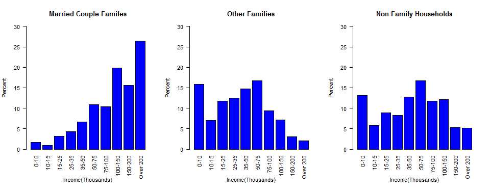
Missing from the discussion is the impact of family structure on the level of income. Data from the American Community Survey on income levels is readily available from the Census Bureau on American Factfinder. The graph below shows the income distribution with data from the 2010 American Community Survey for the District of Columbia for three types of households.
With 26% of the married couple households making over $200,000 and only 5.2% of non-family households and 2.1% of non-married households in that category it is clear that it is the married couple households that is driving the upper end of the income distribution. The opposite effect happens at the low end of the income distribution. This then must be a big component of the reason for the level of income inequality in the District of Columbia. Having two earners in a household makes a significant difference when both can earn an income.
Similar graphs could be produced using education instead of marital status and would likely show that education, as claimed in the DC Fiscal Policy Institute report, is also an important component of income inequality. Changing either of these demographic features of the population of the District of Columbia is not going to be done quickly. But without change on these dimensions the level of income inequality in the district is not likely to change very soon.
Posted in Methodolgy Issues
When Telling the Truth is Telling a Lie
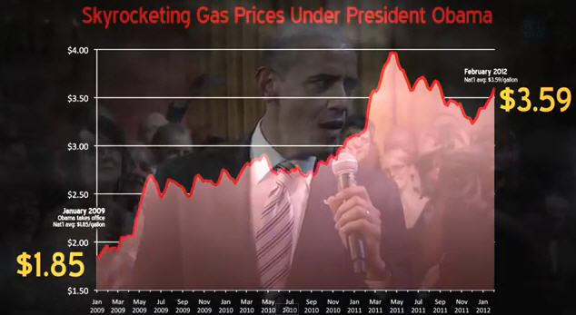
The Republicans have been harping on gas prices for quite some time. Last May they were talking about gas prices doubling under the Obama administration. Today Romney is quoted suggest that the Obama team “talk to…..the folks who are having a hard time filling up their car because the price of gasoline has doubled under this president?” The GOP has recently put forth a video featuring the graphic below claiming “Skyrocketing Gas Prices Under President Obama.”

The number are correct, but the graphic and the claims do not tell the entire story. On first count the graphic itself is deceptive in that is starts with a base value of $1.50 per gallon for the cost of gas. Thus the increase in price over the past three and a half years look bigger than it is.
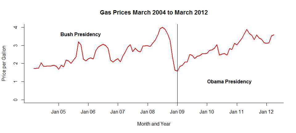
I have been tracking what I have paid for gas since March of 2004. The graph is very instructive. First look at the GOP numbers. Obama was inaugurated on January 20, 2009. I filled my gas tank the same day for $1.779 per gallon. Just last week I filled my tank. The price had gone up to $3.589 per gallon. That is a doubling of the price of gas. Below is a graph of the price I have paid for gas at the first fill-up each month since March of 2004.

So what happened? The first tank of has in March 2004 cost me $1.719 per gallon. By the summer of 2008 the price had much more than doubled to a peak of $4.039 per gallon. This all happened under the Republican Bush administration. So much for the evidence that the Republicans can do a better job of controlling the cost of gasoline.
After June of 2008 the price of gas plummeted down to the the levels that the GOP is so keen on citing at the beginning of the Obama administration. The reason for the fall in price, for those who fail to remember their recent history, was the onset of the current recession. So perhaps the republicans would suggest an even deeper recession to return gas prices to the level of $1.70 per gallon.
The truth is that gas prices have been rising for a number of reasons over the last half century. Anyone who understands economics fully expected that gas prices would return to the levels seen in 2008 when the current recession ends. That they have done so should surprise no one.
Posted in How to Lie with Statisics
