Subscribe to Blog via Email
Good Stats Bad Stats
Search Text
May 2025 S M T W T F S 1 2 3 4 5 6 7 8 9 10 11 12 13 14 15 16 17 18 19 20 21 22 23 24 25 26 27 28 29 30 31 -
Recent Posts
Good Stats Bad Stats
goodstatsbadstats.com
Choosing the Best Data for the Analysis at Hand
There are times when there is more than one data set that can be used to conduct the analysis that the researcher is focused on. Other times there is only one source of data.
Today I was surprised when I visited the Census Bureau website and read their “Stat of the Day.” The title was “Males Per Females.” The text read:
According to the American Community Survey, in 2010 the national average was 96.7 males per 100 females. The states of Alaska (109.0), North Dakota (103.7), and Wyoming (103.5) had the highest ratio.
The American Community Survey is a very large survey conducted by the Census Bureau. The primary goal of the survey is to provide estimates at very low geographic levels. But this “Stat of the Day” focuses on national and state data. What puzzles me is that if giving such statistics for 2010 would not the Decennial Census tabulations be a much preferred source for these numbers. This is even more surprising as those same Decennial Census numbers would be the ones used in the weighting of the data in the American Community Survey?
I just don’t get it………….
Posted in Uncategorized
Income Inequality Measures Revisited
Last week I posted a piece about the release by the Census Bureau of the report Household Income Inequality Within U.S. Counties: 2006–2010. They used 2006 to 2010 American Community Survey data. Their chosen measure of income inequality was the Gini index. Wikipedia provides a good description of how this measure is computed so I will not go into those details here.
When the DC Fiscal Policy Institute released the report Big Gap: Income Inequality in the District Remains One of the Highest in the Nation they used a different measure of income inequality. They chose the ratio of the mean income of those in the upper quintile of the income distribution to the mean income of those in the bottom quintile of the income distribution.
A post at al.com titled “Jefferson income inequality ranks among highest in state, Census says” dug deeper into the job of examining what the data meant. They examined income inequality in the state of Alabama using the same American Community Survey. They observed that many counties with high measures of income inequality are the same counties with “widespread and long-term poverty.” What was happening in these counties was the the higher level of the Gini index was being driven in large part by the very low income at the bottom end of the income distribution.
That is where the Gini index fails to adequately capture the story of what is happening with income in this country. The calculation of the Gini index is such that if the income of every person in a county were to suddenly double the Gini index would remain essentially unchanged. Disproportionately high income as the upper end of the income distribution as well as disproportionately low incomes at the lower end of the income distribution both can result in higher values for the Gini index. The index itself will tell the analyst nothing about the level of income or about what part of the income distribution is driving its value.
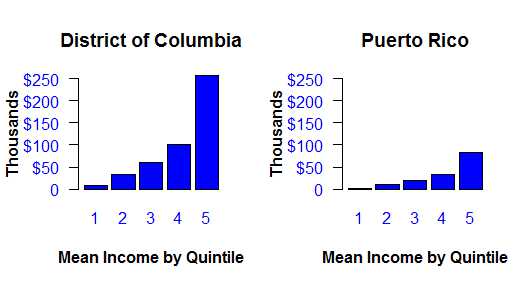
 The graphic to the right illustrated the first point using the same five years of American Community Survey Data. The Gini index for the District of Columbia is 0.535 and the index for Puerto Rico is 0.538. They are both what would be considered very high values for the index. Yet it is readily apparent in the graphic just how much lower are income levels in Puerto Rico. The Gini index for the two jurisdictions are very much the same because the income distribution have approximately the same percentage of households in each income cell. The fact that the income levels are vastly different does not affect the index.
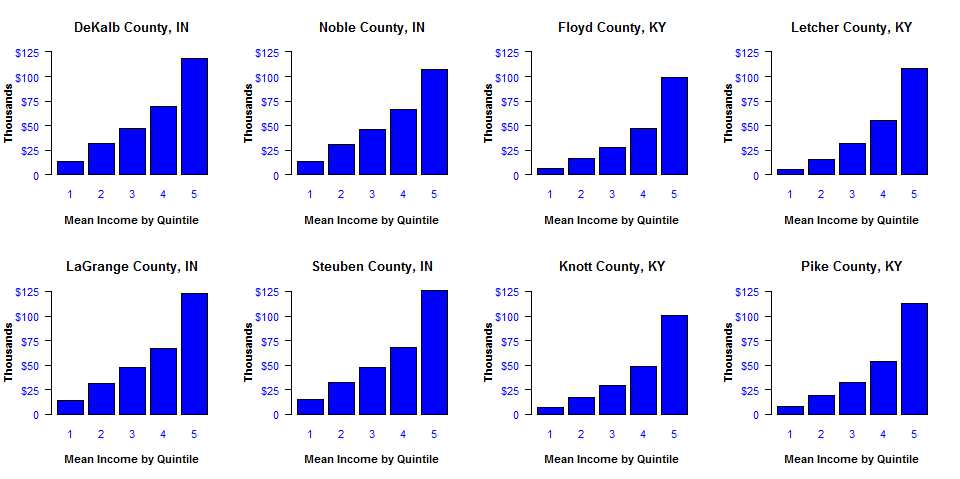
But the problems go beyond this one issue. The Census Bureau provided as a part of their report income inequality a nice looking graphic showing the level of the Gini index by county. But comparing the value of the Gini index across counties is very problematic. It is never clear what the underlying reasons for the difference are between the counties. The series of plot below indicate just one aspect of the situation. It illustrates what was happening in Alabama. I picked four counties in the North Eastern corner of Indiana and four counties in Eastern Kentucky. The Gini index for the four counties in Indiana are between 0.36 and 0.38. That puts them in the bottom 20% of the range of Gini indexes across the country. The four counties in KY are at opposite end of the scale all being in the upper 20% of the range of Gini index with numbers between 0.46 and 0.48. So by traditional measures they have the largest levels of income inequality.
At first glance the distributions do not look all that different. But notice how much lower incomes are in the first quintile in the KY counties. This difference does not carry over in same proportion at the high end of the income scale. The ratio of the mean income for the fifth quintile to the first quintile is about 8.5 in the IN counties. That same ratio is over 15 in the KY counties. The four KY counties consistently have lower incomes for each quintile. The gap at the fifth quintile is still there but is proportionality smaller than for the other four quintiles. In the end the reason for the higher levels of the Gini index in the KY counties is due to primarily to lower incomes in the bottom four quintiles combined with a smaller income gap in the top quintile. This is true at least in terms of average income in each quintile. So a fair conclusion would be the the four KY are suffering across all but the high income levels relative to the IN counties. This shows up when we look at median household income. The same ACS 5-year data show a median household income for the United States of about $52,000. The four counties in KY are far below this at around $30,000. Should we then really be concerned about the apparent high level of income inequality in the KY counties?
Posted in Methodolgy Issues
How Not to Make a Point
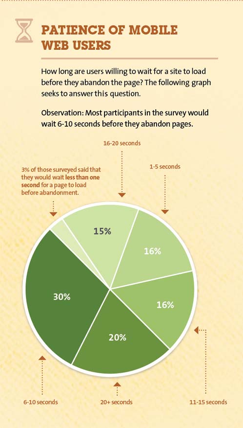
While surfing the web today I came across the image below posted at kissmetrics.com. This is a piece of a much larger graphic, but it makes my point. I don’t care for Pie Charts and this presentation seems to be particularity bad. There are other graphics at the site that are much worst. But this is the one I came across. The theme they use seems to focus on pretty graphic that give a pop. But the visualization seems to take precedence over presentation of the data.
 The first problem is that the image shows two dimensional data using both time and percent of the population in each cell. Pie charts do not handle two dimensional numeric data very well. The authors choose to sort the data by the percent of the population and plotted those data points in a clockwise direction around the pie chart. But in doing so they lost the ability to present the time dimension in a meaningful fashion. This is clearly a situation where a simple bar chart would work much better. I could create such a chart but they have not given me the data that makes such an effort worthwhile for they have chosen to use differing time segments in the pie chart. Pie charts work better when the second dimension is a categorical cell where the ordering of the cell is somewhat arbitrary from at least a numerical perspective. But again I would very much prefer to never see a pie chart.
The authors choose to emphasize that 3% of the people are willing to wait less then a second for a page to load. But if we look at the cell for 1 to 5 second wait which comprises 16% of the population it seems to indicate a 3% drop out for each additional second. So the one second dropout rate is hardly surprising. By choosing to use one segment for the under one second group they have make this sliver of the pie chart appear to stand out. Using 20 seconds at the upper cutoff for the charts seems to be premature as well. My preference would be to see a bar chart with five second intervals through at least 25 or 30 seconds with the final cell being 25+ or 30+ seconds.
Posted in Graphics Visualization
