Subscribe to Blog via Email
Good Stats Bad Stats
Search Text
May 2025 S M T W T F S 1 2 3 4 5 6 7 8 9 10 11 12 13 14 15 16 17 18 19 20 21 22 23 24 25 26 27 28 29 30 31 -
Recent Posts
Good Stats Bad Stats
goodstatsbadstats.com
Deception on the Campaign Trail
Romney, Wilmington Delaware, April 10, 2012:
“Do you know how many women – what percent of the job losses were women? 92.3 percent of the job losses during the Obama years has been women who’ve lost those jobs. The real war on women has been the job losses as a result of the Obama economy,”
Rating: Selective use of statistics to mislead the voters.
A video of Romney’s actual remarks can be seen here. A description of the numbers he is talking about is given here.
The numbers that Romney is using are based on the Bureau of Labor Statistics monthly Employment Survey. He is looking at total nonfarm jobs on two dates – January 2009 when Obama took office and March 2012 which are the latest numbers available from the Bureau of Labor Statistics. The job loss figures used to arrive at the 92.3 percent figure is the net difference between those two dates. They measure jobs, not people with job. The difference is not a measure of jobs loss, but of the net difference between the two dates. Thus the hundreds of temporary jobs created for the 2010 Decennial Census are not include as either job gains or job losses.

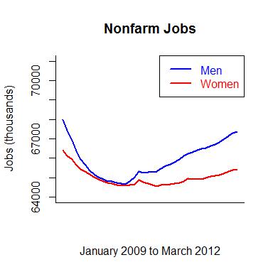
 So Romney wants to blame Obama for the net loss of 683,000 jobs for woman in that time interval and the net loss of 57,000 jobs that men in the same time interval. That results in the 92.3 percent figure he cites. A graph of the time series for both men and woman is posted to the right. Be careful in viewing the graph as the vertical axis does not go all the way to zero. If it did the loss of jobs would mostly be hidden from five. In this time frame it is clear that men suffered worst then the woman in net job losses and also have gained back their losses to a greater extent. If we really want to talk about job losses then the measure is from the peak to the valley in the graph which happened mostly within the first year of the Obama administration. Then there is a gain in the number of jobs over the last two years.
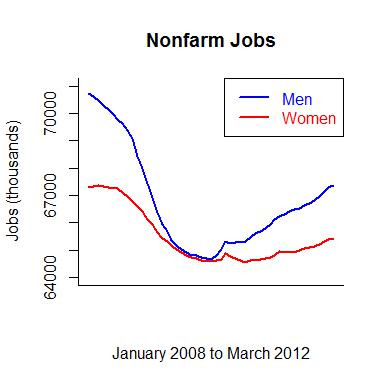
The real problem with the statement and with the graph is that they do not tell the entire story. Rarely can a president be blamed for job losses during the first few months that they are in office. The recession was well underway before January 2009. The numbers fail to show what was happening prior to that time. So the second graph on the right shows the same numbers on the same scale but starts the time series a year earlier at the beginning of the final year of the Bush administration.
That graph tells a very different story. The much larger job losses for both men and woman during 2008 are now clearly evident. Also clear is that men suffered job losses much larger than those that the woman suffered. The men have yet to make up for their larger loses.
To put the situation in perspective Romney is talking about a loss of 740,000 jobs over three years while Obama has been in office. While in the last year of the Bush administration between January 2008 and 2008 there was a loss of 4.4 million jobs. That is a much bigger loss. Perhaps Romney and the Republicans want to take credit for those job losses. Those loss disproportionally impacted men who lost 3.3 million jobs while woman lost 1.1 million jobs.
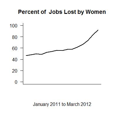
 This entire method Romney used is very badly conceived and executed. The calculations and statements will lead to logical nonsense. The plot to the right illustrates this. Romney should be able to make the equivalent statement each month based on the then currently available data. If he had done so then in January of 2009 he would have said: “46.4 percent of the job losses during the Obama years have been women who’ve lost those jobs.”
The economy has been improving since that time. So the question then is one of job gains not job losses. Yet since then, using method of calculation Romney has devised woman’s job losses have gone from 46.2 percent to 93.4 percent. That percent has shown a steady increase over the last 15 months. Within a couple of months he will be claiming that over 100 percent of all job losers have been woman. And this man claims he understands the economy!
Tax Day – Auto Fatalities – Give Me a Break
The numbers the media cites are wrong the claimed effect is trivial, so why is this news?
Since United States tax returns must be filed by next Tuesday there was the inevitable story this week linking an increased risk a dying in an auto accident to tax day. The source was a “Research Letter” in the Journal of the American Medical Association authored by Dr. Redelmeier titled “Road Crash Fatalities on Tax Day.”
CNN reported:
“The study focused on the 6,783 people who died in car crashes in the U.S. over the last 30 years on April 15, compared to the week preceding tax day and the week that comes after. The results found a nationwide average increase of 13 fatalities on tax day, which is a 6% increase.”
Reporters apparently forgot the very basic step of verifying the numbers they were reporting on. The data used in the study is available from the National Highway Traffic Safety Administration in their Fatality Analysis Reporting System. So verifying the numbers is not a major endeavor. Dr. Redelmeier did not use auto fatalities for his research, but rather persons involved in fatal accidents. Not all people involved in a fatal accident die. So the actual number of fatalities is about half of those cited. The 6,783 deaths on tax day cited by CNN is actually about half that number. Thus the claim of 13 additional deaths on an average tax day is more likely about six additional deaths.
What was the source of the media error? The original item in the JAMA was titled “Road Crash Fatalities on Tax Day.” This may have caused the confusion. The situation is not helped by descriptions in the text of the article which refer to the “number of individuals in fatal crashes.”
To put this discussion in perspective this news item is discussing six additional deaths on Tax Day. At least that is the claim. That is six deaths out of total of 32,000 auto fatalities each year. While I would not want to trivialize six deaths, it does seem that priorities are very much misplaced if much in the way of resources is expended to deal with 0.02% of auto deaths.
The media got carried away with this thought. The Los Angles Times cites a former head of the National Highway Traffic Safety Administration suggesting more research on who are the drivers creating the increase risk.
More research is needed to untangle the link between tax day and traffic deaths, said Dr. Ricardo Martinez, who headed the traffic safety administration in the 1990s. Among the outstanding questions: Does the increased risk come from a small number of really stressed-out drivers — last-minute filers, perhaps — or a large number of slightly edgy ones?
This is looking very much like the full employment act of 2012. Let’s spend money and resources to understand something that has at best a very small impact in the world.
One major methodological issue in the work is the question of the impact of the Easter holiday on the claimed results. Tax day frequently falls in the middle of the Easter celebrations. School students are out on spring break. That effects driving patterns and surely impacts accident probabilities. That was not even considered in the study. And it is only one of many possible confounding variables that should be considered in this type of research.
Posted in Methodolgy Issues, Small Differences
Presenting Results – Washington Post Opinion Survey
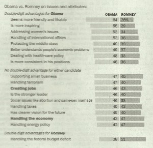
In today’s edition of the Washington Post there was an article “Obama holds clear lead over Romney” which presented results from a recent opinion survey on the current view of the public towards the two candidates. I want to focus on a small piece of how the results were presented. Below is a scanned image of part of the graphics from the print edition of the article. The print edition was in black and white. The online edition featured a colored graphic.
As a graphic visualization the black and white suffers from a significant flaw. The Obama poll results are shown in a light gray while the Romney results are shown in a darker shade. To the human eye the darker shade draws more attention and thus tends to look bigger. For example I had trouble seeing the results on the issue of “supporting small business” where Obama’s poll results were given as 47 as opposed to Romney who got a 45. Romney looks visually like the larger value. Lesson learned: Make the colors more comparable when they must be presented in black and white.
The second issue is again one of data presentation. The Washington posts choose to do two things in the presentation of the results. First the sorted the order by the poll results for Obama. The second thing they did was focus on three groups within the poll results. The groups were Obama ahead by 10 point or more, Romney ahead by 10 points or more, and the two candidates within ten points of each other. So they have in effect used two different sorting of the data. Much better would have to have sorted the results by the differences between the two candidates. Lesson to learn: Be consistent and how the data is presented. Inconsistencies lead to confusion on the part of the readers.
A third issue gets lost in the data. The footnote to the graphic points out that not included in the image were those who said they had no opinion. That group ranged from 8 percent to 16 percent depending on the question. The larger that group is the less likely the two candidates are to differ by more than 10 points in the poll. This then affects the size and rankings of the differences.
Then there is the issue of sampling error. The footnote to the graphic tells readers that the poll was a sample of 1,103 adults and that the results have a margin of error of 3.5 percentage points. What this really means is that the poll results for Obama might be off by as much as 3.5 percentage points. But keep in mind that if Obama’s poll results are high due to this source of error then Romney’s results are likely low by an equally large margin. So while the margin of error on the poll itself may be 3.5 percentage points the margin of error on the comparisons between the two candidates is likely twice that size. That is 7 percentage points. Once that is known then it is clear that rather than focusing on individual differences in a graphic of this nature it is better to focus on where the major differences are between Obama and Romney. In this sense the three grouping have some logic to them. I do find the use of the terminology “No double-digit advantage for either candidate” a bit misleading. Perhaps it would be better to say “Issues where the polling showed neither candidate with a clear advantage.”
Posted in Graphics Visualization, Methodolgy Issues
