Subscribe to Blog via Email
Good Stats Bad Stats
Search Text
March 2026 S M T W T F S 1 2 3 4 5 6 7 8 9 10 11 12 13 14 15 16 17 18 19 20 21 22 23 24 25 26 27 28 29 30 31 -
Recent Posts
goodstatsbadstats.com
Presenting Results – Washington Post Opinion Survey
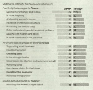
In today’s edition of the Washington Post there was an article “Obama holds clear lead over Romney” which presented results from a recent opinion survey on the current view of the public towards the two candidates. I want to focus on a small piece of how the results were presented. Below is a scanned image of part of the graphics from the print edition of the article. The print edition was in black and white. The online edition featured a colored graphic.
As a graphic visualization the black and white suffers from a significant flaw. The Obama poll results are shown in a light gray while the Romney results are shown in a darker shade. To the human eye the darker shade draws more attention and thus tends to look bigger. For example I had trouble seeing the results on the issue of “supporting small business” where Obama’s poll results were given as 47 as opposed to Romney who got a 45. Romney looks visually like the larger value. Lesson learned: Make the colors more comparable when they must be presented in black and white.
The second issue is again one of data presentation. The Washington posts choose to do two things in the presentation of the results. First the sorted the order by the poll results for Obama. The second thing they did was focus on three groups within the poll results. The groups were Obama ahead by 10 point or more, Romney ahead by 10 points or more, and the two candidates within ten points of each other. So they have in effect used two different sorting of the data. Much better would have to have sorted the results by the differences between the two candidates. Lesson to learn: Be consistent and how the data is presented. Inconsistencies lead to confusion on the part of the readers.
A third issue gets lost in the data. The footnote to the graphic points out that not included in the image were those who said they had no opinion. That group ranged from 8 percent to 16 percent depending on the question. The larger that group is the less likely the two candidates are to differ by more than 10 points in the poll. This then affects the size and rankings of the differences.
Then there is the issue of sampling error. The footnote to the graphic tells readers that the poll was a sample of 1,103 adults and that the results have a margin of error of 3.5 percentage points. What this really means is that the poll results for Obama might be off by as much as 3.5 percentage points. But keep in mind that if Obama’s poll results are high due to this source of error then Romney’s results are likely low by an equally large margin. So while the margin of error on the poll itself may be 3.5 percentage points the margin of error on the comparisons between the two candidates is likely twice that size. That is 7 percentage points. Once that is known then it is clear that rather than focusing on individual differences in a graphic of this nature it is better to focus on where the major differences are between Obama and Romney. In this sense the three grouping have some logic to them. I do find the use of the terminology “No double-digit advantage for either candidate” a bit misleading. Perhaps it would be better to say “Issues where the polling showed neither candidate with a clear advantage.”
Posted in Graphics Visualization, Methodolgy Issues
