Subscribe to Blog via Email
Good Stats Bad Stats
Search Text
July 2026 S M T W T F S 1 2 3 4 5 6 7 8 9 10 11 12 13 14 15 16 17 18 19 20 21 22 23 24 25 26 27 28 29 30 31 -
Recent Posts
goodstatsbadstats.com
Even with penalties many workers may forgo [health] insurance
Such is the title of an article in the Washington Post on a study by the ADP Research Institute. The study and the claims raise several questions.
The Data.
The ADP report is based on data from the large corporations that they work with. This means that a significant segment of the population that works for the smaller businesses are excluded from the study. They say “this information includes exact employee base salary, eligibility, benefits elections and total premiums paid.” The income data in the report come from employee W-2 forms. Much of the analysis focuses on single individuals and households. Nothing is said in the report on how ADP determined marital status and household size. This is important as the W-2 information may not be a good source for that information. For most of my working career my W-2 did not accurately reflect my household situation. As ADP also had access to health benefit information they may have gotten some of the marital status data there. That would not give them information for those how have forgone health insurance coverage. Thus there are several sever limitations to what can be said from the data.Any discussion of these limitations is noticeably missing from the report.
Focusing on the Singles Population
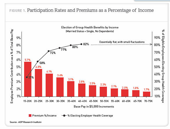 The presentation uses mostly data for and makes conclusions for the single people in the database. Single is as measured by ADP. They do not make a sufficient effort to make it clear throughout most of the study that they have restricted the analysis to this group. The Washington Post article for instance never states that the numbers they cite from the report are for singles rather than for the entire population. The first hint in the report they are talking only about singles is buried in a footnote on page 9 of the 24 page report. On page 11 they provide the graphic on the right and finally mention that the data is dealing with single people with no dependents.
ADP choose to focus on singles because they does not have family income data. Their data is the income is for individual employees. They say “For purposes of this study, unmarried, nonunion, full-time employees were chosen specifically because their reported base pay may be a reasonably accurate proxy for total household income.”
Unfortunately this assumes that the unmarried employee for whom ADP has records is the only person in the household with significant income. Census Bureau numbers can be informative here. In 2007 there were about 19 million nonmarried family households headed by a man or woman. But there were also 37 million nonfamily households. The Census Bureau defines these households as consisting of a householder living alone (a one-person household) or where the householder shares the home exclusively with people to whom he/she is not related.. They are not all single person households. More importantly there is no justification for the assumptions that one person in the household accounts for all or most of the income. That is true only in the single person household. But the Census Bureau numbers tell us that about 7 million of these households there are about 15 million people. For these 15 million people it would be very problematic to assume as does ADP does that the earnings of just one person in the household is a good proxy for total household income. That may have been true 50 years ago. But apparently ADP has never heard of the term “living together.” Given the group of people that ADP has chosen to focus on headlines like “many workers………” are clearly overstatements of what the data shows.
The Married Population
ADP does at one point turn to the married families. Admitting that they do not have spousal income they make assumptions in their analysis about household and spousal income in order to reach some of their conclusions.
They start off saying “Assuming each dual-income household earns, on average, twice as much as a single household.” Based on that assumption they go on to say “Results show that 16.0% of married individuals paid more than 9.5% of base pay to obtain health coverage…” The correct statement is that 16.0% of married individuals in our database who pay for health insurance….. That have made an unstated assumption. The question must be asked who in a married couple family buys the health insurance? If income level is a confounding variable then their conclusion is wrong. If on average the higher income earner buys the health insurance then they have understated the 16.0% figure. This is an assumption that should not be made without looking at data.
The Graphic.
Finally a few comments are needed on the graphic above. This one does not rank amount quality data visualizations. The authors have mixed a bar chart and a line chart into one graphic. Both sets of data are of the same type. They should be displayed consistently. Visualization got in the way of communication. The red bars look good, but showing the percent electing health insurance coverage became problematic so the authors elected to use a line chart. And why does the line chart trail off with the notation “Essentially flat, with small fluctuations.” Please, plot the data instead of clustering up the chart with words when the data would tell me the same thing. The message is the relationship between the two series. A simple x-y chart of one series against the other would make the point they are talking about obvious.
Posted in Graphics Visualization, Methodolgy Issues
I have to disagree with you on the chart visualization:
I don’t think an x-y chart would make the same point: here, you want to provide visuals for both the income bracket and their % (2 data series). If you use x-y chart between the 2 data series (of %), the income bracket information is no longer there. Maybe you can have a bubble chart, where the bubble size is the income bracket?
Or, to follow your idea, it’ll be a cleaner chart with each series charted against income bracket as a connected line chart, each line of a different color.
You make a good point Tam. I like the x-y chart – join the points in sequence – as it shows the relationship between the two series. But you are right it does lose the income bracket information. With a bubble chart you would end up with a large range of size for the bubbles. So I don’t think that works. Perhaps the x-y chart with the points labeled based on income. I’m not thrilled with that kind of labeling.