Subscribe to Blog via Email
Good Stats Bad Stats
Search Text
June 2026 S M T W T F S 1 2 3 4 5 6 7 8 9 10 11 12 13 14 15 16 17 18 19 20 21 22 23 24 25 26 27 28 29 30 -
Recent Posts
goodstatsbadstats.com
Pie Chart + Stacked Bar Chart = Confusion
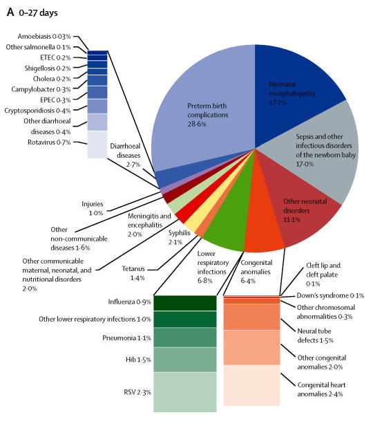 The three charts to the right showed up in the paper “Global and regional mortality from 235 causes of death for 20 age groups in 1990 and 2010: a systematic analysis for the Global Burden of Disease Study 2010.” They were part of one figure in the paper( figure 2). It is well worth viewing the original figure. You will need to register (free) to view the entire paper.
I generally do not care for pie charts so lets start with the problem with those. We are given three pie charts showing causes of mortality in infants and young children. It is quite natural to try to compare across the three age groups. Comparing the size of the slice of pie within one chart is hard enough, but here we must compare across three separate pies. But then the authors made that effort even more difficult by the haphazard placement of the slices of the pie. Take the second and third parts of the figure, for ages 24 days to one year vs the 1 to 4 year old group. In the first “malaria” and “lower respiratory infections are placed next to each other. In the second part the slices are situation across from each other in the pie. In fact there is no consistent placement of the various causes of death across the three charts. Please make it easy for me to make comparisons.
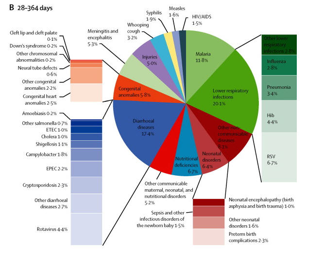 Then because some of the slices of the pie are rather small the authors decided on at series of stacked bar charts to show causes of death within the slices of the pie. A basis rule of graphics is that area should be used constantly throughout the chart. This principle has been completely abandoned. The area within a stacked bar bears no resemblance to the area within the pie chart. Worst the various stacked bar charts cannot be reliably compared to each other. Try comparing retrovirus(0.7%) to Neural tube defects(1.5%) in the chart for the youngest infants? Does the second really look to be twice the size of the first?
Then try to compare the stacked bar charts across the three parts of the figure. Looking at the charts for “lower respiratory infections for the young infants vs the 1 to 4 year old group is instructive. Is the size of the bar for “RSV” for proportionate larger for the infants than for the 1 to 4 year old group given the percentages (2.3% vs 1.6%). And again just like with the pie charts the authors did not maintain any consistency in the ordering of the causes of death between the various bar charts across the three parts of the figure. Consistency in design is important if the reader is expected to easily grasp the visualization.
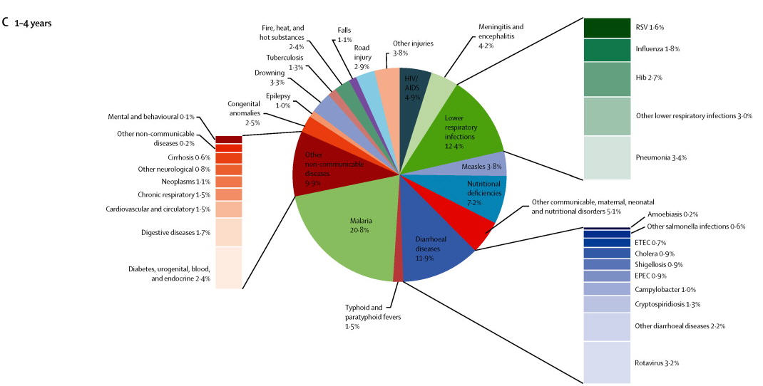 The authors did do the reader the favor of displaying the percentages for each of the causes of death. But this adds considerably to the visual clutter. I am forced to ask would not a simple table have been much more effective in displacing the data in a way that can be easily understood? Had they done that it would be much easier to see things like the difference in percentage of deaths due to “lower respiratory infections” across the three groups (6.8%, 20.1% and 12.4%).
Posted in Graphics Visualization