Subscribe to Blog via Email
Good Stats Bad Stats
Search Text
April 2025 S M T W T F S 1 2 3 4 5 6 7 8 9 10 11 12 13 14 15 16 17 18 19 20 21 22 23 24 25 26 27 28 29 30 -
Recent Posts
Good Stats Bad Stats
goodstatsbadstats.com
Diabetes causes people to skip breakfast
If we saw that headline we might just laugh. But a few weeks ago the media was abuzz with the opposite conclusion. A Minnesota station said ‘U’ Study: Breakfast Could Decrease Diabetes Risk saying the study “links the meal to a decrease in risk for type 2 diabetes” based on a study at the University of Minnesota. Star Tribute’s headline said Breakfast cuts risk of diabetes, U study finds. Minnpost.org did a better job saying “Skipping breakfast associated with higher risk of obesity and diabetes, U of M study finds.” What they added was a discussion of the limitations of the study saying
“Now for those caveats. First, this was an observational study, which means it can only show a correlation between two things (in this case, breakfast and a lower risk of certain medical conditions), not a cause-and-effect. Other “hidden” factors, not controlled for in the study, could explain the results.”
That is important. What they have observed is A is correlated with B. What makes the media with the help of the authors of the paper is: A causes B. But with a correlation study it can just as easily be said the B is correlated with A and therefore B causes A. Thus my title. Both conclusions are unjustified.
The headlines were based on a paper published in the Diabetes Journal titled “Breakfast Frequency and Development of Metabolic Risk.”
A reading of the paper provides a different view of the results. That actual estimate of the hazard ratio for diabetes was 0.81 with a confidence interval from 0.63 to 1.05. Thus a claim that diabetes risk is lower for those eating breakfast cannot be made under the usual rules of classical statistical testing. Failing to find an overall effect the authors then looked at breakdowns by sex and race. There they found some effects. However this is a risky statistical approach as the analysis has entered the realm of multiple comparisons and the confidence intervals need to reflect this. When the overall effect is 0.81 it is a virtual certainty that the rate for one sex group will be lower than 0.81 and one will be higher. The calculation of the confidence intervals and the associated statistical testing must take into consideration that two estimates are being looked at – not just one estimate at a time.
So where did the claim that diabetes had a lower risk come from if the results are not in the paper. I suspect is came out of the subgroup estimates. But the University of Minnesota web posting on the paper also clearly implies the link, saying “A study by University of Minnesota School of Public Health researchers has found consuming breakfast daily, regardless of diet quality, is strongly associated with a reduced risk of developing type 2 diabetes.” This statement, at least to my way of thinking, goes beyond what is provided in the analysis in the published paper.
A second issues in this work is that of conflict of interest. The research was funded in part by General Mills. The authors stated “they had absolutely no hand in any part of the paper or in the design of it. Like you, they’re reading it for the first time today.” This is good but it does not completely solve the conflict of interest problem. Think in terms of what is usually referred to as publication bias. A company can fund such studies. If the results a negative the results are not likely to be published. There is not harm to the company. If the results are positive the results get published. The company can than say the research shows that you should eat breakfast. That in turn will benefit the company. The company does not need to have hand in the actual research. So funding such studies is a no risk proposition for the companies involved. Innocent or guilty, there is no way around this problems for the companies involved. This is one reason why a common advice is to look first at research that has no funding involvement from parties likely to benefit from the results.
Retirement Age and Dementia
Recent news reports have been touting the benefits of delayed retirement and the claim that this action will reduce the incidence of dementia. The Huffington Post started their article saying “People who delay retirement have less risk of developing Alzheimer’s disease or other types of dementia, a study of nearly half a million people in France found.” These statements were attributed to INSERM, the French government’s health-research agency based on a paper presented on Monday July 15, 2013 at the Alzheimer’s Association International Conference in Boston.
I have yet to see the paper and the INSERM website is in French. I am not fluent in that language. It would be useful to see the paper as the published results raise one very important question. The study as reported in the media says they included 429,000 workers and that nearly 3 percent had developed dementia. But the reports also state that the prevelance of Alzheimer’s, the most common form of dementia is about eleven percent.
The eleven percent figure is consistent with other studies. See here, here, and here. The rates vary greatly by age and sex.
My problem is that they study showed only three percent with dementia while the rate should be something over eleven percent. I have to ask what happened to the other eight percent and do I really want to rely on a study that claims to show the value of a delayed retirement when the rate with in the study is only three percent while the rate overall is eleven percent. That discrepancy cries out for an explanation. It is not given it the media reports. Perhaps there is a reason given in the paper itself.
Posted in The Media, Where's the Data?
Big Data and Wimbledon
 I finished watching the last of the Wimbledon tennis matches yesterday. This years play featured a number of great matches and a large number of surprising results. No one would have predicted a Bartoli vs Lisicki match up for the woman’s final. While the men’s final with Djokovic and Murray was expected the early departure of Nadal and Federer from the tournament was not expected.
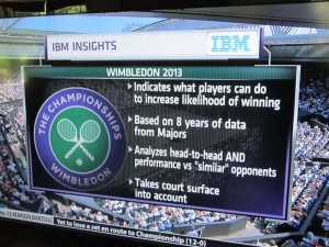
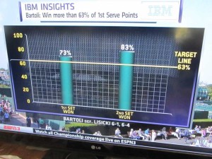
This year IBM, ESPN and the folks at Wimbledon together put together a statistic for each contestant in each match. The graphic on the right gives the description of how they arrived at the statistics. The presentation on ESPN as they showed the matches went under the label “IBM Insights” and claimed to show the likelihood that a player would win a set within a match based on how they did on a measurement of just one of many performance measures for the set. So for example in the Bartoli vs Lisicki match they said that if Bartoli could win more than 63% of her first serve points then the likelihood that she would win the set was 92%. This was an attempt to integrate “Data Analytics” into the commentary.
The problem with this approach is that it is one dimensional. There is a long list of performance measures that impact who wins a given set. This is truly a multidimensional problem. How many points Bartoli wins on her first serve does not matter very much if she can not break Lisicki. For those who do not follow tennis it is common for the server to win a given game. The play is such that the game favors the server. Breaking serve refers to the situation where the server loses that game. Winning six games can win a set – but they have to win by two games. And if they get to six games each then they play what is called a tie break – unless of course it is the third set in the match (for the women, fifth for the men.) Then they play on, at Wimbledon, until someone wins that final set by two games.
 The next issue is that the number itself is not very informative. They picked one point on what is essentially a continuous distribution. So what is Bartoli’s likelihood of winning if she wins 55% or first serve points? if she wins 70% of first serve points?
To the credit of the commentators doing the play by play they mostly ignored the IBM Insights numbers during the match. Rather they focused on what was going on in the match itself and on a wide range of performance measures as the match progressed. They frequently showed comparisons of the two player on several measures as the matched progressed. This was a much more well rounded approach.
Once the match was over sometimes they came back to the IBM Insight statistic and sometimes they just ignored it. They were happy to show the results for Bartoli after she won the Woman’s championship. She had exceeded the standard in both sets in her match. They made no mention of how Lisicki did on her statistic.
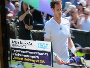
 For the men’s final the story was a bit different. Here the target value for Murray was “Win more than 57% of 2nd serve return points.” Then the likelihood of him winning a set was 78%. Here Murray won three sets, Djokovic won none. The commentators never came back to a discussion the IBM Insight statistic after the match. Murray exceeded the target value of 57% in only the second and third set of the match.
If interested the Wimbledon website does have available the performance measures for each match. They are not labeled as “IBM Insights.” And it looks like they actually computed three performance measures for each player for each match. For those interested the match statistics for the Djokovic Murray match are here. And those for the Bartoli Lisicki match are here.
I am left here with the feeling that the value of “Big Data” and “Data Analytics” was not well served with the “IBM Insights” part of the commentary. This is a case where the situation is much to complex to be summarized in a single number. It would have been better to have left it out entirely.
Posted in Statistical Literacy, The Media