Subscribe to Blog via Email
Good Stats Bad Stats
Search Text
June 2026 S M T W T F S 1 2 3 4 5 6 7 8 9 10 11 12 13 14 15 16 17 18 19 20 21 22 23 24 25 26 27 28 29 30 -
Recent Posts
goodstatsbadstats.com
Record Lows on the Mississippi River
Recent news accounts (here, here, and here) have focused on the low water levels along the Mississippi River, the removal of bedrock from the river bottom, and the impact on barge traffic along the river south of St. Louis. A post over at rud.is asked “How Low Can It [The Mississippi River] Go?” The graphic accompanying the post caught my attention.  The author posted a full size pdf file here.
There are a couple of problems with the graphic. There are also problems with the source data set used in the graphic.
Lessons to learn are that not only must the analyst produce a quality graph but underlying data must be examined closely.
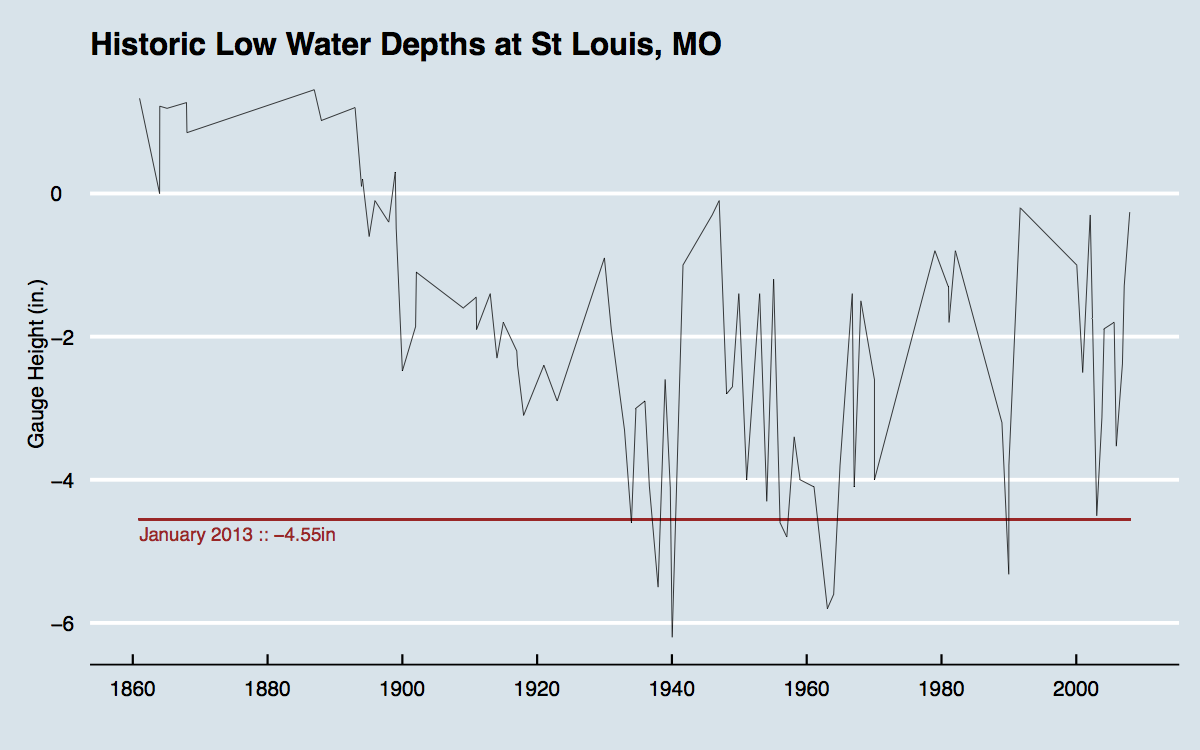
First the issues I have are with the graph. First the annotations on the graph give the gauge levels in inches. The actual levels are in feet. The bigger issue is with the type of graph used for the data set. The underlying data is a file record lows available from NOAA and the USGS. They provide a link to the list of records, daily and historical data on river levels and flow at St. Louis at the source website. However the author of the blog posting graphed the data as if it were a time series. In treating it as a time series he says:
As you can see, there have only been four other (recorded) times when the river was this low and it has just come off of multi-year severely high points with a fairly rapid trend downwards.
His confusion on the type of graph he shows is apparent in his count of the number of times the the low as less than current levels. He cites four instances, but looking at the graphic it is clear that there are not four but eight such instances. Because consecutive record lows on the time scale are neighboring points he seems to be counting them as just one low.
A more appropriate plot would be an x-y plot with the the x-axis listing record lows and the y-axis showing the level for each of these lows. The time spread could still be shown on the x-axis. The error the author made was to join the point and create a line plot. An even more useful plot would be one showing annual low levels along the river. This could be a true line chart.
What the author also failed to do was look closely at the data he was using. 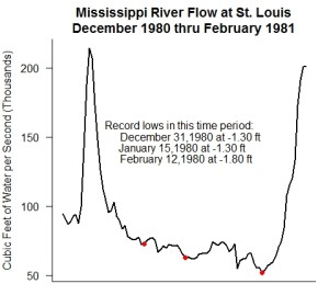 The data file lists 84 record lows since 1861. A key question is how the term record low defined in the data set. At first glance the data set seems to have be constructed by computing monthly low river levels and selecting the lowest 84 values. This becomes apparent when one looks at the data for December 1980 thru February 1981 where there are three record lows in the data set. A graph of the flow levels of the river is shown at the right with the three record lows marked by red dots. (The graph shows flow rates and not river levels. This is because the USSG website provides flows and not gauge readings for 1980.) The graph shows a mostly steady downward trend in the rive level from mid December into February. It would more appropriate, for data analysis purposes to reflect only one record low in the record. It is not clear to me why the USGS and NOAA choose a different approach. There is one exception to this apparent rule that is very hard to explain. In 1970 the file shows a record low of -2.60 feet on January 19th, and a record low of -4.00 feet on the next day – January 20th. I don’t know why back to back days would be recorded as record lows, nor do I think that the river level dropped 1.4 feet in one day. I suspect a typo in the file. In fact the flow data in the NSGS file show a flow of 57.2 kilo cubic feet per second on the 19th and 57.4 on the 20th.
Given these issues I would prefer that a graph of river levels showing the low levels that occur be a time series of the annual levels. Reviewing the data over the 150 year time period, and the tables provided by the USGA and NOAA it is clear that the river has clear seasonal variations with the lowest levels occurring during the winter months. With that in mind I would create an annual measure for the period from July 1 to June 30 and plot those values.
The take home points here are to be careful when plotting data and examine the data very carefully prior to using it. Key questions are is the data of sufficient quality and is it appropriate for the uses being made of it.
Posted in Data Quality, Graphics Visualization, Methodolgy Issues
[…] Stats, Bad Stats has a really good critique of my Mississippi River post that you should read (TL;DR: my graphs & analysis need […]
[…] Stats, Bad Stats has a really good critique of this post that you should read after this (so you know how to avoid the mistakes I made […]