Subscribe to Blog via Email
Good Stats Bad Stats
Search Text
March 2026 S M T W T F S 1 2 3 4 5 6 7 8 9 10 11 12 13 14 15 16 17 18 19 20 21 22 23 24 25 26 27 28 29 30 31 -
Recent Posts
goodstatsbadstats.com
Marriage and Divorce in Mexico
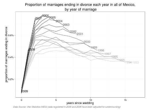
 The folks over at Revolutions know a good graph when they see one. They provided a link to a study by Diego Valle Jones titled: Proportion of marriages ending in divorce. The graph is reproduced at the right. A full size graph can be seen here.
I must give Diego Valle Jones a pat on the back for a graph well done. There are no flashy colors. Instead Diego Valle used the gray scale to show the different cohorts by year. The labeling is well done and kept simple so that the data almost speaks for itself. He has done a good job of data analytic. I would like to see more of this.
Posted in Uncategorized