Subscribe to Blog via Email
Good Stats Bad Stats
Search Text
March 2026 S M T W T F S 1 2 3 4 5 6 7 8 9 10 11 12 13 14 15 16 17 18 19 20 21 22 23 24 25 26 27 28 29 30 31 -
Recent Posts
goodstatsbadstats.com
A Graph Should Tell the Same Story as the News Article
Today Federal News Radio published a piece on contracting at the Department of Defense. The issue goes back to the “$500 hammer” fiasco that came to light under the Clinton administration in the 1990’s. Reforms were made to get the DoD to buy off the shelf products instead of using elaborate specifications that drove up the costs to the government. The story line in the article dealt with how successfully this goal had been accomplished during the past 15 years.
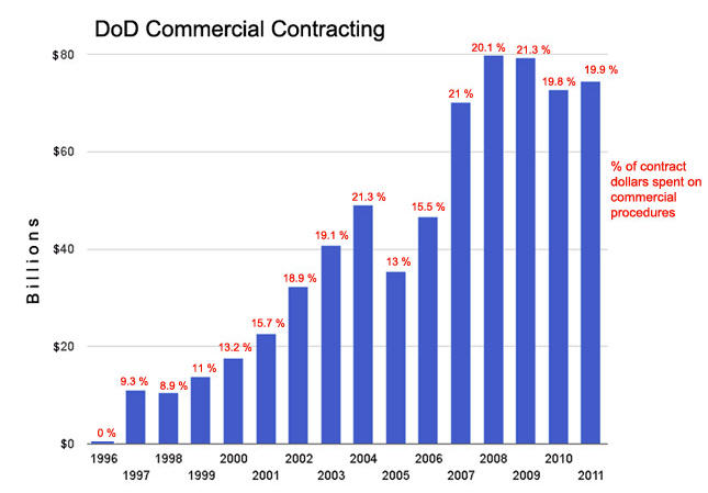
 There are a number of measures that could be used to evaluate the results. There were two highlighted in the article and both were put into the graph – which is reproduced on the right. There are a number of problems with the graph. First off the main measure used in the graph is the level of spending, or what is referred to as “DoD Commercial Contracting” as measured in the billions of dollars. The problem with using this as the primary measure is that it is not benchmarked. It is subject to both the success of the system and to the variability of defense spending over the past 15 years. Unfortunately this is the measure highlighted most prominently in the graph. It was used to determine the size of the bars in the bar chart. The authors must have had a partial grasp of this problem as they then proceeded to label each bar with the percentage of contract spending that was attributable to the new “commercial contracting” procedures. This resulted in an attempt to show two dimensions in a one dimensional graph. The percentages are a much better measure to illustrate, or tell the story, what has happened in the last 15 years. Unfortunately in adding the second set of data to the graph they created a cluttered graphic that is much harder to understand.
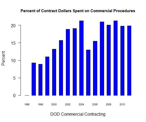
 A better presentation would have been to use the graphic that is posted on the right that shows just the percentage of contract spending that is attributable to “commercial contracting” over the time period. The overall level of contracting can then be covered in the text of the piece with a simple statement that it was X billion dollars in 1996 and Y billion dollars in 2011. This would have provided sufficient context to the extent of federal spending in this area without unduly cluttering the accompanying graphic. Also with the new graphic it becomes readily apparent that the upward trend in “commercial contact” spending since 1997 shown in the original graphic is not nearly as impressive when it is viewed in the percentage terms that I have used in the reformatted graphic. The new graphic does a better job of telling a story that is consistent with the message in the news item without the clutter of the original graphic.
Posted in Graphics Visualization, Telling the Full Story