Subscribe to Blog via Email
Good Stats Bad Stats
Search Text
March 2026 S M T W T F S 1 2 3 4 5 6 7 8 9 10 11 12 13 14 15 16 17 18 19 20 21 22 23 24 25 26 27 28 29 30 31 -
Recent Posts
goodstatsbadstats.com
What Cliff?
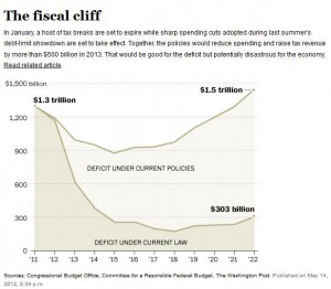
In Monday’s Washington Post I spotted and article titled: “Taxmageddon sparks rising anxiety” that dealt with the fiscal issues that the congress and the president face at the end of this year as the Bush tax cuts expire and the agreement made by the two political parties made earlier this year kick into effect.
The associated graph is a prime example of how not to do graphics. I have reproduced it to the right. In fairness to the Washington Post they copied and modified the original graphic released by the Committed for a Responsible Federal Budget in their report “Between a Mountain of Debt and a Fiscal Cliff.” That graphic was just as bad. The original graph is shown on the cover of that report. I will not reproduce it here.
The main issue is that the differences between the two lines mean is not explained to the reader. One is labeled “Deficit Under Current Law” and the other is labeled “Deficit Under Current Policies.” I always thought federal spending was done under the current laws and that is sometimes referred to as current policies. so I must ask how does the government have different levels of spending depending on “law” and “policy.? To most people there difference between the two lines is completely meaningless.
The second issue with the graphic is the use of shading under the two lines. Adding this feature is just adding clutter to the graph. Shading or colored graphics of areas on a graph should serve a purpose. In this graphic the shading has no meaning and so should never have been used.
Posted in Graphics Visualization