Subscribe to Blog via Email
Good Stats Bad Stats
Search Text
May 2025 S M T W T F S 1 2 3 4 5 6 7 8 9 10 11 12 13 14 15 16 17 18 19 20 21 22 23 24 25 26 27 28 29 30 31 -
Recent Posts
Good Stats Bad Stats
goodstatsbadstats.com
Coffee, Mortality, and Data Quality
This past week there were several news articles discussing the link between coffee drinking and mortality based on a New England Journal of Medicine paper titled: “Association of Coffee Drinking with Total and Cause-Specific Mortality.” Science Daily for example said “Coffee Drinkers Have Lower Risk of Death, Study Suggests.” I was able to obtain a copy of the paper and frankly I find several red flags as I look at the data that was used. Given the data the analysis may be well done, but computer geeks have a saying: “garbage in, garbage out.” I would not label the data used for this research as garbage. But I do have several concerns. While the authors recognized some of these issues in the paper, I am of the opinion that they were not well addressed and there implications that deserves further consideration. The mere mention of the problem does not answer the very important question as to how the problem impacts the conclusions reached in the paper.
The data in the study must first be regarded as being far from representing the population of the United States. The actual sampling was done in only six states. But even there the data cannot be claimed to represent the people living in those six states. The data source was the the NIH-AARP Diet and Health Study. The first stage of sample selection was members of the AARP in the selected states. Current membership numbers for the AARP seem to be around 40 to 45 million persons age 50 and over. The size of this group in the United States is about 99 million according to the 2010 Decennial Census. So the first problem is the sampling frame represents less than 50% of the population who have elected to join the AARP. Those are current numbers. The actual sample selection was done in 1996 and 1997. I do not have membership number for the AARP back then. The second stage of sample selection was much more problematic. 3.5 million questionnaires were mailed back. Approximately 600 thousand were returned. This means that the response rate for the survey was on the order of 17%. Response rates at this level are usually regarded as unacceptably low for most survey organizations. Combining the two problems the resulting sample represents about 8% of the population of the six states. Keep in mind that this 8% were in effect self selected into the sample. The first stage of self selection was the choice To join the AARP and the second stage was the choice to return the questionnaires.
But it gets worst. In the study the authors decided to exclude respondents from the analysis for several reasons. By the time they implemented these exclusions they had reduced the sample to 400,000 respondents. This then represents about 6% of the target population.
I find it very disconcerting to make claims about the population as a whole based on a sample selected in this manner. As a matter of comparisons the federal government would never consider providing estimates of monthly unemployment based on data with these types of sampling problems. So I am unsure why such selection procedures are considered acceptable when dealing with medical data. Even if all of the analysis done in the paper is sound it is very unclear that the results can be generalized beyond those people who ended up in the analysis. Any claim that those results can or should be generalized to the population of the United States would require substantial justification. So while the sample used is very large the biased selection procedures raise serious issues. The size of a study becomes very much unimportant when biased selection procedures are used. Statisticians will frequently say that the errors due to such procedures dwarf the measurement errors and cannot be offset by increasing the size of the data set.
As an example of the biased nature of the resulting sample the paper lists college graduation rates for the group (age 50 to 71) as ranging from 37% to 53% for men and ranging from 24% to 31% form woman with the level depending on the amount of coffee they drank. While the latest Census Bureau numbers put the current percent with college degrees at 28.6% for those age 45 to 64. Given the increasing trends in graduation rates this should be considered an overstatement of the level of education that should have been seen in the study participants if the sample was representative of the population. The large difference indicates that the authors ended up with a group that is much better educated than the general population. Adjustments can be made for difference between the general population and the sample population and these differences can be incorporated into the modeling methodology. However the larger these differences are in the more difficult such adjustments become and the less clear it becomes that such adjustments adequately account for the differences.
Those are not the only problem with the analysis. As the authors dutifully point out the entire study is based on a self reporting of the amount of coffee consumption at a single point in time. There was no measure of long term coffee consumption available in the data set. In fact all of the characteristic variables used for the individual other than the death information were based on the data reported in the questionnaires at the time of original survey. Reporting links between coffee consumption and mortality based on such data and analysis I find troubling. It seems little different from looking at those who received a ticket for speeding 15 years ago and studying traffic fatalities in auto accidents years later. There may well be a link, but this just does not seem to be the way to examine the situation.
The final issue I have with studies of this magnitude is the well documented problem of publication bias. This is where only data where results are statistically significant are reported in the journals and the studies where links were not found are not reported. It is never clear if the purported link is the result of random chance or reflects reality. Using the statistical standards employed in this reports five percent of all studies on this data set would be expected to show a significant statistical result even it the results were the result of pure random chance. The website for the survey show hundreds of studies based on this data. Studies of this size draw a large number or research interests and are therefore in a position where the publication bias issue needs to be seriously addressed before actions are taken based on the results of the studies that are done using data such as was used here. Ideally this would be done across all of the analysis done using the data set and is not specific just to this one study on coffee and mortality.
Posted in Data Quality, Methodolgy Issues, Publication Bias
A Graph Should Tell the Same Story as the News Article
Today Federal News Radio published a piece on contracting at the Department of Defense. The issue goes back to the “$500 hammer” fiasco that came to light under the Clinton administration in the 1990’s. Reforms were made to get the DoD to buy off the shelf products instead of using elaborate specifications that drove up the costs to the government. The story line in the article dealt with how successfully this goal had been accomplished during the past 15 years.
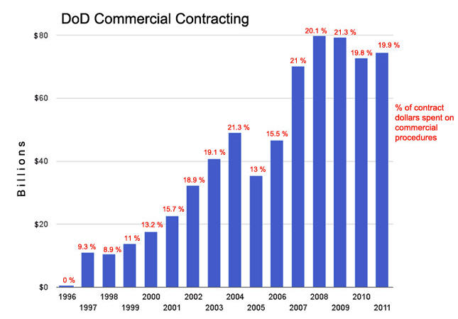
 There are a number of measures that could be used to evaluate the results. There were two highlighted in the article and both were put into the graph – which is reproduced on the right. There are a number of problems with the graph. First off the main measure used in the graph is the level of spending, or what is referred to as “DoD Commercial Contracting” as measured in the billions of dollars. The problem with using this as the primary measure is that it is not benchmarked. It is subject to both the success of the system and to the variability of defense spending over the past 15 years. Unfortunately this is the measure highlighted most prominently in the graph. It was used to determine the size of the bars in the bar chart. The authors must have had a partial grasp of this problem as they then proceeded to label each bar with the percentage of contract spending that was attributable to the new “commercial contracting” procedures. This resulted in an attempt to show two dimensions in a one dimensional graph. The percentages are a much better measure to illustrate, or tell the story, what has happened in the last 15 years. Unfortunately in adding the second set of data to the graph they created a cluttered graphic that is much harder to understand.
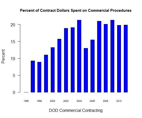
 A better presentation would have been to use the graphic that is posted on the right that shows just the percentage of contract spending that is attributable to “commercial contracting” over the time period. The overall level of contracting can then be covered in the text of the piece with a simple statement that it was X billion dollars in 1996 and Y billion dollars in 2011. This would have provided sufficient context to the extent of federal spending in this area without unduly cluttering the accompanying graphic. Also with the new graphic it becomes readily apparent that the upward trend in “commercial contact” spending since 1997 shown in the original graphic is not nearly as impressive when it is viewed in the percentage terms that I have used in the reformatted graphic. The new graphic does a better job of telling a story that is consistent with the message in the news item without the clutter of the original graphic.
Posted in Graphics Visualization, Telling the Full Story
Marriage and Divorce in Mexico
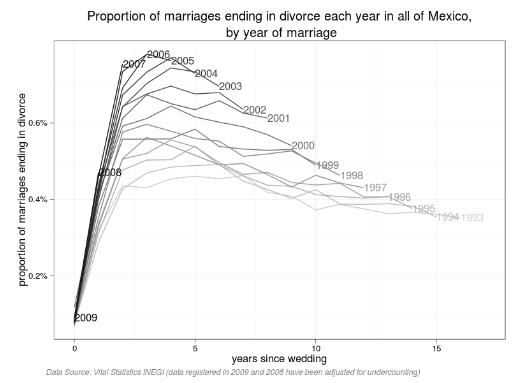
 The folks over at Revolutions know a good graph when they see one. They provided a link to a study by Diego Valle Jones titled: Proportion of marriages ending in divorce. The graph is reproduced at the right. A full size graph can be seen here.
I must give Diego Valle Jones a pat on the back for a graph well done. There are no flashy colors. Instead Diego Valle used the gray scale to show the different cohorts by year. The labeling is well done and kept simple so that the data almost speaks for itself. He has done a good job of data analytic. I would like to see more of this.
Posted in Uncategorized