Subscribe to Blog via Email
Good Stats Bad Stats
Search Text
June 2026 S M T W T F S 1 2 3 4 5 6 7 8 9 10 11 12 13 14 15 16 17 18 19 20 21 22 23 24 25 26 27 28 29 30 -
Recent Posts
goodstatsbadstats.com
Understanding reported changes in median income
This is the time of year when the Census Bureau releases data on the income and health in the United States. It is also a time when in the rush to tell the American people what is happening in the nation and in their own communities that the media gets the story very badly wrong.
Today’s Washington Post included an article titled: “Virginia’s median household income takes hit, census data indicate.” The article is based on data from the American Community Survey and released in the recent Census Bureau Report with the somewhat deceptive title: “Household Income: 2012.” It contained data on median household income for states and selected metropolitan areas for 2000, 2011 and 2012.
The post report started with the statement
Virginia’s median household income fell more than 2 percent last year, the most significant drop in the country at a time when most states saw their incomes go flat, according to Census Bureau figures.
With this one line the reporters and editors at the Washington Post showed a clear failure to understand the very basics of statistical analysis.
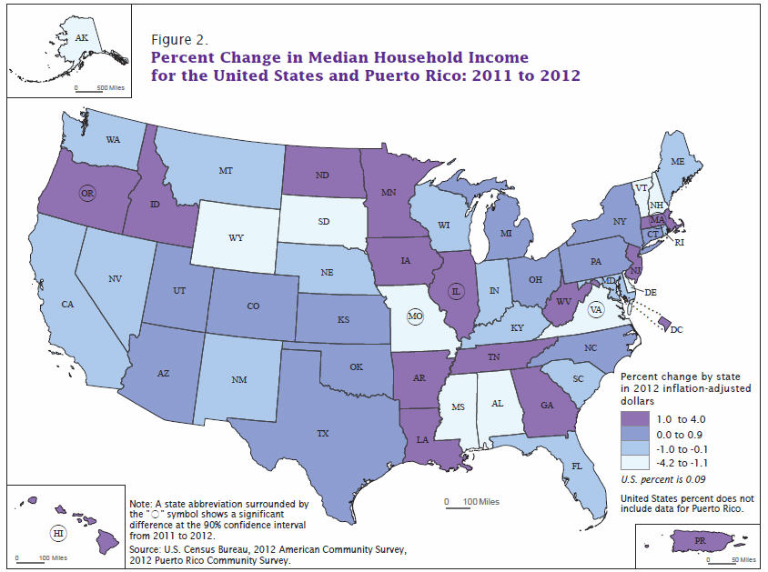 So what went wrong. In table 1 of the Census Bureau report the year to year changes in household median income are reported. The numbers are shown graphically at the right using the image in the report. From the graphic and from the table we can see that there were six states where the year to year change in median household income from 2011 to 2012 was statistically significant. All this means is the estimated changes were large enough and the sample size was also large enough in six states so that statisticians using classical testing methods would be willing to say that the medians actually changed in those states. Such measures say nothing about the analytically significant changes. They also do not measure which states had the largest changes.
In a companion article the reporters partially got the concept and said
By this yardstick, there were significant income increases for 2012 in Hawaii, Illinois, Massachusetts and Oregon. There were significant declines in Missouri and Virginia.
Here they are specifically referring to “statistical significance.” The problem is that the readers are not versed in the details of the statistical methods. What they gather from the article as they are written is that Virginia had the biggest and most significant loss in the median household income between the two years. What the actual estimates themselves show are decreases of 2.6% in AK, 3.0% in DE, 2.2% in SD, 4.2% in WY. None of these differences are “statistically different” from zero. But they are the best estimates available and by just about any statistical standard the true differences in these other four states are likely larger than the difference measured for the state of Virginia. Any claim the Virgina had the “the most significant drop in the country” cannot be justified.
I must also fault the Census Bureau on their report. Part of the problem they have is with the strict use of classical statistical methods. For the graphic and the table they used the 90% level of confidence in their testing. However there are 50 states being compared year to year. With 50 comparisons an expected five changes would be “statistically significant.” To see six states flagged with significant changes is no surprise to the trained statistician. To highlight those six changes gives them a credibility beyond their due. The statisticians reading this might argue with me on this, but they are not the ones reading the report. Rather it is writers, politicians and the untrained public that are the intended audience for the report. As such the report must be written to that group of people. When the reporters write “There were significant declines in Missouri and Virginia” the general reader has no idea that they are talking about statistical significance and not analytical significance.
Lest one think that those the east coast were the only ones who did not understand the data. The Oregon Public Broadcasting group seemed to be rejoicing in the increase in median household income in that state. At least they managed to find a commenter who was not so sure of the results – or at least was a bit surprised by them.
This entire episode highlights the dangers of focusing on the extreme values in any analysis. Generate 50 random numbers from any distribution, do a statistical test with a 90% confidence and likely you will be able to conclude that five those numbers are “statistically different” from the mean of the underlying distribution. The ones that are “statistically different” are the ones that will be highlighted in the media as doing far better or worst than most of the other states.
[…] “Understanding reported changes in median income” http://goodstatsbadstats.com/?p=1819 […]