Subscribe to Blog via Email
Good Stats Bad Stats
Search Text
July 2026 S M T W T F S 1 2 3 4 5 6 7 8 9 10 11 12 13 14 15 16 17 18 19 20 21 22 23 24 25 26 27 28 29 30 31 -
Recent Posts
Good Stats Bad Stats
goodstatsbadstats.com
Who pays the most taxes? A worthless graphic
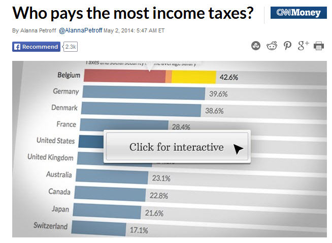 I spotted this graphic over at CNN tonight. But they don’t get the real credit as it came from the Organisation for Economic Co-operation and Development. The full CNN article is here, and the interactive graphic is here.
It is hard to imagine how to construct a less informative graphic to compare tax rates around the globe. How many problems can I name?
The comparisons are base on a single childless worker making what is described as the average salary in their country. How can anyone think that represents the complexity of the tax code anywhere? Tax structures vary by country. Not all are equally progressive, or regressive – depending on your view point. And is a single person typical in any sense? Does the average salary say anything about the tax rates of most people?
Then there is the question of what the taxes actually pay for. In the United States there has been a lot in the news about the advent of Obama care. But in truth much of the costs of insurance is born by the individual in the United State. While in other countries the state pays those costs through the taxes they collect. How do I compare taxes that don’t even pay for the same thing?
Next there is the issue of local taxes. The CNN piece tells me that in the United States they used the local taxes for Detroit, MI. What? They claimed that was something lower than average. But what tax are they counting? Are property taxes included? I don’t know. For the other countries CNN tells me nothing about how the local taxes are computed. Do they use taxes in Berlin for the German tax rates? Who knows?
In the United State they use 7.7% for the Social Security Tax. What about the employer contribution to that tax? Shouldn’t that be counted as well?
Come on CNN, come on the Organization for Economic Co-operation and Development, people deserve better reporting than this represents.
Costs – child care vs college
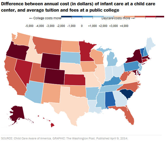 I spotted the graphic at the right in the Washington Post last week.
My first thought was that this was two dimensional data being shown in a one dimensional graphic. The differences shown are the product a very separate economic factors. Day care costs are very likely linked to local cost of living factors and state regulations. College costs one the other hand a more closely tied to how each state chooses to subsidize the education of their residents and how they charge for out of state students.
My second line of thought went down the path of why compare the two costs. They occur at different times in the life cycle of a family. The child care costs usually kick in early on, while college costs kick in 15 or so years later. By that time the family income should be somewhat higher due to things such as career advancement.
The data in the graphic came from a report by the Child Care Aware. They can be characterized as an advocacy group for affordable quality child care.
Part of the groups advocacy seems to be to make child care look at expensive as possible in their comparisons. The data in the graphic apparently came frim Appendix 6 of the report. The child care costs in the comparison are those for full time care infants in center. It is hard to imagine picking a more expensive choice. Meanwhile the college costs are for those as a public college. Those are of course on the low end of scale of costs for a college education. Following the link provided in the report the college numbers are for instate tuition and fees for four-year colleges. So they conveniently did not include the full cost of a college education. They left out the major cost or room and board – or the equivalent cost if the student lives off campus. This makes the child care cost seem large in comparison the the college costs.
It is worth pursuing some of the other tables in the report to see how they treat the data. In Appendix 4 they compare average costs of care for school age care in a center to the median income for a single mother. What does it mean to compare a mean to a median? Without knowledge of the distributions of the two variables it is hard to say. Is the mean cost anywhere near the median cost. How many single mothers are using a center for child care vs other less expensive options? And I though we had gotten past the single mother to a single parent concept sometime ago.
Likely the group feels they met the goal of showing that child care costs are high. But don’t we already know that? The real question are the costs “reasonable” given the service supplied?
Posted in Methodolgy Issues, Telling the Full Story
Addressing income inequality – Charles Lane style
When a solution to a problem is proposed it is usually good practice to ask the simple question “What will doing this action accomplish?” Sometimes the answer is “nothing.”
This past week an editorial appeared in the Washington Post by Charles Lane on the subject of income inequality. The auspicious title was “Fixing one driver of inequality may hit close to home for some progressives.” Charles Lane was the author.
In response to proposal to increase the minimum wage and increase taxes on the rich he turns his attention to what he labels “Exhibit A” in government policies that “skew” the income distribution upward. The culprit is the treatment of residential real estate in the tax code via deductions for both the interest payments on home loans and for property taxes. He seems to relish the fact the eliminating these tax benefits would hurt the most in the areas that support President Obama.
Charles Lane throws out some very big and impressive numbers on the cost to the treasury of these deductions. He uses numbers like $70.3 billion, $31.7 billion and $52.5 billion. They are impressive amounts with a total cost of $154.5 Billion. These are annual number. Lane’s point is that the bulk of these deductions help those in the top quintile of the income distribution. Thus eliminating, or curtailing them would reduce income inequality. On that point he is correct.
However when I ask the simple question does it make a material difference the answer is not much.
The Census Bureau regularly releases numbers on income and income inequality. The most recent data is for 2012 in the report “Income, Poverty, and Health Insurance Coverage in the United States: 2012.” Additional data can be found in the income section of the Census Bureau website.
This provides all the data need for a quick back of the envelope calculation. First note that Lane does not claim that the value of all of the deductions accrue to those in the top quintile of the income distribution. But let me make the assumption that they do. This will mean that be eliminating the entirety of these deductions I am overstating the impact the change will have on income inequality. The Census Bureau tables show that in 2012 there were 124,459 thousand households in the United States with a mean income of $71,274. Simple multiplication gives an estimate of aggregate income in the county of $8,871 billion. The Census Bureau report shows that 51.0 percent of this income is taken by the top quintile. That comes to an aggregate income for the top 20 percent of households of $4,524 billion dollars. The tax deductions cost the treasury $155 billion. The cost to the top quintile then is something less than that figure. That is it less than 3.3 percent of their income.
It seems obvious that anything that impacts only about three percent of the income of those in top 20 percent will do very little to reduce income inequality when that group is making over five times those in the second quintile, over three time that of those in the middle quintile and over twice that of in the fourth quintile.
The bottom line is that while there may be good reasons to doing away with the deductions, reducing income inequality is not one of them.
Posted in Small Differences, Telling the Full Story, Where's the Data?