Subscribe to Blog via Email
Good Stats Bad Stats
Search Text
March 2026 S M T W T F S 1 2 3 4 5 6 7 8 9 10 11 12 13 14 15 16 17 18 19 20 21 22 23 24 25 26 27 28 29 30 31 -
Recent Posts
goodstatsbadstats.com
GOP Tax Plan – How to Confuse Your Readers
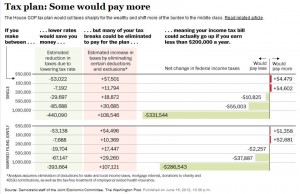
 I spotted the graph to the right in the Washington Post yesterday. Click on the image to obtain a larger, clearer image. The article dealt with the impact of the GOP tax cuts on the middle class and was based on a report by Senate Democrats and their assessment of the tax plan put forth by the Ryan.
The graph fails to communicate on several levels. The most basic issue is the lack of context for the numbers in the graph and and adequate base for the various income levels. Particular troublesome is the lack of a base for those making over a million dollars. Is the decrease in taxes for married couples with an average income of two million, three million, ten million. The impact of the decrease of $286,000 dollars in taxes is very different depending on the income levels in the group. Open ended categories like the one used here rarely work well either in a graph or in a table.
The second piece of useful information missing is the current tax liability for the groups shown in the table. What is the relative increase or decrease in taxes paid under the plan would be valuable information to have. While singles making between one and two hundred thousand dollars would “on average” pay an additional $4,600 in taxes and no one want a new bill of that size to enter into their expenses such numbers need to be put in the context of the taxes they are already paying. Is this a doubling of their tax bill or is it a ten percent increase?
Posted in Uncategorized