Subscribe to Blog via Email
Good Stats Bad Stats
Search Text
March 2026 S M T W T F S 1 2 3 4 5 6 7 8 9 10 11 12 13 14 15 16 17 18 19 20 21 22 23 24 25 26 27 28 29 30 31 -
Recent Posts
goodstatsbadstats.com
Graphic Visualization 101
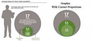
In my last post I talked about the report from the Partnership for Public Service. Today I want to look at just one of the data visualizations in the report as it is a textbook example of how not to present data. The report presents some of the data that I talked about in that last post in what look like a nice fancy graphic image. It shows only three number in what I would call a bubble chart. Each circle represents a separate number. The general rule in graphic visualization is that the area of the graph should be proportionate the to area shown. However in this figure the diameter of the circle was used instead. As result a number that is twice as big shows four times the area. As a result the data visualization is a misrepresentation of the true difference. I have redone the image using the area instead of the diameter of the circles to illustrate the differences. The original graph and the revised graph as shown side by side below.

However I do not like even the revised image as placement of each circle on top of the other hides the true proportions.
This is a case in which a simple old fashioned bar chart would be much more effect.
Posted in Methodolgy Issues