Subscribe to Blog via Email
Good Stats Bad Stats
Search Text
July 2026 S M T W T F S 1 2 3 4 5 6 7 8 9 10 11 12 13 14 15 16 17 18 19 20 21 22 23 24 25 26 27 28 29 30 31 -
Recent Posts
goodstatsbadstats.com
Metro fare comparsions – Graphics that don’t work
The Washington Post did a piece on Sunday discussing a potential fare increase for the Washington DC area Metro system. As part of that article they included a graphic comparing the costs of various subway systems across the country. The graphic fails on several key points.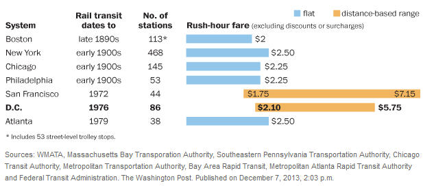
The presentation of the graphic is complicated because the Washington Metro system uses a fare structure that is based on both the distance traveled and the time of day of the trip. The same is true of the San Francisco Metro system. The other five metro systems shown in the graphic have a flat fare structure. The claim in the article is that those five systems were in place prior to the existence of the technology needed to implement a variable fare structure and that those living in the areas would not tolerate a move to a variable fare structure. The justification for a variable fare system usually takes on two points. First the users should pay for the length of the trip. And second, the flat fare structure discriminates against the poor who live in the inner cities.
This mix of fare structures makes the graphic meaningless in some ways. The Washington Metro and San Francisco fares look much worse than those in the other cities. Many readers will focus on the maximum fare for those two areas when making the comparisons. The graphic almost pushes the reader in that direction. More sophisticated readers may think in terms of the average of the high and low fares. For that Washington Metro system that would be $3.92. However this is not a good value to use. Those who read the details of the piece will find that as Metro calculates it; the total fare revenue divided by the number of fares collected, the average fare is about $2.90. That is still higher that the fare in the fixed rate systems but not anywhere near what the graphic implies.
Even the $2.90 figure is not a good number to use. In the graphic the Chicago system fare is cited as $2.25. However when I go to the Chicago Transit Authority webpage I find that $2.25 is the regular fare. There is also a reduced fare of $1.10 for some riders and a fare of $0.75 for students. There are also some who qualify for free rides. Thus I do not have an average fare for the Chicago system. I suspect the same if true for other systems. As a result the $2.25 figure for Chicago cannot be compared to the $2.90 figure for Washington.
But it gets more complicated. The federal government provides a generous subsidy to employees who use the metro and who agree not to use any federally subsidized parking and not be part of a carpool into work. The current subsidy is $245 a month. Even at the highest fare of $7.15 this would pay for 34 trips on the metro system. If this subsidy was paid directly to the Washington Metro the fares would likely be lower than they are now. We have a situation where the federal government subsidizes the metro system, yet that subsidy is not reflected in a reduced average fare. At the same time the local jurisdictions subsidize the system directly and this results in reduced fares. Thus the average fare is more a matter of how the system is subsidized than a measure of the direct impact on the users.
So later in the article when they writers point out
In a typical year, Metro collects about 67 cents in subway fares (give or take a few pennies) for every dollar it spends to operate the system. That “fare recovery ratio,” as transit experts call it, is among the highest in the country. The national average is a little less than 50 cents, according to the Federal Transit Administration.
The comparison is largely meaningless as the difference may well be more of a matter of how the system is subsidized – directly or indirectly – than is any measure of what some call the “fare recovery ratio.”
At this point the numbers in the graphic reflect this problem and the the accompanying article have become deceptive. Telling the full story in this situation is very difficult especially when key pieces of information are ignored.
As for the graphic itself, the bar here is used in two different ways: for the fixed-fare systems the length represents the magnitude of the fare, whereas for the others it represents the difference between two possible fares. Since a bar chart naturally invites comparison between the lengths of the bars, this chart is suggesting a comparison that isn’t important (or at least wasn’t part of the article).