Subscribe to Blog via Email
Good Stats Bad Stats
Search Text
June 2026 S M T W T F S 1 2 3 4 5 6 7 8 9 10 11 12 13 14 15 16 17 18 19 20 21 22 23 24 25 26 27 28 29 30 -
Recent Posts
goodstatsbadstats.com
Income inequaltiy – Change the list
Last summer CCN asked readers to vote for topics from a long list of social issues. The five topics with the highest vote counts were selected for future stories. This became their “Change the List” series. This week they posted the piece on income inequality titled “The most unequal place in America.”
While the issue of income inequality is well worth reporting and people disagree on the causes and implications of the current level of income inequality in the United States this piece fails to do even a credible job of incorporating statistical literacy into the analysis.
East Carroll Parish, Louisiana, with a population 7,500, was highlighted as the place with the highest level of income inequality in the United States. How was it chosen? Last fall the Census Bureau released a report using five year data from the American Community Survey where East Carroll Parish was identified as among the counties with the highest level of income inequality (see table 5). The statisticians at the Census Bureau recognized that there was enough sampling error (variance) in the estimates that they did not claim any one county was the worst. The writers at CNN thought they knew better apparently because the highest numerical estimate was for East Carroll Parish.
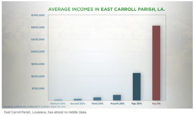 That is really not a major problem for the article. There is still considerable income inequality in that little Parish in LA. The bigger question is if a Parish with a population of only 7,700 and 2,500 households can represent the areas of the country with the highest level of income inequality. That means that in the graphic to the right the bar for the top 5% likely represents 50 households and is based in a sample from many fewer households. In short the actual average income could be considerably different from the numbers shown.
But there are other problems with the graph as well. First note that the six bars do not all represent the same size group. The five to the left represents 20% of the population while the final bar on the right represents only 5% of the population. That 5% overlaps with those in the fifth bar. This results in an image which shows an upward trend by cell with the change between the fifth and sixth bar being largely meaningless. It gets worst. A good graph should fully document who the data refers to. In this graphic, nor in the accompanying article are we told the group of people the average incomes refer to. Is it persons, families, or household?
The first graph in the article is titled “Level of Income Inequality.” It compares the Gini index for East Carroll Parish with that of United States, Iran, Nigeria, and Sweden. There is no explanation of why those five areas were chosen. But again it gets worst. The x-axis is labeled “Gini Index” and goes from “better” to “worst” on a scale of zero to 80. I doubt very much that an index of zero is considered better than an index of 10. A certain amount of income inequality is inevitable. While higher levels of the index are generally considered worst, the same is not true at the lower end of the scale. Also bear in mind that since the author chose to focus on the county(parish) with the highest index it was guaranteed to have an index higher than that of the United States as a whole.
Then there is the graph titled “Social Ills and Income Inequality.” The measure of “Social Ills” is undefined. But the United states stands out as the county with the highest income inequality and the worst social ills. But this is a graph of only a select subset of the developed countries in the world. Where would Iran be on this graphic? Where would Nigeria be on this graphic? What if social ills was measured based on poverty rates? What if it was measured on gender equality, what if it was measured on standards human rights? The graph itself shows a strong correlation between income inequality and the social ills index. The article tries to take this correlation and turn it into a cause and effect. Must I repeat again the correlation does not prove a causes be. Perhaps it is the social ills that cause the income inequality and not the other way around.
I have to comment on one more graph in the article. This one is titled “Top Marginal Tax Rate” and is accompanied with the statement “And the tax rate on the richest Americans has dropped considerably.” The graph shows as 91% marginal tax rate around 1960 and a current marginal tax rate of 31%. Again data is missing. An important component of discussion here is who is paying those rates. I very much prefer the graphic over at taxcut.org that shows the marginal tax rate by the percentile of the earners income. Here, for example we see that the marginal rate for the 99th percentile peaked at about 53% around 1979 and has now dropped to about 33%. While for the 90th percentile it peaked at about 33% in the mid 1980s and has now dropped to about 25%.
Let me stop there. The article fails many tests of statistical literacy. That is a real shame. The piece makes some good points that are worth thinking about. I can only wish that articles such as this would get a good statistical review before they are published.