Subscribe to Blog via Email
Good Stats Bad Stats
Search Text
July 2026 S M T W T F S 1 2 3 4 5 6 7 8 9 10 11 12 13 14 15 16 17 18 19 20 21 22 23 24 25 26 27 28 29 30 31 -
Recent Posts
goodstatsbadstats.com
Income Mobility
 This past week there were a number of stories on income mobility in the United States. The work these reports were based on was a paper titled: “The Economic Impacts of Tax Expenditures: Evidence from Spatial Variation Across the U.S.” out of Harvard and the University of California. Interestingly, based on the title, the main focus of the paper was on taxes and income mobility. However the published reports tended to ignore the tax angel and focused on income mobility as impacted by social conditions, segregation, and the availability of public transportation. The New York Times summed it with their piece “In Climbing Income Ladder, Location Matters” and the accompanying graphic which is shown at the right. Their graphic is much better than those I saw from the authors and from other sources. The New York Times frequently does a very good job with their graphics.
Before I go on let me commend the authors who have created a web site where anyone can view their paper and all of the associated data. It is rare indeed when authors provide that level of detail for the work they have done. That effort is much appreciated and the authors should be commended for making the data so easily available.
 The study was based on tax data for parents and set of kids born in 1980 and 1981. The authors looked at where in the income distribution the parents were and where the children were in the income distribution years later. This was not a measure of income mobility for an individual but rather mobility over two generations. The question being considered was how well the children did relative to the parents. The New York times graphic and much of the reporting centered around one number. This was the probability that he child was in the top quintile given the parents were in the bottom quintile. The data for for 741 commuting zones is provided at the web site and is reflected in the graphic.
It is unfortunate that the focus was on specific areas. Looking at the New York times graphic the arc from South East Virgina to Western Mississippi where the children seemed to fare the worst by the metric that the authors used is very similar to what has been seen in other graphics.
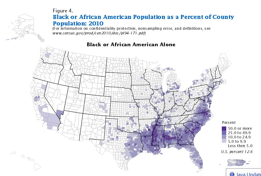
 First notice the graphic from a Census Bureau report showing Black population percentages by county. Notice the ark across the South where the counties have the higher proportion of Blacks than in the rest of the county matches the same arc seen in the income mobility graphic. This raises the question as the influence of race on upward mobility.
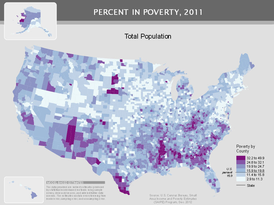
Next look at the graphic of poverty rates by county. That also was published by the Census Bureau. The same arc, this time of high poverty rates is seen in this graphic as in the previous two. Should we ask is poverty itself related to lower income mobility?
But the story is much more complex. There is lower income mobility in Ohio and Michigan than in other part of the county. But those two states do not show up as areas with higher Black population or higher poverty. Sure there are individual cites in those two states with high concentrations of Blacks and poverty. But the income mobility issue covers a much larger area than just those cites. Then there are areas of eastern Kentucky and West Virginia with high poverty rates but the income mobility is better than elsewhere. This tells us that the story may well vary by areas of the country. There is likely not just one reason for the differences in income mobility, but many reasons.
Complex situations like this are not easy for the media to deal with and require some difficult work for researcher to ferret out what is going on in the real world.
After examining some of the data the authors posted at the web site I think there are indications that the simple one number method for measuring income mobility has serious flaws. Looking at just the one number may be a good starting point. But the data set provides a much more robust set of number that ask for more answers and more research.
As a starting point I picked two commuting zones – Atlanta, GA and Pittsburgh, PA. Atlanta was picked as it had a low income mobility rate and was featured in many of the news reports. I picked Pittsburgh as it had one of the higher income mobility rates and I knew the city having lived there for six years. The data the authors provide show a poverty rate for Pittsburgh of 12.5% and for Atlanta of 9.9%. That makes Pittsburgh the poorer area on that metric. Pittsburgh was 7.0% Black, while Atlanta was 25.8% Black.
Using the data from the author’s web site the two tables below show the full transition matrix for the two areas. The numbers in the table reflect the probability that the child will move from a given quintile for the parent to a given quintile for the child. So these are actually conditional probabilities. Each column represents the probability that the child is in a particular income quintile given the parents income quintile. The New York Times article focused first on the probability of moving from the lowest(1st) quintile to the highest(5th) quintile. For Atlanta that number is 4.0%. For Pittsburgh that number is 10.3%.
These two tables change the entire perspective. Look closely the last two rows of both tables. Regardless of the parent’s income quintile the child’s probability of being in the top two quintiles of income in Atlanta are less that the probabilities in Pittsburgh. What was presented as being a poverty problem can now be seen as something that is happening at all income levels for the parents. Arguments like, race, segregation, and access to public transportation no longer have the same weight when all income groups are impacted.
What is going on? I don’t have an answer and would certainly caution about making conclusions based on just the data for two areas. Perhaps there is something going on with the passage of time that had impacted the two areas differently. Perhaps over the last few decades Pittsburgh has been more successful at attracting the higher paying jobs than Atlanta has been. That is why it is necessary to look at much more of the data, at more areas before coming to any hypothesis about what the differences mean. But clearly differences like that observed in these two tables need to be explained before there can be an understanding of what this data is showing us.
I see an interesting problem with many research papers devoted to the issue. But the paper these authors have put forth is a very good starting point.
| Parent’s Quintile | |||||
| Child’s Quintile | 1 | 2 | 3 | 4 | 5 |
| 1 | 31.0 | 24.2 | 19.7 | 16.7 | 15.0 |
| 2 | 36.8 | 31.9 | 22.5 | 20.7 | 15.1 |
| 3 | 19.3 | 22.0 | 22.1 | 20.5 | 17.3 |
| 4 | 9.0 | 14.0 | 18.5 | 21.2 | 22.4 |
| 5 | 4.0 | 8.1 | 14.3 | 20.9 | 30.2 |
| Parent’s Quintile | |||||
| Child’s Quintile | 1 | 2 | 3 | 4 | 5 |
| 1 | 31.7 | 22.1 | 15.6 | 11.1 | 10.1 |
| 2 | 23.9 | 20.6 | 17.4 | 14.0 | 11.7 |
| 3 | 19.3 | 21.4 | 21.1 | 19.7 | 16.3 |
| 4 | 14.7 | 19.4 | 22.8 | 24.5 | 23.7 |
| 5 | 10.3 | 16.5 | 23.2 | 30.6 | 38.1 |